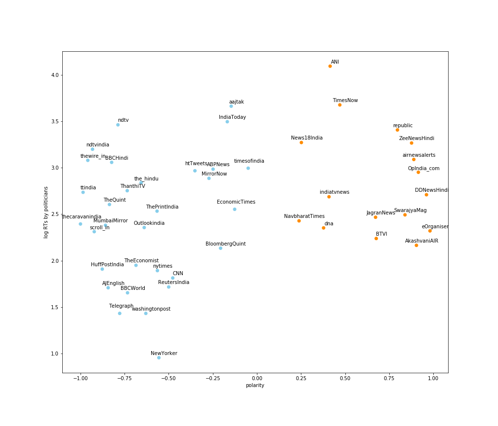
Dibyendu Mishra and Joyojeet Pal of the University of Michigan have some very interesting research out on the political bias of Indian news publications. Rather than do complicated gymnastics such as NLP, they’ve simply looked at the share of articles from each news publication that is retweeted by BJP and non-BJP publications, to draw out a measure of their bias (see link above for methodology).
They have made a nice scatter plot (the other axis is how “popular” these news outlets are in terms of the number of articles retweeted), and looking left to right, you can see the understood (by politicians) bias of various Indian news publications.  As Helmet pointed out on Twitter, the most “centrist” news outlets seem to be the Times of India and the Economic Times, both from the Bennett, Coleman and Company group, who people crib about for “being too commercial” and “having too many advertisements”.
Nice idea and analysis.
Moral of story = read TOI and ET for seemingly least biased news! (If you have to read any news at all) https://t.co/EWxiUpnldt
— Sanjeev Vaidyanathan (@sanhelmet) February 29, 2020
This reminds me of another piece of analysis that was in the news a few months ago, about how subscription-driven online news has led to news outlets being politically polarising. For example, Zach Goldberg did some analysis of frequency of words/phrases in the New York Times that are associated with the extreme left.
1/n Spent some time on LexisNexis over the weekend. Depending on your political orientation, what follows will either disturb or encourage you. But regardless of political orientation, I'm sure we can all say 'holy fucking shit'
— Zach Goldberg (@ZachG932) May 28, 2019
Note the inflexion point sometime in 2012 or so, around the same time when the NY Times put up its paywall.
David Rozado has a more comprehensive picture (check out his nifty tool here).
The idea is this – when newspapers depended on advertising for most of their funding, they needed to be centrist. Taking political sides meant that large mass-market advertisers wouldn’t want to advertise in this newspaper, and the paper would thus lose revenues. Hence, for the longest time, whatever the quality of the reporting and writing was, news outlets strove to be reasonably politically unbiased – taking sides would mean a loss of money.
Once digital took off, and it became clear that digital advertising wouldn’t really sustain the papers, they started putting their content behind paywalls. And subscription revenues meant two things – news outlets weren’t as beholden to advertisers as they used to be, and it was easier to get paying subscribers if you had a strong ideology. Moreover, online you can provide targeted advertising (rather than mass-market), so you can get away with being biased. And so with the coming of paywalls, newspapers started becoming far more political as the New York Times graph above indicates.
In India, there haven’t been too many publications behind paywalls, but media is evidently getting more and more polarised over time. Papers and channels are branding themselves (implicitly) as being pro or against a particular political party, and that is driving their viewership.
While these media outlets are good for fanbois (and fangirls) of particular ideologies, the ideological bent has meant that it has become harder to get objective news.
And that’s where money, and advertising, comes in.
The positioning of ToI and ET in the middle of the Indian media ideological graph is interesting because they belong to a group that is brazen about commercialisation and revenues (from advertising). And in terms of news objectivity, that’s a good thing. Since ToI and ET are highly money minded, they want to get as much advertising as possible, and in order to attract mass marketers, they need to not be biased.
Taking a political stand means pissing off people belonging to the opposite political persuasion, and that means less readership, which means less advertising revenues. And so if you read the editorials of these newspapers (I read ET everyday), you see that they maintain a careful balance of not appearing too biased in favour or against any party. And you see them raking in the advertisers while more biased (and “ideological”) competitors are forced to request for donations, or put up paywalls restricting their readership.
Putting it another way, there is no surprise that ToI and ET are not biased in their news, and are retweeted by politicians of all persuasions. It is the classic money-driven media model, and that is the one that is capable of providing the most objective news.

