Topography of Bangalore

My day on Twitter didn’t start out too well today. I wrote this:

As I’ve stayed on for longer, with more data, things have improved today. I’ve learnt a few things, had a few conversations, and watched some fights. But so far, my day has been made by this article about Bangalore’s topography and development.

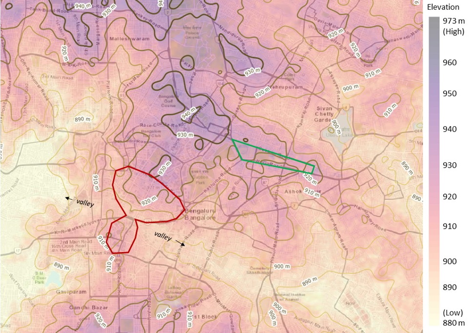
I’m halfway through reading it, so can’t say yet if I can agree with its conclusions. But what I really really like about the article is the maps. The main map they have is a topographical map of Bangalore (unfortunately, focusses on the cantonment area, so my areas are left out), and then zooming in to bits to explore development.

Topography of Bangalore, from the India Forum article

So many insights already from this:

  1. There is a clear correlation between areas that are perceived to be “posh” and elevation. The better planned areas of Bangalore are built on higher ground than the worse planned.
  2. “High grounds” lives up to its name
  3. While the article (so far) is mainly about construction of the cantonment, the preference for high areas post independence is also evident. From the bottom of the map seen above, you can broadly identify the northern boundary of the area that is now Jayanagar and Basavanagudi. Similarly, the Vidhana Soudha is built at pretty much the highest part of Bangalore (before the Metro came up, you could see the Vidhana Soudha by standing on top of the Trinity Church spire)

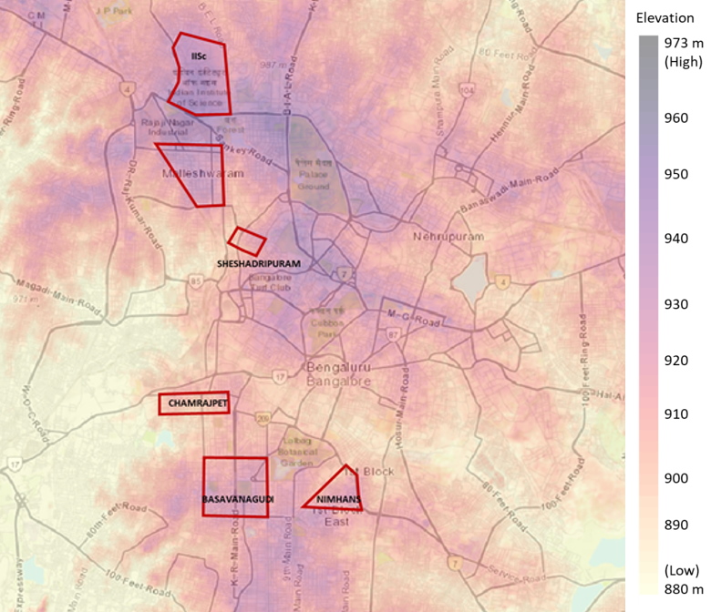
Later on in the article there is a more zoomed-out map of Bangalore. And that confirms that Jayanagar is indeed on lofty land.

Jayanagar is right at the bottom of this image. It’s interesting that parts of Banashankari (a rather hilly area) are actually low-lying

Progressing in the article, and it goes off into the (not unexpected) caste and class conflict territory. In any case, I’ve got my value from it. These maps are absolutely fascinating! I hope you like them as well

Training to be a quizzer

Eleven days before our daughter was born in September 2016, the wife and I attended the annual Family Quiz organised by the Karnataka Quiz Association. We ended up doing fairly well in the quiz, and placed third.

Unfortunately, despite the quiz having been described as “for teams of three and under from the same family”, we only got two book coupons as a prize. If they had given us three prizes instead, I could’ve claimed that our daughter won her first quiz even before she was born.

Two years and four months on, I’ve greatly disappointed my wife in terms of how much I’ve taught our daughter. According to some sort of an agreement we had come to ages back (maybe even before we were married), I was supposed to have taught our daughter calculus by now. As it happens, she can barely count to twenty, and still hasn’t fully got the concept of counting objects.

However, there are other areas of development where, despite me not putting any sort of effort whatsoever, she has done rather well in terms of her learning. I had written last month that she had proved adept at showing off her Quantum Physics for Babies in front of visitors. And before that she had shown promise by reading bus number boards.

Now, an anecdote from last night suggests she is already gearing up to be a quizzer.

Back in May, a friend and business associate gifted her this illustrated book of nursery rhymes (I don’t have the copy with me as I write this, but it was possibly this one). Since each page contains a full rhyme and maybe one or two illustrations, we don’t use the book too much – the daughter prefers books that have a higher picture-to-word ratio.

In fact, the fact that I’m not even sure what the book precisely looks like should tell you that we don’t use the book too often. Once in a while, my wife reads out poems from that just before bedtime, but I normally don’t read from it.

Anyways, last night as I was putting the daughter to bed, she picked out this book and asked me to read it to her before she fell asleep. And then she showed off her prowess as a quizzer.

Being two and a third years old, she can’t yet read (she knows the numbers and a few letters of the English and Kannada alphabets, but not much more). However, the way she was recognising the poems from the illustrations suggested that she was actually reading!

Guessing “Humpty Dumpty” by looking at an egghead sitting on a wall was rather easy. Some of the other poems she guessed correctly were, however, stuff I surely wouldn’t have  gotten from the illustrations. In fact, this included poems whose existence even I wasn’t aware of before I saw them in the book. I was so impressed that I didn’t really mind that she didn’t go to bed until it was eleven o’clock last night!

Now, this might be a false alarm. In the past she seems to have answered arithmetic questions correctly which later turned out to be a fluke. The sheer proportion of poems she got correct last night suggested this is not the case. The other doubt is that she might have seen the book elsewhere, and thus mugged up the picture-poem associations.

The way she was guessing, however, suggested to me that she was simply recognising the objects in the pictures and the actions they were exhibiting, and then working out the name of the poem from these figures and actions (obviously she knew it’s a book of rhymes, so the sample space was finite). And that is exactly how your mental process goes when you’re attempting a (good) quiz.

Now I don’t mind so much that she still has a long way to go before she can learn calculus.

Reading Boards

Today was a landmark day in the life of the daughter. She looked at a bus this evening, and without any prompting, started trying to read the number on it.

Most of today hadn’t been that great for her. She’s been battling a throat infection for a few days now, and has been largely unable to eat for the last couple of days because of which she had developed high fever today. As a result, we took her to hospital today, and it was on the way back from there that the landmark event happened.

Having got on to the bus at the starting point, we had the choice of seat, and obviously chose the best seat in the house – the seat right above the driver (I’m going to miss double decker buses when we move out of London). She was excited to be in a bus – every day on the way to her nursery, we pass by many buses, prompting her to exclaim “red bus!!” and expressing a desire to ride them. The nursery is five minutes walk away from home, so no such opportunity arises.

I must also mention that we live at a busy intersection, close to the Ealing Broadway “town centre”. From our living room window we can see lots of buses, and the numbers are easily recognisable (it helps that London buses have electronic number boards). And sometimes when Berry refuses to eat, her mother takes her to the window where they watch buses come and go, with one spoonful for each bus. Along the way, the wife reads out the bus numbers aloud to Berry. So far, though, Berry had never tried to read a bus number from our house window.

But sitting in a bus herself this evening, she “broke through”. Ahead of us was bus 427, which she read as “four seven”. I asked her what was in between 4 and 7, and she had no answer. Maybe she didn’t understand “between”.

A short distance later, there was bus 483 coming from the other side. She started with the 3 and then read the 8. And then the bus passed. And then there was bus E1 in front of us. Berry read it as “E”. I hadn’t known that she can recognise E. I know she knows all numbers, and A to D. So this was news to me. Getting her to read the number next to that was a challenge. 1 is a challenge for her since it looks like I. After much prompting, there was nothing, and I told her it was E1. Five minutes later, we encountered 427 again. This time she read in full, except that she called it “seven two four”.

I grew up at a time when our lives were much less documented. The only solid memory I have of my childhood is this photo album, most of whose photos were taken by an uncle who had a camera, and whose camera had this feature to imprint the date on the photos. So I have a very clear idea about what I looked like at different ages, and what I did when, but the rest of my growing up years were a little fuzzy.

There is the odd memory, though. My grandfather’s younger brother, who lived next door, had a car (a Fiat 1100). I loved going on rides with him in that, and I used to sit between him and my grandfather. I don’t remember too many specific trips, but I know that my grandfather would make me read signboards from shops, and I would read them letter by letter.

My grandfather’s younger brother passed away when I was two years and seven months old. So I know that by the time I was that age, I was able to read letters from signboards.

It is only natural for us to benchmark our children’s growth to that of other people we know – ourselves, if possible, and if not, some cousins or friends’ children. Thus far, I had lacked a marker to know of whether Berry had “beaten me to it” at various life events. I know she started walking quicker than me, because my first year birthday photos show me trying to stand on my won. I know she spoke later than me because multiple people have told me I would speak sentences at the time of our housewarming (when I was a year and half old).

Thanks to the memory of going on rides with my grandfather’s brother, and reading signboards, I know that I would read them before I was two years seven months old (or maybe earlier, since I’m guessing I did it multiple times in his car else no one would’ve told me about it).

And today, at two years and two months, the daughter started reading numbers on surrounding buses. She doesn’t know the full alphabet yet, but this is a strong start!

I’m proud of her!

Measuring Income

Earlier today I was reading an interview in the Business Standard with Shaibal Gupta, Secretary of the Asian Development Research Institute and member of the Raghuram Rajan committee on composite development index of states.  Gupta wrote a dissenting note to the report, with his main contention being the use of the Median Per Capita Expenditure (MPCE) as a measure of income to compare states rather than using the Per Capita Gross State Domestic Product (GSDP). I must state up front that I agree with the report here, and will use this post to defend my stance. Meanwhile, I must mention that one of the reasons he gave for using the GSDP (“Per capita income is taken as an indicator for this purpose by a number of institutions, including the Planning Commission and Finance Commissions.”, he said) almost made me fall off my chair.

Suppose you run a manufacturing company. Your production facility is located in Hosur, Tamil Nadu. However, for administrative convenience, and for the convenience of your top management, you have decided to headquarter your company in Bangalore, Karnataka (for the record, Hosur is just about 35 kms from Bangalore). Most of your workers live in Tamil Nadu, and draw their salaries there. Your top management gets compensated in Karnataka, and they live there. The question is how your company contributes to the economies of the two states.

From an accounting perspective, all your sales are attributed to Karnataka, for you are headquartered there. Of course, what your workers in Tamil Nadu spend out of their salaries will be accounted for in that State’s GDP but the overall sales of the company itself will be attributed to Karnataka, even though the company does next to no economic activity there. With the simple act of locating your company headquarters in Karnataka, you push up Karnataka’s GSDP while reducing Tamil Nadu’s. Some states (eg. Maharashtra and Delhi) are much more popular than others for the location of company headquarters, and they can lead to a fairly distorted figure of how much is produced in each state.

That is not all. The problem with Per Capita GSDP is that it is a mean figure, and is thus liable to be grossly affected by extreme values. Let us say we are comparing the income levels in two neighbourhoods. Neighbourhood A has 1000 people.999 of them earn Rs. 100 per month while the 1000th earns Rs. 1 crore per month. Neighbourhood B also has 1000 people but each of them earns Rs. 10000. Which neighbourhood is richer?

If you go by the mean income, the mean income of A is Rs. (999 * 1000 + 1 * 1,00,00,000)/1000 = Rs. 10999. The mean income of B is Rs. 10000. So you would say that A is richer than B. While on an average that might be true, you might notice that the number for A is skewed by the one rich guy. What this hides is the fact that 99.9% of A earn only a tenth of B’s mean income. Can we do better?

Instead of looking at what the resident of a neighbourhood makes on an average, what if we instead measure what the average person in the neighbourhood makes? In other words, what if we measure the median income in each neighbourhood? The advantage with the median is that it doesn’t get skewed by extreme values, as is likely in case of a variable such as income which usually follows a power law distribution. In our example above, the median income of A is Rs. 1000 while that of B is Rs. 10,000 which is probably a better reflection of the richness of the average resident of these two localities.

Similarly, the per capita GSDP, being a mean measure, is not a great measure for determining the richness or poorness of the people of a state. Suppose, for example, that neighbourhoods A and B are two states. Notice that A will have a much larger GSDP compared to B, and that this tells us nothing about the richness of the average resident of these two states.

Putting both above reasons together, you realize that the per capita GSDP is not  a great estimator of the richness of a particular state.

So what do we use? We discussed above that median income is a much better metric than the mean income. So can we use that for measuring richness instead? While it sounds good in theory, we have a practical and accounting problem – given that a large part of the country is essentially a cash economy, it is hard to keep track of people’s incomes. Moreover, there are enough reasons to both under-report and over-report one’s income if you were to ask someone as part of a survey. For this reason, the general consensus among development economists is that total consumption expenditure is a good estimate of income among the poor, whose net savings rate is negligible.

What about the non-poor, you may ask. Notice that we are only trying to capture the expenditure of the median resident of a state, and assuming that more than 50% of a state is within an income level at which income equals consumption expenditure is fair. So the median per capita expenditure will give a good picture.

So how do we estimate this? Unfortunately, we don’t have any accounting statistics that capture this, and we need to rely on surveys. The National Sample Survey Organization (NSSO) conducts surveys on people’s consumption expenditure every five years, and this is what the Rajan committee has used. Now, you may question the wisdom of relying on sample data (rather than “population data”) to determine the richness or poorness.

The answer to that is that the median is a rather robust statistic, and as long as samples have been chosen at random, it is unlikely that the median of a sample will be too far away from the median of the population (and this is independent of the distribution of the population). We will examine the issue of sampling median in a subsequent post.

In conclusion, I endorse the decision of the Rajan committee to use the median per capita consumption expenditure as a metric for determining the richness or poorness of a state.
The Raghuram Rajan Committee report on Composite Development Index of States

In July this year, at a resort near Bangalore (yes, we at Takshashila do sometimes play resort politics) I got the fifth batch of the GCPP to work on the problem of building an index which measures the development of various Indian states in the last 10 years. I used this case as a reference while doing my module on Analytical Methods in Public Policy. This was as part of one of the weekend workshops which are part of the GCPP. As part of this exercise I taught them how to pick variables, how to measure them, procure data, look for interactions between variables and then combine them to form an index.

It is interesting that a couple of months after that session, the report of the Raghuram Rajan Committee on Composite Development Index of States has been published. I will use this blog post to give my comments on that report as I go through it. Since I’m going to be effectively “live-blogging” my reading of the report, the rest of this post is in bullet points.

Also, in keeping up with my title of “resident quant” I will try as much as possible to restrict my comment to the data and methodology, and not comment on economic issues. However, it is likely that I might go on economic rants here or there.

  • The first paragraph of the executive summary states that the reason we adopted a command and control model after independence was so that we don’t increase the inequalities across regions and states. This is the first time I’m hearing this story
  • The index is based entirely on publicly available data. I think this is a good thing.
  • Each state gets 0.3% of the total available pool, irrespective of its size. Of the remaining 91.6% (28 states => 8.4% fixed payment), 3/4th will be distributed based on “need” and 1/4 on “performance”. Nearly seventy years since independence, I’m of the opinion that this ratio should be less skewed towards “need”
  • Arbitrary cutoffs have been drawn at scores of 0.6 and 0.4 to classify states as “least developed” and “less developed”. While these are round numbers, I’m not yet sure they make sense.
  • The report alludes to the “resource curse”, which is a good thing.
  • Quote: “The Normal Central Assistance (NCA) grant, which is distributed to states as per Gadgil-Mukherjee formula based on categorization of “Special Category” and “General Category” states, constituted only about 3.8 per cent of total resources transferred to States and 8.2 per cent of plan transfers.” (emphasis mine)
  • The underdevelopment index has ten components. I won’t comment on the wisdom of the number of quality of the components chosen.
  • It is a good thing that Mean Per Capita Consumption Expenditure is used as a measure of richness rather than per capita Net State Domestic Product. As the report argues, the latter can include economic activity that doesn’t really reach the people, and is hence not as good a measure as consumption expenditure.
  • Table 1 (on page 17 of the report) gives the correlations between the metrics chosen. I think it is a fantastic thing that they have chosen to present the correlations in the first place (something ripe to be pushed under the carpet). As expected, a number of chosen variables are highly correlated.
  • Correlation between Consumption Expenditure and Urbanisation is 75%!! Similarly, correlation between expenditure and female literacy is 58%.
  • Then comes the damp squib – the excitement induced by presenting the correlation table is doused by the statement that each of the ten parameters are going to be accorded equal weight. This is disappointing on several counts: firstly, the sheer arbitrariness (remember that ‘equal allocation’ is as arbitrary as any other distribution). Next, that the correlations are thrown out of the window and certain factors are likely to get more weight. Then, the fact that this makes it easily manipulable by adding or deleting factors of choice. I’m so disappointed by this one decision that I’m putting this entire point in boldface. Apologies. 
  • The report acknowledges that broadly categorizing states into “developed” and “under developed” creates issues of moral hazard. However, rather than fully doing away with the division, the committee (again, disappointingly) takes a “middle path” by splitting two categories into three. I suspect some mathematical brain is involved here, in that the next committee will increase number of categories to four, and the one after to five, until a time when each state (finally!!) becomes its own category
  • To convert per capita allocation to state-wide allocation, the formula uses a combination of population and area. I agree that it is tougher to provide infrastructure to thinly populated  areas, so this combination is fair. It reminds me of my days in airline cargo pricing when we would similarly adjust between the weight and volume of a piece of cargo.
  • Performance index is computed based on changes in the development index over time. This is a good thing. Shows the committee is “eating its own dog-food”
  • This is the first time “performance” is being used as a criterion for fund distribution. So the 25% weight is a good start. I retract my earlier abuse of this ratio.
  • The committee recommends that this analysis be carried out every five years, since a good amount of data used in calculating indices are published at that frequency. Also considering that’s the frequency of finance commissions, it is a good thing.
  • The report tries to bolster its credibility by showing that the index is highly correlated with the UN Human Development Index. I like it that a scatter plot and regression line have been presented
  • The allocation based on performance is again skewed in favour of less developed states. So you are likely to get more if 1. You are underdeveloped and 2. You have shown an improvement. I think this is fair.
  • One good thing is that the formula is plug and play. It is “timeless” in a sense. At any given future point in time, you can simply look up the data points that are required and just construct the index. There is no human intelligence required for that effort
  • There is heavy reliance on NSSO data, and I’m not sure that’s a good thing since it is “survey data”. I think it might have been better to have used data from census.
  • The committee actually examined the option of weighting factors based on squared factor loadings from a Principal Component Analysis (*applause*) and found that the index thus constituted was 99% correlated with the one using simple arithmetic averages, and thus decided to go with the simpler formula. I’ll still continue to keep the earlier point in bold, though
  • Each “sub-component” was normalized between 0 and 1 using a simple linear formula (higher number indicating greater under-development). I like it that they used this rather than a rank ordering metric.
  • The report includes a sensitivity analysis to show that the ranking and index values are robust. Again, applause
  • A dissent note from Committee member Shaibal Gupta indicates that there are problems in using a simple weighted average rather than data from the PCA

Finally, despite all the talk of transparency and ease of calculation, the report itself does not contain either the index number or the component values for various states. I hope the data has been released (and if it has, please help me by giving me the link). If not, we should campaign for the data to be given out to the public in a CSV (or equivalent) format through the government data portal http://data.gov.in