The (missing) Desk Quants of Main Street

A long time ago, I’d written about my experience as a Quant at an investment bank, and about how banks like mine were sitting on a pile of risk that could blow up any time soon.

There were two problems as I had documented then. Firstly, most quants I interacted with seemed to be solving maths problems rather than finance problems, not bothering if their models would stand the test of markets. Secondly, there was an element of groupthink, as quant teams were largely homogeneous and it was hard to progress while holding contrarian views.

Six years on, there has been no blowup, and in some sense banks are actually doing well (I mean, they’ve declined compared to the time just before the 2008 financial crisis but haven’t done that badly). There have been no real quant disasters (yes I know the Gaussian Copula gained infamy during the 2008 crisis, but I’m talking about a period after that crisis).

There can be many explanations regarding how banks have not had any quant blow-ups despite quants solving for math problems and all thinking alike, but the one I’m partial to is the presence of a “middle layer”.

Most of the quants I interacted with were “core” in the sense that they were not attached to any sales or trading desks. Banks also typically had a large cadre of “desk quants” who are directly associated with trading teams, and who build models and help with day-to-day risk management, pricing, etc.

Since these desk quants work closely with the business, they turn out to be much more pragmatic than the core quants – they have a good understanding of the market and use the models more as guiding principles than as rules. On the other hand, they bring the benefits of quantitative models (and work of the core quants) into day-to-day business.

Back during the financial crisis, I’d jokingly predicted that other industries should hire quants who were now surplus to Wall Street. Around the same time, DJ Patil et al came up with the concept of the “data scientist” and called it the “sexiest job of the 21st century”.

And so other industries started getting their own share of quants, or “data scientists” as they were now called. Nowadays its fashionable even for small companies for whom data is not critical for business to have a data science team. Being in this profession now (I loathe calling myself a “data scientist” – prefer to say “quant” or “analytics”), I’ve come across quite a few of those.

The problem I see with “data science” on “Main Street” (this phrase gained currency during the financial crisis as the opposite of Wall Street, in that it referred to “normal” businesses) is that it lacks the cadre of desk quants. Most data scientists are highly technical people who don’t necessarily have an understanding of the business they operate in.

Thanks to that, what I’ve noticed is that in most cases there is a chasm between the data scientists and the business, since they are unable to talk in a common language. As I’m prone to saying, this can go two ways – the business guys can either assume that the data science guys are geniuses and take their word for the gospel, or the business guys can totally disregard the data scientists as people who do some esoteric math and don’t really understand the world. In either case, value added is suboptimal.

It is not hard to understand why “Main Street” doesn’t have a cadre of desk quants – it’s because of the way the data science industry has evolved. Quant at investment banks has evolved over a long period of time – the Black-Scholes equation was proposed in the early 1970s. So the quants were first recruited to directly work with the traders, and core quants (at the banks that have them) were a later addition when banks realised that some quant functions could be centralised.

On the other hand, the whole “data science” growth has been rather sudden. The volume of data, cheap incrementally available cloud storage, easy processing and the popularity of the phrase “data science” have all increased well-at-a-faster rate in the last decade or so, and so companies have scrambled to set up data teams. There has simply been no time to train people who get both the business and data – and the data scientists exist like addendums that are either worshipped or ignored.
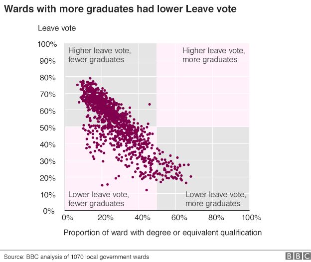
When a two-by-two ruins a scatterplot

The BBC has some very good analysis of the Brexit vote (how long back was that?), using voting data at the local authority level, and correlating it with factors such as ethnicity and educational attainment.

In terms of educational attainment, there is a really nice chart, that shows the proportion of voters who voted to leave against the proportion of population in the ward with at least a bachelor’s degree. One look at the graph tells you that the correlation is rather strong:

‘Source: http://www.bbc.com/news/uk-politics-38762034And then there is the two-by-two that is superimposed on this – with regions being marked off in pink and grey. The idea of the two-by-two must have been to illustrate the correlation – to show that education is negatively correlated with the “leave” vote.

But what do we see here? A majority of the points lie in the bottom left pink region, suggesting that wards with lower proportion of graduates were less likely to leave. And this is entirely the wrong message for the graph to send.

The two-by-two would have been useful had the points in the graph been neatly divided into clusters that could be arranged in a grid. Here, though, what the scatter plot shows is a nice negatively correlated linear relationship. And by putting those pink and grey boxes, the illustration is taking attention away from that relationship.

Instead, I’d simply put the scatter plot as it is, and maybe add the line of best fit, to emphasise the negative correlation. If I want to be extra geeky, I might also write down the R^2 next to the line, to show the extent of correlation!


Financial inclusion and cash

Varad Pande and Nirat Bhatnagar have an interesting Op-Ed today in Mint about financial inclusion, and about how financial institutions haven’t been innovative to make products that are suited to the poor, and how better user interface can also drive financial inclusion. I found this example they took rather interesting:

Take, for instance, a daily wager who makes Rs200 on the days she gets work. Work is unpredictable, and expenses too can be volatile, so she has to borrow money for buying vegetables, or to pay the doctor’s fees when her children fall sick. Her real need is for a flexible—small ticket, variable amount, rapid approval—loan product that she can access instantly. Unfortunately, no institutional channel—neither the public sector bank where she has a “no frills” account, nor the MFI that she has previously borrowed from—offers such a product. She ends up borrowing from neighbours, often from the local moneylender.

Now, based on my experience in FinTech, it is not hard to design a loan product for someone whose cash flows are known. The bank statement is nothing but a continuing story of the account holder’s life, and if you can understand the cash flows (both in and out) for a reasonable period of time, it is straightforward to design a loan product that fits that cash flow pattern.

The key thing, however, is that you need to have full information on transactions, in terms of when cash comes in and goes out, what the cash outflow is used for, and all that. And that is where the cash economy is a bit of a bummer.

For a banker who is trying to underwrite, and decide the kind of loan product (and interest rate) to offer to a customer, the customer’s cash transactions obscure information; information that could’ve been used by the bank to design/structure/recommend the appropriate product for the customer.

For the case that Pande and Bhatnagar take, if all inflows and outflows are in cash, there is little beyond the potential borrower’s word that can convince bankers of the borrower’s creditworthiness. And so the potential borrower is excluded from the system.

If, on the other hand, the potential borrower were to have used non-cash means for all her transactions, bankers would have had a full picture of her life, and would have been able to give her an appropriate loan!

In this sense, I think so far financial inclusion has been going on ass-backwards, with most microfinance institutions (MFIs) targeting loans rather than deposits. And with little data to base credit on, it’s resulted in wide credit spreads and interest rates that might be seen as usurious.

Instead, if banks and MFIs had gone the other way, first getting customers to deposit, and then use the bank account for as much of their transactions as possible, it would have been possible to design much better financial products, and include more customers!

The current disruption in the cash economy possibly offers banks and MFIs a good chance to rectify their errors so far!

Intermediation and the battle for data

The Financial Times reports ($) that thanks to the rise of AliPay and WeChat’s payment system, China’s banks are losing significantly in terms of access to customer data. This is on top of the $20Billion or so they’re losing directly in terms of fees because of these intermediaries.

But when a consumer uses Alipay or WeChat for payment, banks do not receive data on the merchant’s name and location. Instead, the bank record simply shows the recipient as Alipay or WeChat.

The loss of data poses a challenge to Chinese banks at a time when their traditional lending business is under pressure from interest-rate deregulation, rising defaults, and the need to curb loan growth following the credit binge. Big data are seen as vital to lenders’ ability to expand into new business lines.

I had written about this earlier on my blog about how intermediaries such as Swiggy or Grofers, by offering a layer between the restaurant/shop and consumer, now have access to the consumer’s data which earlier resided with the retailer.

What is interesting is that before businesses realised the value of customer data, they had plenty of access to such data and were doing little to leverage and capitalise on it. And now that people are realising the value of data, new intermediaries that are coming in are capturing the data instead.

From this perspective, the Universal Payment Interface (UPI) that launched last week is a key step for Indian banks to hold on to customer data which they could have otherwise lost to payment wallet companies.

Already, some online payments are listed on my credit card statement in the name of the payment gateway rather than in the name of the merchant, denying the credit card issuers data on the customer’s spending patterns. If the UPI can truly take off as a successor to credit cards (rather than wallets), banks can continue to harness customer data.

Mike Hesson and cricket statistics

While a lot is made of the use of statistics in cricket, my broad view based on presentation of statistics in the media and the odd player/coach interview is that cricket hasn’t really learnt how to use statistics as it should. A lot of so-called insights are based on small samples, and coaches such as Peter Moores have been pilloried for their excess focus on data.

In this context, I found this interview with New Zealand coach Mike Hesson in ESPNCricinfo rather interesting. From my reading of the interview, he seems to “get” data and how to use it, and helps explain the general over-performance to expectations of the New Zealand cricket team in the last few years.

Some snippets:

You’re trying to look at trends rather than chuck a whole heap of numbers at players.

For example, if you look at someone like Shikhar Dhawan, against offspin, he’s struggled. But you’ve only really got a nine or ten-ball sample – so you’ve got to make a decision on whether it’s too small to be a pattern

Also, players take a little while to develop. You’re trying to select the player for what they are now, rather than what their stats suggest over a two or three-year period.

And there are times when you have to revise your score downwards. In our first World T20 match, in Nagpur, we knew it would slow up,


Go ahead and read the whole thing.

Restaurants, deliveries and data

Delivery aggregators are moving customer data away from the retailer, who now has less knowledge about his customer. 

Ever since data collection and analysis became cheap (with cloud-based on-demand web servers and MapReduce), there have been attempts to collect as much data as possible and use it to do better business. I must admit to being part of this racket, too, as I try to convince potential clients to hire me so that I can tell them what to do with their data and how.

And one of the more popular areas where people have been trying to use data is in getting to “know their customer”. This is not a particularly new exercise – supermarkets, for example, have been offering loyalty cards so that they can correlate purchases across visits and get to know you better (as part of a consulting assignment, I once sat with my clients looking at a few supermarket bills. It was incredible how much we humans could infer about the customers by looking at those bills).

The recent tradition (after it has become possible to analyse large amounts of data) is to capture “loyalties” across several stores or brands, so that affinities can be tracked across them and customer can be understood better. Given data privacy issues, this has typically been done by third party agents, who then sell back the insights to the companies whose data they collect. An early example of this is Payback, which links activities on your ICICI Bank account with other products (telecom providers, retailers, etc.) to gain superior insights on what you are like.

Nowadays, with cookie farming on the web, this is more common, and you have sites that track your web cookies to figure out correlations between your activities, and thus infer your lifestyle, so that better advertisements can be targeted at you.

In the last two or three years, significant investments have been made by restaurants and retailers to install devices to get to know their customers better. Traditional retailers are being fitted with point-of-sale devices (provision of these devices is a highly fragmented market). Restaurants are trying to introduce loyalty schemes (again a highly fragmented market). This is all an attempt to better get to know the customer. Except that middlemen are ruining it.

I’ve written a fair bit on middleman apps such as Grofers or Swiggy. They are basically delivery apps, which pick up goods for you from a store and deliver it to your place. A useful service, though as I suggest in my posts linked above, probably overvalued. As the share of a restaurant or store’s business goes to such intermediaries, though, there is another threat to the restaurant – lack of customer data.

When Grofers buys my groceries from my nearby store, it is unlikely to tell the store who it is buying for. Similarly when Swiggy buys my food from a restaurant. This means loyalty schemes of these sellers will go for a toss. Of course not offering the same loyalty program to delivery companies is a no-brainer. But what the sellers are also missing out on is the customer data that they would have otherwise captured (had they sold directly to the customer).

A good thing about Grofers or Swiggy is that they’ve hit the market at a time when sellers are yet to fully realise the benefits of capturing customer data, so they may be able to capture such data for cheap, and maybe sell it back to their seller clients. Yet, if you are a retailer who is selling to such aggregators and you value your customer data, make sure you get your pound of flesh from these guys.

On apps tracking you and turning you into “lab rats”

Tech2, a division of FirstPost, reports that “Facebook could be tracking all rainbow profile pictures“. In what I think is a nonsensical first paragraph, the report says:

Facebook’s News Feed experiment received a huge blow from its social media networkers. With the new rainbow coloured profile picture that celebrates equality of marriage turned us into ‘lab rats’ again? Facebook is probably tracking all those who are using its new tool to change the profile picture, believes The Atlantic.

I’m surprised things like this still makes news. It is a feature (not a bug) of any good organisation that it learns from its user interactions and user behaviour, and hence tracking how users respond to certain kinds of news or updates is a fundamental part of how Facebook should behave.

And Facebook is a company that constantly improves and updates the algorithm it uses in order to decide what updates to show whom. And to do that, it needs to maintain data on who liked what, commented on what, and turned off what kind of updates. Collecting and maintaining and analysing such data is a fundamental, and critical, part of Facebook’s operations, and expecting them not to do so is downright silly (and it would be a downright silly act on part of the management if they stop experimenting or collecting data).

Whenever you sign on to an app or a service, you need to take it as a given that the app is collecting data and information from you. And that if you are not comfortable with this kind of data capture, you are better off not using the app. Of course, network effects mean that it is not that easy to live like you did in “the world until yesterday”.

This seems like yet another case of Radically Networked Outrage by outragers not having enough things to outrage about.

Getting counted

So I got counted yesterday. And my caste was also noted. This was part of the caste census that is being currently conducted by the state government. I had a few pertinent observations on the questions and procedure, so thought I should write them down here.

  • The survey team consisted of a man and a woman. I wonder if the gender combination of the surveyors was chosen deliberately, in order to avoid awkwardness in either direction depending upon who opens the doorbell.
  • Anyway, the man seemed to be the senior person and didn’t speak much. The woman had an extraordinarily large “exam pad” (of A2 size if I’m not wrong), with a sheaf of papers where she would note down the answers.
  • So after “normal details” such as names and address, the survey proceeded directly to the caste. “Do I have to answer that?”, I asked. They said I didn’t have a choice. I told them and the lady noted it down. Then I was asked about my subcaste. I again asked if I should answer. The woman said yes, but the man overruled and they moved on.
  • There were other demographic questions involved, which I don’t remember answering during the “general census” four years ago. Stuff like the age at which we got married and the age at which we joined school.

    Anyone who can get their hands on the raw data can have a field day looking at the correlations. Like – what is the distribution of age of marriage by caste? etc.

  • The questionnaire was a pretty long one. A cursory search indicates there are a total of 55 questions. I was also asked about household assets. “How many TVs?” “One” “How many computers?” “Hmm.. Five”. “Laptops?” “I already counted them among computers” and so on.
  • I got asked about my family income also. Now you can see that all this data along with caste can be used to form some interesting correlations.
  • And it doesn’t stop there. This is the first time in a census that I’ve been asked for an identity proof. “We want both voter ID card and Aadhaar”, the lady said. I showed our voter IDs, and she noted down the number. Remember that this is a “caste census”? You know where this might be going now. I told them I couldn’t find my Aadhaar, and they said it was okay.
  • As the lady ploughed through the multiple pages of the extra-large form, I couldn’t help wondering as to why the surveyors couldn’t have been given tablets instead – in terms of the repeated efforts of first filling up the forms and then having to enter the data into the database. Given the size of the form and difficulty of carrying, it would have done the surveyors a huge favour.
  • Finally, the form was filled with pencil. Ostensibly this was so that if they made any errors in entry, they could correct immediately. I’m assuming there are no “convenient alterations” made.

Thinking about it now (I didn’t think yesterday) I’ve perhaps given away more information than I should have (voter ID number, etc.), and might have compromised on my privacy. I hope, however, that I’m one of those people who gets access to the raw database once it’s compiled (obviously much much easier said than done), given the kind of data that has been collected and the insights that can be drawn from it.

If you are a politician who gets your hands on this data, and want to use that to build your election strategy, you should hire me. There is a wealth of information in this data!

Exponential increase

“Increasing exponentially” is a common phrase used by analysts and commentators to describe a certain kind of growth. However, more often than not, this phrase is misused and any fast growth is termed as “exponential”.

If f(x) is a function of x, f(x) is said to be exponential if and only if it can be written in the form:

f(x) = K alpha ^x

So if your growth is quick but linear, then it is not exponential. While on the topic, I want to point you to two posts I’ve written on my public policy blog for Takshashila: one on exponential growth in bank transfers that I wrote earlier today and another on exponential growth in toilet ownership. The former shows you how to detect exponential growth and in the latter I use what I think is an innovative model to model toilet growth as exponential.

Me, all over the interwebs this week

Firstly, on Tuesday, I got interviewed by this magazine called Information Week. Rather, I had gotten interviewed by them a long time back but the interview appeared on Tuesday. I spoke about the challenges of election forecasting in India and the quality of surveys.

Again on Tuesday, and again on Wednesday, I wrote a pair of articles for Mint analyzing constituencies and parties. On Tuesday, I analyzed constituencies whose representatives have always belonged to ruling parties in the last 4 elections. There are 34 such constituencies. Then on Wednesday I wrote about the influence of states in the Lok Sabha, analyzing the proportion of MPs from each major state that was part of the ruling coalition.

If I had forgotten to mention earlier, I have a deal with Mint that lasts till next October where each month I’m supposed to write 3 articles on election data. You can find all my articles so far here.

Then, today, Pragati published my review of the book Why Nations Fail by Acemoglu and Robinson. More than a book on economics or institutions, it is an awesome history book. Get it.

And in the midst of all this, right here, I wrote a “worky” post about the pros and cons of having a dedicated analytics team.

And if you didn’t notice, this website now has “new clothes”. It was a rather long-pending change and the most important feature of the new layout is that it is “responsive”, and thus looks much better on smartphones. I’ve heard a couple of issues with it already, and do let me know if you have any more issues. And for the first time last night I opened this blog on an iPad and I find that it looks fantabulous, thanks to the OnSwipe plugin I use.