69 is the answer

The IDFC-Duke-Chicago survey that concluded that 50% of Bangalore had covid-19 in late June only surveyed 69 people in the city. 

When it comes to most things in life, the answer is 42. However, if you are trying to rationalise the IDFC-Duke-Chicago survey that found that over 50% of people in Bangalore had had covid-19 by end-June, then the answer is not 42. It is 69.

For that is the sample size that the survey used in Bangalore.

Initially I had missed this as well. However, this evening I attended half of a webinar where some of the authors of the survey spoke about the survey and the paper, and there they let the penny drop. And then I found – it’s in one small table in the paper.

The IDFC-Duke-Chicago survey only surveyed 69 people in Bangalore

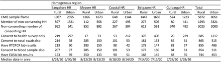
The above is the table in its glorious full size. It takes effort to read the numbers. Look at the second last line. In Bangalore Urban, the ELISA results (for antibodies) were available for only 69 people.

And if you look at the appendix, you find that 52.5% of respondents in Bangalore had antibodies to covid-19 (that is 36 people). So in late June, they surveyed 69 people and found that 36 had antibodies for covid-19. That’s it.

To their credit, they didn’t highlight this result (I sort of dug through their paper to find these numbers and call the survey into question). And they mentioned in tonight’s webinar as well that their objective was to get an idea of the prevalence in the state, and not just in one particular region (even if it be as important as Bangalore).

That said, two things that they said during the webinar in defence of the paper that I thought I should point out here.

First, Anu Acharya of MapMyGenome (also a co-author of the survey) said “people have said that a lot of people we approached refused consent to be surveyed. That’s a standard of all surveying”. That’s absolutely correct. In any random survey, you will always have an implicit bias because the sort of people who will refuse to get surveyed will show a pattern.

However, in this particular case, the point to note is the extremely high number of people who refused to be surveyed – over half the households in the panel refused to be surveyed, and in a further quarter of the panel households, the identified person refused to be surveyed (despite the family giving clearance).

One of the things with covid-19 in India is that in the early days of the pandemic, anyone found having the disease would be force-hospitalised. I had said back then (not sure where) that hospitalising asymptomatic people was similar to the “precogs” in Minority Report – you confine the people because they MIGHT INFECT OTHERS.

For this reason, people didn’t want to get tested for covid-19. If you accidentally tested positive, you would be institutionalised for a week or two (and be made to pay for it, if you demanded a private hospital). Rather, unless you had clear symptoms or were ill, you were afraid of being tested for covid-19 (whether RT-PCR or antibodies, a “representative sample” won’t understand).

However, if you had already got covid-19 and “served your sentence”, you would be far less likely to be “afraid of being tested”. This, in conjunction with the rather high proportion of the panel that refused to get tested, suggests that there was a clear bias in the sample. And since the numbers for Bangalore clearly don’t make sense, it lends credence to the sampling bias.

And sample size apart, there is nothing Bangalore-specific about this bias (apart from that in some parts of the state, the survey happened after people had sort of lost their fear of testing). This further suggests that overall state numbers are also an overestimate (which fits in with my conclusion in the previous blogpost).

The other thing that was mentioned in the webinar that sort of cracked me up was the reason why the sample size was so low in Bangalore – a lockdown got announced while the survey was on, and the sampling team fled. In today’s webinar, the paper authors went off on a rant about how surveying should be classified as an “essential activity”.

In any case, none of this matters. All that matters is that 69 is the answer.


More on Covid-19 prevalence in Karnataka

As the old song went, “when the giver gives, he tears the roof and gives”.

Last week the Government of Karnataka released its report on the covid-19 serosurvey done in the state. You might recall that it had concluded that the number of cases had been undercounted by a factor of 40, but then some things were suspect in terms of the sampling and the weighting.

This week comes another sero-survey, this time a preprint of a paper that has been submitted to a peer reviewed journal. This survey was conducted by the IDFC Institute, a think tank, and involves academics from the University of Chicago and Duke University, and relies on the extensive sampling network of CMIE.

At the broad level, this survey confirms the results of the other survey – it concludes that “Overall seroprevalence in the state implies that by August at least 31.5 million residents had been infected by August”. This is much higher than the overall conclusions of the state-sponsored survey, which had concluded that “about 19 million residents had been infected by mid-September”.

I like seeing two independent assessments of the same quantity. While each may have its own sources of error, and may not independently offer much information, comparing them can offer some really valuable insights. So what do we have here?

The IDFC-Duke-Chicago survey took place between June and August, and concluded that 31.5 million residents of Karnataka (out of a total population of about 70 million) have been infected by covid-19. The state survey in September had suggested 19 million residents had been infected by September.

Clearly, since these surveys measure the number of people “who have ever been affected”, both of them cannot be correct. If 31 million people had been affected by end August, clearly many more than 19 million should have been infected by mid-September. And vice versa. So, as Ravi Shastri would put it, “something’s got to give”. What gives?

Remember that I had thought the state survey numbers might have been an overestimate thanks to inappropriate sampling (“low risk” not being low risk enough, and not weighting samples)? If 20 million by mid-September was an overestimate, what do you say about 31 million by end August? Surely an overestimate? And that is not all.

If you go through the IDFC-Duke-Chicago paper, there are a few figures and tables that don’t make sense at all. For starters, check out this graph, that for different regions in the state, shows the “median date of sampling” and the estimates on the proportion of the population that had antibodies for covid-19.

Check out the red line on the right. The sampling for the urban areas for the Bangalore region was completed by 24th June. And the survey found that more than 50% of respondents in this region had covid-19 antibodies. On 24th June.

Let’s put that in context. As of 24th June, Bangalore Urban had 1700 confirmed cases. The city’s population is north of 10 million. I understand that 24th June was the “median date” of the survey in Bangalore city. Even if the survey took two weeks after that, as of 8th of July, Bangalore Urban had 12500 confirmed cases.

The state survey had estimated that known cases were 1 in 40. 12500 confirmed cases suggests about 500,000 actual cases. That’s 5% of Bangalore’s population, not 50% as the survey claimed. Something is really really off. Even if we use the IDFC-Duke-Chicago paper’s estimates that only 1 in 100 cases were reported / known, then 12500 known cases by 8th July translates to 1.25 million actual cases, or 12.5% of the city’s population (well below 50% ).

My biggest discomfort with the IDFC-Duke-Chicago effort is that it attempts to sample a rather rapidly changing variable over a long period of time. The survey went on from June 15th to August 29th. By June 15th, Karnataka had 7200 known cases (and 87 deaths). By August 29th the state had 327,000 known cases and 5500 deaths. I really don’t understand how the academics who ran the study could reconcile their data from the third week of June to the data from the third week of August, when the nature of the pandemic in the state was very very different.

And now, having looked at this paper, I’m more confident of the state survey’s estimations. Yes, it might have sampling issues, but compared to the IDFC-Duke-Chicago paper, the numbers make so much more sense. So yeah, maybe the factor of underestimation of Covid-19 cases in Karnataka is 40.

Putting all this together, I don’t understand one thing. What these surveys have shown is that

  1. More than half of Bangalore has already been infected by covid-19
  2. The true infection fatality rate is somewhere around 0.05% (or lower).

So why do we still have a (partial) lockdown?

PS: The other day on WhatsApp I saw this video of an extremely congested Chickpet area on the last weekend before Diwali. My initial reaction was “these people have lost their minds. Why are they all in such a crowded place?”. Now, after thinking about the surveys, my reaction is “most of these people have most definitely already got covid and recovered. So it’s not THAT crazy”.

Local time zones and function food

Last year after we got back to Bangalore from London, we started inviting people home for meals. It gave us an opportunity to socialise and rebuilt our network here. However, soon we stopped doing this – we had what I call a “time zone problem”.

In the UK, people eat early, and kids go to bed early. We liked both these aspects of the British culture and (to the extent possible) adopted them wholeheartedly. Now, back in India, we continue to follow these practices, but realise that most people around us don’t follow it. And this results in “time zone issues”.

This inevitably results in crane-fox situations when we have to go to someone’s place to eat or vice versa. We have gotten foxed several times, turning up for dinner at 630 or 7, and staying hungry till 9. We’ve tried craning several times, calling people at home for dinner at 630 or 7, and having them turn up much later in the evening.

Meeting outside in neutral places has some mitigating factors. Like 8pm drinks with friends means I finish my dinner and then go for drinks, thus maintaining my schedule. When I want to avoid drinking, the easiest thing to do is to drive to the venue (I’m paranoid about driving without full control).

The worst are religious functions. I’m pretty sure I’ve cribbed about them several time here on this blog. With very few exceptions, they invariably serve lunch or dinner late. Also that a “sacred event” is going on is reason enough for most other guests to not be bothered about the disruptions in eating schedules.

And to deal with that (apart from the fact that a large number of functions after we returned to India served pretty unspectacular food), we took inspiration from a close relative who has this policy of never eating at functions (the one time he broke this policy, two years ago, also coincided with what is easily the worst wedding food I’ve ever eaten, so it’s unlikely he’s breaking his policy again). Unless we have good reason to believe that the food at a function is going to be good (most reliable indicator being the caterer), we’ve taken to this relative’s policy.

Timing of most events in Bangalore means that we can eat our food at our normal times (lunch at noon, dinner at 6:30) and then comfortably get to the function well in time. Sometimes the host might get offended when we don’t eat, so a lighter than usual meal at home ensures that there is room for at least a dessert and a tiny course of meal.

As for the original crane-fox situation (calling people home or visiting for meals), we’ve started making adjustments. A few months after we returned, the daughter got back to her usual schedule of going to bed at 7 (unlike most children her age, she doesn’t nap in the afternoon). So dinner invites (in either direction) are out of the question. Lunch invites we manage by adjusting our breakfast times and quantities.

What’s the use of living in India if you cut yourself off from all socialising?

Covid-19 superspreaders in Karnataka

Through a combination of luck and competence, my home state of Karnataka has handled the Covid-19 crisis rather well. While the total number of cases detected in the state edged past 2000 recently, the number of locally transmitted cases detected each day has hovered in the 20-25 range.

Perhaps the low case volume means that Karnataka is able to give out data at a level that few others states in India are providing. For each case, the rationale behind why the patient was tested (which is usually the source where they caught the disease) is given. This data comes out in two daily updates through the @dhfwka twitter handle.

There was this research that came out recently that showed that the spread of covid-19 follows a classic power law, with a low value of “alpha”. Basically, most infected people don’t infect anyone else. But there are a handful of infected people who infect lots of others.

The Karnataka data, put out by @dhfwka  and meticulously collected and organised by the folks at covid19india.org (they frequently drive me mad by suddenly changing the API or moving data into a new file, but overall they’ve been doing stellar work), has sufficient information to see if this sort of power law holds.

For every patient who was tested thanks to being a contact of an already infected patient, the “notes” field of the data contains the latter patient’s ID. This way, we are able to build a sort of graph on who got the disease from whom (some people got the disease “from a containment zone”, or out of state, and they are all ignored in this analysis).

From this graph, we can approximate how many people each infected person transmitted the infection to. Here are the “top” people in Karnataka who transmitted the disease to most people.

Patient 653, a 34 year-old male from Karnataka, who got infected from patient 420, passed on the disease to 45 others. Patient 419 passed it on to 34 others. And so on.

Overall in Karnataka, based on the data from covid19india.org as of tonight, there have been 732 cases where a the source (person) of infection has been clearly identified. These 732 cases have been transmitted by 205 people. Just two of the 205 (less than 1%) are responsible for 79 people (11% of all cases where transmitter has been identified) getting infected.

The top 10 “spreaders” in Karnataka are responsible for infecting 260 people, or 36% of all cases where transmission is known. The top 20 spreaders in the state (10% of all spreaders) are responsible for 48% of all cases. The top 41 spreaders (20% of all spreaders) are responsible for 61% of all transmitted cases.

Now you might think this is not as steep as the “well-known” Pareto distribution (80-20 distribution), except that here we are only considering 20% of all “spreaders”. Our analysis ignores the 1000 odd people who were found to have the disease at least one week ago, and none of whose contacts have been found to have the disease.

I admit this graph is a little difficult to understand, but basically I’ve ordered people found for covid-19 in Karnataka by number of people they’ve passed on the infection to, and graphed how many people cumulatively they’ve infected. It is a very clear pareto curve.

The exact exponent of the power law depends on what you take as the denominator (number of people who could have infected others, having themselves been infected), but the shape of the curve is not in question.

Essentially the Karnataka validates some research that’s recently come out – most of the disease spread stems from a handful of super spreaders. A very large proportion of people who are infected don’t pass it on to any of their contacts.

Gully Cricket With A Test Cricketer

Long, long ago, I’d written a post comparing gully cricket with baseball. This was based on my experience playing cricket in school, on roads next to friends’ houses, in the gap between my house and the next, and even the gap between rows of desks in my school classroom.

I hadn’t imagined all this gully cricket experience to come in useful in any manner. Until a few weeks back when Siddhartha Vaidyanathan asked me to join him in this episode of “81 all out” podcast. The “main guest” on this show was Test cricketer Vijay Bharadwaj, whose Test debut, you might remember, ended in “83 all out“.

It was a fascinating conversation, and I loved being part of it. I realised that the sort of gully cricket I played was nothing like the sort that Vijay played. As I mention in the podcast, I “never graduated from the road to the field”.

Unfortunately I wasn’t able to put my fundaes on baseball, and other theories I’ve concocted about Gully Cricket. Nevertheless, I had fun recording this, and I think you’ll have fun listening to it as well. You can listen to it here, or on any of your usual podcast tools (search for “81 all out”).

The future of work, and cities

Ok this is the sort of speculative predictive post that I don’t usually indulge in. However, I think my blog is at the right level of obscurity that makes it conducive for making speculative predictions. It is not popular enough that enough people will remember this prediction in case this doesn’t come through. And it’s not that obscure as well – in case it does come through, I can claim credit.

So my claim is that companies whose work doesn’t involve physically making stuff haven’t explored the possibilities of remote work enough before the current (covid-19) crisis hit. With the gatherings of large people, especially in air-conditioned spaces being strongly discouraged, companies that hadn’t given remote working enough thought are being forced to consider the opportunity now.

My prediction is that once the crisis over and things go back to “normal”, there will be converts. Organisations and teams and individuals who had never before thought that working from home would have taken enough of a liking to the concept to give it a better try. Companies will become more open to remote working, having seen the benefits (or lack of costs) of it in the period of the crisis. People will commute less. They will travel less (at least for work purposes). This is going to have a major impact on the economy, and on cities.

I’m still not done with cities.

For most of history, there has always been a sort of natural upper limit to urbanisation, in the form of disease. Before germ theory became a thing, and vaccinations and cures came about for a lot of common illnesses, it was routine for epidemics to rage through cities from time to time, thus decimating their population. As a consequence, people didn’t live in cities if they could help it.

Over the last hundred years or so (after the “Spanish” flu of 1918), medicine has made sufficient progress that we haven’t seen such disease or epidemics (maybe until now). And so the network effect of cities has far outweighed the problem of living in close proximity to lots of other people.

Especially in the last 30 years or so, as “knowledge work” has formed a larger part of the economies, a disproportionate part of the economic growth (and population growth) has been in large cities. Across the world – Mumbai, Bangalore, London, the Bay Area – a large part of the growth has come in large urban agglomerations.

One impact of this has been a rapid rise in property prices in such cities – it is in the same period that these cities have become virtually unaffordable for the young to buy houses in. The existing large size and rapid growth contribute to this.

Now that we have a scary epidemic around us, which is likely to spread far more in dense urban agglomerations, I imagine people at the margin to reconsider their decisions to live in large cities. If they can help it, they might try to move to smaller towns or suburbs. And the rise of remote work will aid this – if you hardly go to office and it doesn’t really matter where you live, do you want to live in a crowded city with a high chance of being hit by a stray virus?

This won’t be a drastic movement, but I see a marginal redistribution of population in the next decade away from the largest cities, and in favour of smaller towns and cities.It won’t be large, but significant enough to have an impact on property prices. The bull run we’ve seen in property prices, especially in large and fast-growing cities, is likely to see some corrections. Property holders in smaller cities that aren’t too unpleasant to live in can expect some appreciation.

Oh, and speaking of remote work, I have an article in today’s Times Of India about the joys of working from home. It’s not yet available online, so I’ve attached a clipping.

Schelling segregation on High Streets

We’ve spoken about Thomas Schelling’s segregation model here before. The basic idea is this – people move houses if not enough people like them live around them. A simple rule is – if at least 3 of your 8 neighbours around you aren’t like you, you move.

And Schelling’s insight was that even such a simple rule – that you only need more than a third of neighbours like yourself  to stay in your place, when applied system wide, can quickly result in near-complete segregation.

I had done a quick simulation of Schelling’s model a few years back, and here is a picture from that

Of late I’ve started noticing this in retail as well. The operative phrase in the previous sentence is “I’ve started noticing”, for I think there is nothing new about this phenomenon.

Essentially retail outlets want to be located close to other stores that belong to the same category, or at least the same segment. One piece of rationale here is spillovers – someone who comes to a Louis Philippe store, upon not finding what they want, might want to hop over to the Arrow store next door. And then to the Woodland store across the road to buy shoes. And so on.

When a store is located with stores selling stuff targeted at a disjoint market, this spillover is lost.

And then there is the branding issue. A store that is located along with more downmarket stores risks losing its own brand value. This is one reason you see, across time, malls becoming segmented by the kind of stores they have.

A year and half back, I’d written about how the Jayanagar Shopping Complex “died”, thanks to non-increase of rents which resulted in cheap shops taking over, resulting in all the nicer shops moving out. In that I’d written:

On the other hand, the area immediately around the now-dying shopping complex has emerged as a brilliant retail destination.

And now I see this Schelling-ian game playing out in the area around the Jayanagar Shopping Complex. This is especially visible on two roads that attract a lot of shoppers – 11th main and 30th cross (which intersect at the Cool Joint junction).

These are two roads that have historically had a lot of good branded stores, but the way they’ve developed in the last year or so is interesting.

I don’t know if it has to do with drainage works that have been taking forever, but 32nd Cross seems to be moving more and more downmarket. A Woodland’s shoe store moved out. As did a Peter England store. Shree Sagar, which once served excellent chaats, now looks desolate.

The road has instead been taken over by stores selling “export reject garments” and knock down brands. And as I’ve observed over the last few months, these kind of shops continue take over more and more of the retail space on that road. In that sense, it is surprising that a new Jockey store took over three floors of a building on that road – seems completely out of character there. I expect it to move in short order.

I must mention here that over the last few years, the supply of retail space in Jayanagar has exploded, and that has automatically meant that all kinds of brands have space to operate there. It was only natural that a process takes place where certain roads become more upmarket than others.

Nevertheless, the way 30th cross (between 10th and 11th mains) and 10th main have visibly evolved over the last year or so is rather interesting.

Trip To Indiranagar

The first time I recall going to Indiranagar was in 1992, when we purchased a used car from someone who used to live there. While walking from the nearest bus stop to the house of the previous owner of our car, we had taken a longish route, as my parents admired all the “beautiful houses” in the area.

Six years later I went to school in that part of town. The “beautiful houses” were still there, and I used to walk past them on my way to school from the bus stop every morning. While I found the culture of the place to be quite different from that of Jayanagar (where I lived), I found the part of town to be nice, and liked going there (though not necessarily for school).

And it was another 6-year gap after school before I resumed my visits to Indiranagar. This time round, it wasn’t as regular as going to school, and most of the time the agenda was eating. Indiranagar by the mid 2000s had a lot of wonderful restaurants serving a nice variety of cuisines. Some of these restaurants were also rather fancy, and so when I met up with college friends living in Bangalore from time to time, it was usually in one place of another in Indiranagar. I continued to find the place nice.

Marriage and child and change in profession have all meant that visits to Indiranagar have become less frequent, and most of them nowadays are work-related. I spend time in coffee shops there. I take the metro to go there. I occasionally walk around a bit from meeting to meeting, but don’t notice the surroundings around. Some eateries there continue to be nice, though there are a lot more of them nowadays than before.

Something snapped today when we went there for lunch.

Lunch was at “Burma Burma” which the wife had rather hyped up over the years, and where it is reportedly incredibly hard to find a table. The drive to there was smooth, the car was handed over to the valet, and off we went inside to our table. The service was excellent, but the food was so-so. I’ve never eaten burmese food in my life so I don’t know if Burmese food is supposed to taste that way, but it tasted extremely Indian. Moreover the food was “low density” – I ate until my stomach was full but still didn’t feel like I’d gotten sufficient energy.

It was after the meal that I realised how much Indiranagar has changed, and not for the better. Immediately after we got out of the restaurant, I ran after the valet to tell him to leave my car where it was (on a side road) since I had “other business on the road”.

I wanted to check out the newly opened Blue Tokai Coffee Shop, also on 12th main. The walk to get there was horrendous. It was only 200 metres from Burma Burma (made a bit longer by our walking for a bit in the wrong direction), but it was impossible to walk anywhere but in the middle of the road. Footpaths were fully occupied by trees, dug up drains and parked vehicles. And there was a continuous line of parked vehicles right next to the footpath.

It was as if the 12th Main (the same road on which I would walk to school) area has been redesigned such that you drive from shop to shop, giving your car to valets who will then proceed to park it in some side road.

Oh, and Blue Tokai is a non-starter. It’s a small space on the first floor with acoustics so bad that one loud group in the place can render the whole place unbearable. It didn’t help that they took forever to take our order, and we decided to decamp to the (tried and trusted, for me) Third Wave Coffee Roasters on CMH Road.

And that meant another walk, though we eschewed 12th main this time, and then a short drive. Both of us noticed that the roads of Indiranagar seemed narrower than what we remembered – maybe the multitude of restaurants there means valets keep parking all through the inside roads, and double parked roads can be narrow indeed. And the area around CMH where Third Wave is located isn’t particularly nice either.

It seems to me that Indiranagar is not posh any more. In a way it was so posh at one point in time that everyone sought to set up shop there, and all the shops meant that the area has lost its character. The “beautiful houses” are being torn down one by one, replaced by commercial buildings full of restaurants, cars parked by whose valets will flood more and more of the inner roads, and make the entire area unwalkable.

I’m pretty sure most of the posh people in the area have left, having sold their houses into the real estate boom. I just wonder where they have moved to!

PS: The coffee at Third Wave was incredibly bad as well. It’s not usually so – I keep saying that they’re the best coffee shop in Bangalore. The milk today was scalding hot, and the barista poured so much of it in our cups, and without any of the finesse you associate with flat white, that it was completely tasteless.


Bangalore names are getting shorter

The Bangalore Names Dataset, derived from the Bangalore Voter Rolls (cleaned version here), validates a hypothesis that a lot of people had – that given names in Bangalore are becoming shorter. From an average of 9 letters in the name for a male aged around 80, the length of the name comes down to 6.5 letters for a 20 year old male. 

What is interesting from the graph (click through for a larger version) is the difference in lengths of male and female names – notice the crossover around the age 25 or so. At some point in time, men’s names continue to become shorter while women’s names’ lengths stagnate.

So how are names becoming shorter? For one, honorific endings such as -appa, -amma, -anna, -aiah and -akka are becoming increasingly less common. Someone named “Krishnappa” (the most common name with the ‘appa’ suffix) in Bangalore is on average 56 years old, while someone named Krishna (the same name without the suffix) is on average only 44 years old. Similarly, the average age of people named Lakshmamma is 55, while that of everyone named Lakshmi is just 40.  while the average Lakshmi (same name no suffix) is just 40.

In fact, if we look at the top 12 male and female names with a honorific ending, the average age of the version without the ending is lower than that of the version with the ending. I’ve even graphed some of the distributions to illustrate this.

  In each case, the red line shows the distribution of the longer version of the name, and the blue line the distribution of the shorter version

In one of the posts yesterday, we looked at the most typical names by age in Bangalore. What happens when we flip the question? Can we define what are the “oldest” and “youngest” names? Can we define these based on the average age of people who hold that name? In order to rule out fads, let’s stick to names that are held by at least 10000 people each.

These graphs are candidates for my own Bad Visualisations Tumblr, but I couldn’t think of a better way to represent the data. These graphs show the most popular male and female names, with the average age of a voter with that given name on the X axis, and the number of voters with that name on the Y axis. The information is all in the X axis – the Y axis is there just so that names don’t overlap.

So Karthik is among the youngest names among men, with an average age among voters being about 28 (remember this is not the average age of all Karthiks in Bangalore – those aged below 18 or otherwise not eligible to vote have been excluded). On the women’s side, Divya, Pavithra and Ramya are among the “youngest names”.

At the other end, you can see all the -appas and -ammas. The “oldest male name” is Krishnappa, with an average age 56. And then you have Krishnamurthy and Narayana, which don’t have the -appa suffix but represent an old population anyway (the other -appa names just don’t clear the 10000 people cutoff).

More women’s names with the -amma suffix clear the 10000 names cutoff, and we can see that pretty much all women’s names with an average age of 50 and above have that suffix. And the “oldest female name”, subject to 10000 people having that name, is Muniyamma. And then you have Sarojamma and Jayamma and Lakshmamma. And a lot of other ammas.

What will be the oldest and youngest names we relax the popularity cutoff, and instead look at names with at least 1000 people? The five youngest names are Dhanush, Prajwal, Harshitha, Tejas and Rakshitha, all with an average age (among voters) less than 24. The five oldest names are Papamma, Kannamma, Munivenkatappa, Seethamma and Ramaiah.

This should give another indication of where names are headed in Bangalore!

Smashing the Law of Conservation of H

A decade and half ago, Ravikiran Rao came up with what he called the “law of conservation of H“. The concept has to do with the South Indian practice of adding a “H” to denote a soft consonant, a practice not shared by North Indians (Karthik instead of Kartik for example). This practice, Ravikiran claims, is balanced by the “South Indian” practice of using “S” instead of “Sh”, because of which the number of Hs in a name is conserved.

Ravikiran writes:

The Law of conservation of H states that the total number of H’s in the universe will be conserved. So the extra H’s that are added when Southies have to write names like Sunitha and Savitha are taken from the words Sasi and Sri Sri Ravisankar, thus maintaining a balance in the language.

Using data from the Bangalore first names data set (warning: very large file), it is clear that this theory doesn’t hold water, in Bangalore at least. For what the data shows is that not only do Bangaloreans love the “th” and “dh” for the soft T and D, they also use “sh” to mean “sh” rather than use “s” instead.

The most commonly cited examples of LoCoH are Swetha/Shweta and Sruthi/Shruti. In both cases, the former is the supposed “South Indian” spelling (with th for the soft T, and S instead of sh), while the latter is the “North Indian” spelling. As it turns out, in Bangalore, both these combinations are rather unpopular. Instead, it seems like if Bangaloreans can add a H to their name, they do. This table shows the number of people in Bangalore with different spellings for Shwetha and Shruthi (now I’m using the dominant Bangalorean spellings).

As you can see, Shwetha and Shruthi are miles ahead of any of the alternate ways in which the names can be spelt. And this heavy usage of H can be attributed to the way Kannada incorporates both Sanskrit and Dravidian history.

Kannada has a pretty large vocabulary of consonants. Every consonant has both the aspirated and unaspirated version, and voiced and unvoiced. There are three different S sounds (compared to Tamil which has none) and two Ls. And we need a way to transliterate each of them when writing in English. And while capitalising letters in the middle of a word (as per Harvard Kyoto convention) is not common practice, standard transliteration tries to differentiate as much as possible.

And so, since aspirated Tha and Dha aren’t that common in Kannada (except in the “Tha-Tha” symbols used by non-Kannadigas to show raised eyes), th and dh are used for the dental letters. And since Sh exists (and in two forms), there is no reason to substitute it with S (unlike Tamil). And so we have H everywhere.

Now, lest you were to think that I’m using just two names (Shwetha and Shruthi) to make my point, I dug through the names dataset to see how often names with interchangeable T and Th, and names with interchangeable S and Sh, appear in the Bangalore dataset. Here is a sample of both:

There are 13002 Karthiks registered to vote in Bangalore, but only 213 Kartiks. There are a hundred times as many Lathas as Latas. Shobha is far more common than Sobha, and Chandrashekhar much more common than Chandrasekhar.


So while other South Indians might conserve H, by not using them with S to compensate for using it with T and D, it doesn’t apply to Bangalore. Thinking about it, I wonder how a Kannadiga (Ravikiran) came up with this theory. Perhaps the fact that he has never lived in Karnataka explains it.