Periodicals and Dashboards

The purpose of a dashboard is to give you a live view of what is happening with the system. Take for example the instrument it is named after – the car dashboard. It tells you at the moment what the speed of the car is, along with other indicators such as which lights are on, the engine temperature, fuel levels, etc.

Not all reports, however, need to be dashboards. Some reports can be periodicals. These periodicals don’t tell you what’s happening at a moment, but give you a view of what happened in or at the end of a certain period. Think, for example, of classic periodicals such as newspapers or magazines, in contrast to online newspapers or magazines.

Periodicals tell you the state of a system at a certain point in time, and also give information of what happened to the system in the preceding time. So the financial daily, for example, tells you what the stock market closed at the previous day, and how the market had moved in the preceding day, month, year, etc.

Doing away with metaphors, business reporting can be classified into periodicals and dashboards. And they work exactly like their metaphorical counterparts. Periodical reports are produced periodically and tell you what happened in a certain period or point of time in the past. A good example are company financials – they produce an income statement and balance sheet to respectively describe what happened in a period and at a point in time for the company.

Once a periodical is produced, it is frozen in time for posterity. Another edition will be produced at the end of the next period, but it is a new edition. It adds to the earlier periodical rather than replacing it. Periodicals thus have historical value and because they are preserved they need to be designed more carefully.

Dashboards on the other hand are fleeting, and not usually preserved for posterity. They are on the other hand overwritten. So whether all systems are up this minute doesn’t matter a minute later if you haven’t reacted to the report this minute, and thus ceases to be of importance the next minute (of course there might be some aspects that might be important at the later date, and they will be captured in the next periodical).

When we are designing business reports and other “business intelligence systems” we need to be cognisant of whether we are producing a dashboard or a periodical. The fashion nowadays is to produce everything as a dashboard, perhaps because there are popular dashboarding tools available.

However, dashboards are expensive. For one, they need a constant connection to be maintained to the “system” (database or data warehouse or data lake or whatever other storage unit in the business report sense). Also, by definition they are not stored, and if you need to store then you have to decide upon a frequency of storage which makes it a periodical anyway.

So companies can save significantly on resources (compute and storage) by switching from dashboards (which everyone seems to think in terms of) to periodicals. The key here is to get the frequency of the periodical right – too frequent and people will get bugged. Not frequent enough, and people will get bugged again due to lack of information. Given the tools and technologies at hand, we can even make reports “on demand” (for stuff not used by too many people).
Vlogging!

The first seed was sown in my head by Harish “the Psycho” J, who told me a few months back that nobody reads blogs any more, and I should start making “analytics videos” to increase my reach and hopefully hit a new kind of audience with my work.

While the idea was great, I wasn’t sure for a long time what videos I could make. After all, I’m not the most technical guy around, and I had no patience for making videos on “how to use regression” and stuff like that. I needed a topic that would be both potentially catchy and something where I could add value. So the idea remained an idea.

For the last four or five years, my most common lunchtime activity has been to watch chess videos. I subscribe to the Youtube channels of Daniel King and Agadmator, and most days when I eat lunch alone at home are spent watching their analyses of games. Usually this routine gets disrupted on Fridays when the wife works from home (she positively hates these videos), but one Friday a couple of months back I decided to ignore her anyway and watch the videos (she was in her room working).

She had come out to serve herself to another serving of whatever she had made that day and saw me watching the videos. And suddenly asked me why I couldn’t make such videos as well. She has seen me work over the last seven years to build what I think is a fairly cool cricket visualisation, and said that I should use it to make little videos analysing cricket matches.

And since then my constant “background process” has been to prepare for these videos. Earlier, Stephen Rushe of Cricsheet used to unfailingly upload ball by ball data of all cricket matches as soon as they were done. However, two years back he went into “maintenance mode” and has stopped updating the data. And so I needed a method to get data as well.

Here, I must acknowledge the contributions of Joe Harris of White Ball Analytics, who not only showed me the APIs to get ball by ball data of cricket matches, but also gave very helpful inputs on how to make the visualisation more intuitive, and palatable to the normal cricket fan who hasn’t seen such a thing before. Joe has his own win probability model based on ball by ball data, which I think is possibly superior to mine in a lot of scenarios (my model does badly in high-scoring run chases), though I’ve continued to use my own model.

So finally the data is ready, and I have a much improved visualisation to what I had during the IPL last year, and I’ve created what I think is a nice app using the Shiny package that you can check out for yourself here. This covers all T20 international games, and you can use the app to see the “story of each game”.

And this is where the vlogging comes in – in order to explain how the model works and how to use it, I’ve created a short video. You can watch it here:

While I still have a long way to go in terms of my delivery, you can see that the video has come out rather well. There are no sync issues, and you see my face also in one corner. This was possible due to my school friend Sunil Kowlgi‘s Outklip app. It’s a pretty easy to use Chrome app, and the videos are immediately available on the platform. There is quick YouTube integration as well, for you to upload them.

And this is not a one time effort – going forward I’ll be making videos of limited overs games analysing them using my app, and posting them on my Youtube channel (or maybe I’ll make a new channel for these videos. I’ll keep you updated). I hope to become a regular Vlogger!

So in the meantime, watch the above video. And give my app a spin. Soon I’ll be releasing versions covering One Day Internationals and franchise T20s as well.


Programming Languages

I take this opportunity to apologise for my prior belief that all that matters is thinking algorithmically, and language in which the ideas are expressed doesn’t matter.

About a decade ago, I used to make fun of information technology company that hired developers based on the language they coded in. My contention was that writing code is a skill that you either have or you don’t, and what a potential employer needs to look for is the ability to think algorithmically, and then render ideas in code. 

While I’ve never worked as a software engineer I find myself writing more and more code over the years as a part of doing data analysis. The primary tool I use is R, where coding doesn’t really feel like coding, since it is a rather high level language. However, I’m occasionally asked to show code in Python, since some clients are more proficient in that, and the one thing that has done is to teach me the value of domain knowledge of a programming language. 

I take this opportunity to apologise for my prior belief that all that matters is thinking algorithmically, and language in which the ideas are expressed doesn’t matter. 

This is because the language you usually program in subtly nudges you towards thinking in a particular way. Having mostly used R over the last decade, I think in terms of tables and data frames, and after having learnt tidyverse earlier this year, my way of thinking algorithmically has become in a weird way “object oriented” (no, this has nothing to do with classes). I take an “object” (a data frame) and then manipulate it in various ways, changing it, summarising stuff, calculating things on the fly and aggregating, until the point where the result comes out in an elegant manner. 

And while Pandas allows chaining (in fact, it is from Pandas that I suspect the tidyverse guys got the idea for the “%>%” chaining operator), it is by no means as complete in its treatment of chaining as R, and that that makes things tricky. 

Moreover, being proficient in R makes you think in terms of vectorised operations, and when you see that python doesn’t necessarily offer that, and and operations that were once simple in R are now rather complicated in Python, using list comprehension and what not. 

Putting it another way, thinking algorithmically in the framework offered by one programming language makes it rather stressful to express these thoughts in another language where the way of algorithmic thinking is rather different. 

For example, I’ve never got the point of the index in pandas dataframes, and I only find myself “resetting” it constantly so that my way of addressing isn’t mangled. Compared to the intuitive syntax in R, which is first and foremost a data analysis tool, and where the data frame is “native”, the programming language approach of python with its locs and ilocs is again irritating. 

I can go on… 

And I’m guessing this feeling is mutual – someone used to doing things the python way would find R’s syntax and way of doing things rather irritating. R’s machine learning toolkit for example is nowhere as easy as scikit learn is in python (this doesn’t affect me since I seldom need to use machine learning. For example, I use regression less than 5% of the time in my work). 

The next time I see a job opening for a “java developer” I will not laugh like I used to ten years ago. I know that this posting is looking for a developer who can not only think algorithmically, but also algorithmically in the way that is most convenient to express in Java. And unlearning one way of algorithmic thinking and learning another isn’t particularly easy. 

Analytics for general managers

While good managers have always been required to be analytical, the level of analytical ability being asked of managers has been going up over the years, with the increase in availability of data.

Now, this post is once again based on that one single and familiar data point – my wife. In fact, if you want me to include more data in my posts, you should talk to me more.

Leaving that aside, my wife works as a mid-level manager for an extremely large global firm. She was recruited straight out of business school for a “MBA track” program. And from our discussions about her work in the first few months, one thing she did lots of was writing SQL queries. And she still spends a lot of her time writing queries and building Excel models.

This isn’t something she was trained for, or was tested on while being recruited. She did her MBA in a famously diverse global business school, the diversity of its student bodies implying the level of maths and quantitative methods being kept rather low. She was recruited as a “general manager”. Yet, in a famously data-driven company, she spends a considerable amount of time on quantitative stuff.

It wasn’t always like this. While analytical ability has what (in my opinion) set apart graduates of elite MBA programs from those of middling MBA programs, the level of quantitative ability expected out of MBAs (apart from maybe those in finance) wasn’t too high. You were expected to know to use spreadsheets. You were expected to know some rudimentary statistics- means and standard deviations and some basic hypothesis testing, maybe. And you were expected to be able to make managerial decisions based on numbers. That’s about it.

Over the years, though, as the corpus of data within (and outside) organisations has grown, and making decisions based on data has become fashionable (a brilliant thing as far as I’m concerned), the requirement from managers has grown as well. Now they are expected to do more with data, and aren’t always trained for that.

Some organisations have responded to this problem by supplying “data analysts” who are attached to mid level managers, so that the latter can outsource the analytical work to the former and spend most of their time on “managerial” stuff. The problem with this is twofold – it is hard to guarantee a good career path to this data analyst (which makes recruitment hard), and this introduces “friction” – the manager needs to tell the analyst what precise data and analysis she needs, and iterating on this can lead to a lot of time lost.

Moreover, as the size of the data has grown, the complexity of the analysis that can be done and the insights that can be produced has become greater as well. And in that sense, managers who have been able to adapt to the volume and complexity of data have a significant competitive advantage over their peers who are less comfortable with data.

So what does all this mean for general managers and their education? First, I would expect the smarter managers to know that data analysis ability is a competitive advantage, and so invest time in building that skill. Second, I know of some business schools that are making their MBA programs less quantitative, as their student body becomes more diverse and the recruitment body becomes less diverse (banks are recruiting far less nowadays). This is a bad move. In fact, business schools need to realise that a quantitative MBA program is more of a competitive advantage nowadays, and tune their programs accordingly, while not compromising on the diversity of the student intake.

Then, there is a generation of managers that got along quite well without getting its hands dirty with data. These managers will now get challenged by younger managers who are more conversant with data. It will be interesting to see how organisations deal with this dynamic.

Finally, organisations need to invest in training programs, to make sure that their general managers are comfortable with data, and analysis, and making use of internal and external data science resources. Interestingly enough (I promise I hadn’t thought of this when I started writing this post), my company offers precisely one such workshop. Get in touch if you’re interested!

The missing middle in data science

Over a year back, when I had just moved to London and was job-hunting, I was getting frustrated by the fact that potential employers didn’t recognise my combination of skills of wrangling data and analysing businesses. A few saw me purely as a business guy, and most saw me purely as a data guy, trying to slot me into machine learning roles I was thoroughly unsuited for.

Around this time, I happened to mention to my wife about this lack of fit, and she had then remarked that the reason companies either want pure business people or pure data people is that you can’t scale a business with people with a unique combination of skills. “There are possibly very few people with your combination of skills”, she had said, and hence companies had gotten around the problem by getting some very good business people and some very good data people, and hope that they can add value together.

More recently, I was talking to her about some of the problems that she was dealing with at work, and recognised one of them as being similar to what I had solved for a client a few years ago. I quickly took her through the fundamentals of K-means clustering, and showed her how to implement it in R (and in the process, taught her the basics of R). As it had with my client many years ago, clustering did its magic, and the results were literally there to see, the business problem solved. My wife, however, was unimpressed. “This requires too much analytical work on my part”, she said, adding that “If I have to do with this level of analytical work, I won’t have enough time to execute my managerial duties”.

This made me think about the (yet unanswered) question of who should be solving this kind of a problem – to take a business problem, recognise it can be solved using data, figuring out the right technique to apply to it, and then communicating the results in a way that the business can easily understand. And this was a one-time problem, not something you would need to solve repeatedly, and so without the requirement to set up a pipeline and data engineering and IT infrastructure around it.

I admit this is just one data point (my wife), but based on observations from elsewhere, managers are usually loathe to get their hands dirty with data, beyond perhaps doing some basic MS Excel work. Data science specialists, on the other hand, will find it hard to quickly get intuition for a one-time problem, get data in a “dirty” manner, and then apply the right technique to solving it, and communicate the results in a business-friendly manner. Moreover, data scientists are highly likely to be involved in regular repeatable activities, making it an organisational nightmare to “lease” them for such one-time efforts.

This is what I call as the “missing middle problem” in data science. Problems whose solutions will without doubt add value to the business, but which most businesses are unable to address because of a lack of adequate skillset in solving the issue; and whose one-time nature makes it difficult for businesses to dedicate permanent resources to solve.

I guess so far this post has all the makings of a sales pitch, so let me turn it into one – this is precisely the kind of problem that my company Bespoke Data Insights is geared to solving. We specialise in solving problems that lie at the cusp of business and data. We provide end-to-end quantitative solutions for typically one-time business problems.

We come in, understand your business needs, and use a hypothesis-driven approach to model the problem in data terms. We select methods that in our opinion are best suited for the precise problem, not hesitating to build our own models if necessary (hence the Bespoke in the name). And finally, we synthesise the analysis in the form of recommendations that any business person can easily digest and action on.

So – if you’re facing a business problem where you think data might help, but don’t know how to proceed; or if you are curious about all this talk about AI and ML and data science and all that, and want to include it in your business; or you want your business managers to figure out how to use the data  teams better, hire us.

Why data scientists should be comfortable with MS Excel

Most people who call themselves “data scientists” aren’t usually fond of MS Excel. It is slow and clunky, can only handle a million rows of data (and nearly crash your computer if you go anywhere close to that), and despite the best efforts of Visual Basic, is not very easy to program for doing repeatable tasks.

In fact, some data scientists may consider Excel to be “too downmarket” for them to use. At one firm I worked for, I had heard a rumour that using Excel for modelling was a fire-able offence, though I’m glad to report that I flouted this rule without much adverse effect. Yet, in my years as a “data science” and analytics consultant, and having done several modelling jobs before, I think Excel is an extremely necessary tool in a data scientist’s arsenal. There are several reasons for this.

The main one is communication. “Business types” love Excel – they use it for pretty much every official activity (I know of people who write documents in Excel). If you ask for a set of numbers, you are most likely to find it in an Excel sheet. I know of fairly large organisations which use Excel to store and transmit data (admittedly poor usage). And even non-quantitaive business types understand some of the basic quantitative functions thanks to Excel, such as joining (VLookup), pivoting, basic data cleaning (TRIM, VALUE, etc.), averaging, visualisation and sometimes even basic statistics such as correlation and regression.

One of the main problems that organisations face is lack of communication between data scientists and the business side (I mentioned this in a talk I gave last month: video here and slides here). Excel is an excellent middle ground, since it is reasonably quantitative and business people know how to use it.

In fact, in my consulting experience I’ve found that when working with clients, using Excel can make your client (usually a business person) feel more comfortable and involved in the analysis, speeding up the process and significantly improving collaboration. They’ll feel more empowered to intervene, which means they can add value, and they can feel especially happy if you occasionally let them enter some simple quantitative formulae.

The next advantage of Excel is that it puts the numbers out there. A long time back, when I was still doing full time jobs, I was asked to build a forecasting model (using a programming language) and couldn’t get it right for several months. And then on a whim I decided to use Excel, and when I saw the data in front of me, it was clear why the forecasts were so useless – because the data was so random.

Excel also allows you to quickly try things and iterate, again by putting the data and the analysis in front of you. Admittedly, the toolkit available is limited compared to what programming languages or statistical softwares can offer, but through clever usage (especially with Visual Basic), there is a lot you can achieve.

Then, Excel sometimes nudges you towards finding simple solutions. It is possible when you’re using a programming language to veer towards overly complicated solutions, and possibly use the proverbial nuclear weapon against the sparrow.

When I was working on the forecasting work a decade ago, I found that the forecasts would feed into a fairly complicated-looking model that had been developed over several years by several developers. On a whim, I decided to “do more” in Excel and managed to replicate the entire model in Excel (using VB and Solver). The people leading the product weren’t particularly happy, but using Excel was critical in ultimately moving to a simpler solution.

A similar thing occurred recently as well. I had been building a fairly complex optimisation model, which I tried replicating in Excel for communication purposes (so I could work on it together with the client). And it turned out there was a far simpler solution that I had missed all this time, and the simpler solution became apparent only because I used Excel.

I’m sure this is not an exhaustive list. So, if you’re a data scientist, you will do well to be at least conversant with Excel. I know it may only serve limited needs in terms of analysis, but the effort in learning  will get more than compensated for in the communication and collaboration and simplicity.

Tailpiece:
A long time ago, a co-worker passed by my desk and saw me work on Excel. He saw my spreadsheet and remarked, “oh, so many numbers! it must be very complicated” and went on his way. I don’t know if he is a data scientist now.

Stocks and flows

One common mistake even a lot of experienced analysts make is comparing stocks to flows. Recently, for example, Apple’s trillion dollar valuation was compared to countries’ GDP. A few years back, an article compared the quantum of bad loans in Indian banks to the country’s GDP. Following an IPL auction a few years back, a newspaper compared the salary of a player the market cap of some companies (paywalled).

The simplest way to reason why these comparisons don’t make sense is that they are comparing variables that have different dimensionality. Stock variables are usually measured in dollars (or pounds or euros or whatever), while flows are usually measured in terms of currency per unit time (dollars per year, for example).

So to take some simple examples, your salary might be $100,000 per year. The current value of your stock portfolio might be $10,246. India’s GDP is 2 trillion dollars per year.  Liverpool FC paid £67 million to buy out Alisson’s contract at AS Roma, and will pay him a salary of about £77,000 per week. Apple’s market capitalisation is 1.05 trillion dollars, and its sales as per the latest financials is 229 billion dollars per year.

Get the drift? The simplest way to avoid confusing stocks and flows is to be explicit about the dimensionality of the quantity being compared – flows have a “per unit time” suffixed to their dimensions.

Following the news of Apple’s market cap hitting a trillion dollars, I put out a tweet about the fallacy of comparing it to the GDP of the United States.

A lot of the questions that followed came from stock market analysts, who are used to looking at companies in terms of financial ratios, most of which involve both stocks and flows. They argued that because these ratios are well-established, it is legitimate to compare stocks to flows.

For example, we get the Price to Earnings ratio by dividing a company’s stock price (a stock) by the company’s annual earnings per share (a flow). The asset turnover ratio is derived by dividing the annual revenues (a flow) by the amount of assets (a stock). In fact, barring simple ratios such as gross margin, most ratios in financial analysis involve dividing a stock by a flow or the other way round.

To put it simply, financial ratios are not a case of comparing stocks to flows because ratios by themselves don’t mean a thing, and their meaning is derived from comparing them to similar ratios from other companies or geographies or other points in time.

A price to earnings ratio is simply the ratio of price per share to (annual) earnings per share, and has the dimension of “years”. When we compute the P/E ratio, we are not comparing price to earnings, since that would be nonsensical (they have different dimensions). We are dividing one by the other and comparing the ratio itself to historic or global benchmarks.

The reason a company with a P/E ratio of 25 (for example) is seen as being overvalued is because this value lies at the upper end of the distribution of historical P/E ratios. So we are comparing one ratio to the other (with both having the same dimension).

In conclusion, when you take the ratio of one quantity to another, you are just computing a new quantity – you are not comparing the numerator to the denominator. And when you compare quantities, always make sure that you are being dimensionally consistent.


Stirring the pile efficiently

Warning: This is a technical post, and involves some code, etc. 

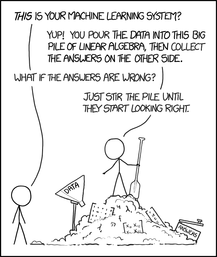
As I’ve ranted a fair bit on this blog over the last year, a lot of “machine learning” in the industry can be described as “stirring the pile”. Regular readers of this blog will be familiar with this image from XKCD by now:

Source: https://xkcd.com/1838/

Basically people simply take datasets and apply all the machine learning techniques they have heard of (implementation is damn easy – scikit learn allows you to implement just about any model in three similar looking lines of code; See my code here to see how similar the implementation is).

So I thought I’ll help these pile-stirrers by giving some hints of what method to use for different kinds of data. I’ve over-simplified stuff, and so assume that:

  1. There are two predictor variables X and Y. The predicted variable “Z” is binary.
  2. X and Y are each drawn from a standard normal distribution.
  3. The predicted variable Z is “clean” – there is a region in the X-Y plane where Z is always “true” and another region where Z is always “false”
  4. So the idea is to see which machine learning techniques are good at identifying which kind of geometrical figures.
  5. Everything is done “in-sample”. Given the nature of the data, it doesn’t matter if we do it in-sample or out-of-sample.

For those that understand Python (and every pile-stirrer worth his salt is excellent at Python), I’ve put my code in a nice Jupyter Notebook, which can be found here.

So this is what the output looks like. The top row shows the “true values” of Z. Then we have a row for each of the techniques we’ve used, which shows how well these techniques can identify the pattern given in the top row (click on the image for full size).

As you can see, I’ve chosen some common geometrical shapes and seen which methods are good at identifying those. A few pertinent observations:

  1. Logistic regression and linear SVM are broadly similar, and both are shit for this kind of dataset. Being linear models, they fail to deal with non-linear patterns
  2. SVM with RBF kernel is better, but it fails when there are multiple “true regions” in the dataset. At least it’s good at figuring out some non-linear patterns. However, it can’t figure out the triangle or square – it draws curves around them, instead.
  3. Naive Bayesian (I’ve never understood this even though I’m pretty good at Bayesian statistics, but I understand this is a commonly used technique; and I’ve used default parameters so not sure how it is “Bayesian” even) can identify some stuff but does badly when there are disjoint regions where Z is true.
  4. Ensemble methods such as Random Forests and Gradient Boosting do rather well on all the given inputs. They do well for both polygons and curves. Elsewhere, Ada Boost mostly does well but trips up on the hyperbola.
  5. For some reason, Lasso fails to give an output (in the true spirit of pile-stirring, I didn’t explore why). Ridge is again a regression method and so does badly on this non-linear dataset
  6. Neural Networks (Multi Layer Perceptron to be precise) does reasonably well, but can’t figure out the sharp edges of the polygons.
  7. Decision trees again do rather well. I’m pleasantly surprised that they pick up and classify the disjoint sets (multi-circle and hyperbola) correctly. Maybe it’s the way scikit learn implements them?

Of course, the datasets that one comes across in real life are never such simple geometrical figures, but I hope that this set can give you some idea on what techniques to use where.

At least I hope that this makes you think about the suitability of different techniques for the data rather than simply applying all the techniques you know and then picking the one that performs best on your given training and test data.

That would count as nothing different from p-hacking, and there’s an XKCD for that as well!

Source: https://xkcd.com/882/

Duckworth Lewis Book

Yesterday at the local council library, I came across this book called “Duckworth Lewis” written by Frank Duckworth and Tony Lewis (who “invented” the eponymous rain rule). While I’d never heard about the book, given my general interest in sports analytics I picked it up, and duly finished reading it by this morning.

The good thing about the book is that though it’s in some way a collective autobiography of Duckworth and Lewis, they restrict their usual life details to a minimum, and mostly focus on what they are famous for. There are occasions when they go into too much detail describing a trip to either Australia or the West Indies, but it’s easy to filter out such stuff and read the book for the rain rule.

Then again, it isn’t a great book. If you’re not interested in cricket analytics there isn’t that much for you to know from the book. But given that it’s a quick read, it doesn’t hurt so much! Anyway, here are some pertinent observations:

  1. Duckworth and Lewis didn’t get paid much for their method. They managed to get the ICC to accept their method sometime in the mid 90s, but it wasn’t until the early 2000s, by when Lewis had become a business school professor, that they managed to strike a financial deal with ICC. Even when they did, they make it sound like they didn’t make much money off it.
  2. The method came about when Duckworth quickly put together something for a statistics conference he was organising, where another speaker who was supposed to speak about cricket pulled out at the last minute. Lewis later came across the paper, and then got one of his undergrad students to do a project about it. The two men subsequently collaborated
  3. It’s amazing (not in a positive way) the kind of data that went into the method. Until the early 2000s, the only dataset that was used to calibrate the method was what was put together by Lewis’s undergrad. And this was mostly English County games, played over 40, 55 and 60 overs. Even after that, the frequency of updation with new data (which reflects new playing styles and strategies) is rather low.
  4. The system doesn’t seem to have been particularly well software engineered – it was initially simply coded up by Duckworth, and until as late as 2007 it ran on the DOS operating system. It was only in 2008 or so, when Steven Stern joined the team (now the method is called DLS to include his name), that a windows version was introduced.
  5. There is very little discussion of alternate methods, and though there is a chapter about it, Duckworth and Lewis are rather dismissive about them. For example, another popular method is by this guy called V Jayadevan from Thrissur. Here is some excellent analysis by Srinivas Bhogle where he compares the two methods. Duckworth and Lewis spend a couple of pages listing a couple of scenarios where Jayadevan’s method doesn’t work, and then spends a paragraph disparaging Bhogle for his support of the VJD method.
  6. This was the biggest takeaway from the book for me – the Duckworth Lewis method doesn’t equalise probabilities of victory of the two teams before and after the rain interruption. Instead, the method equalises the margin of victory between the teams before and after the break. So let’s say a team was 10 runs behind the DL “par score” when it rains. When the game restarts, the target is set such that the team is still 10 runs behind the par score! They make an attempt to explain why this is superior to equalising probabilities of winning  but don’t go too far with it.
  7. The adoption of Duckworth Lewis seems like a fairly random event. Following the World Cup 1992 debacle (when South Africa’s target went from 22 off 13 to 22 off 1 ball after a rain break), there was a demand for new rain rules. Duckworth and Lewis somehow managed to explain their method to the ECB secretary. And since it was superior to everything that was there then, it simply got adopted. And then it became incumbent, and became hard to dislodge!
  8. There is no mention in the book about the inherent unfairness of the DL method (in that it can be unfair to some playing styles).

Ok this is already turning out to be a long post, but one final takeaway is that there’s a fair amount of randomness in sports analytics, and you shouldn’t get into it if your only potential customer is a national sporting body. In that sense, developments such as the IPL are good for sports analytics!

The (missing) Desk Quants of Main Street

A long time ago, I’d written about my experience as a Quant at an investment bank, and about how banks like mine were sitting on a pile of risk that could blow up any time soon.

There were two problems as I had documented then. Firstly, most quants I interacted with seemed to be solving maths problems rather than finance problems, not bothering if their models would stand the test of markets. Secondly, there was an element of groupthink, as quant teams were largely homogeneous and it was hard to progress while holding contrarian views.

Six years on, there has been no blowup, and in some sense banks are actually doing well (I mean, they’ve declined compared to the time just before the 2008 financial crisis but haven’t done that badly). There have been no real quant disasters (yes I know the Gaussian Copula gained infamy during the 2008 crisis, but I’m talking about a period after that crisis).

There can be many explanations regarding how banks have not had any quant blow-ups despite quants solving for math problems and all thinking alike, but the one I’m partial to is the presence of a “middle layer”.

Most of the quants I interacted with were “core” in the sense that they were not attached to any sales or trading desks. Banks also typically had a large cadre of “desk quants” who are directly associated with trading teams, and who build models and help with day-to-day risk management, pricing, etc.

Since these desk quants work closely with the business, they turn out to be much more pragmatic than the core quants – they have a good understanding of the market and use the models more as guiding principles than as rules. On the other hand, they bring the benefits of quantitative models (and work of the core quants) into day-to-day business.

Back during the financial crisis, I’d jokingly predicted that other industries should hire quants who were now surplus to Wall Street. Around the same time, DJ Patil et al came up with the concept of the “data scientist” and called it the “sexiest job of the 21st century”.

And so other industries started getting their own share of quants, or “data scientists” as they were now called. Nowadays its fashionable even for small companies for whom data is not critical for business to have a data science team. Being in this profession now (I loathe calling myself a “data scientist” – prefer to say “quant” or “analytics”), I’ve come across quite a few of those.

The problem I see with “data science” on “Main Street” (this phrase gained currency during the financial crisis as the opposite of Wall Street, in that it referred to “normal” businesses) is that it lacks the cadre of desk quants. Most data scientists are highly technical people who don’t necessarily have an understanding of the business they operate in.

Thanks to that, what I’ve noticed is that in most cases there is a chasm between the data scientists and the business, since they are unable to talk in a common language. As I’m prone to saying, this can go two ways – the business guys can either assume that the data science guys are geniuses and take their word for the gospel, or the business guys can totally disregard the data scientists as people who do some esoteric math and don’t really understand the world. In either case, value added is suboptimal.

It is not hard to understand why “Main Street” doesn’t have a cadre of desk quants – it’s because of the way the data science industry has evolved. Quant at investment banks has evolved over a long period of time – the Black-Scholes equation was proposed in the early 1970s. So the quants were first recruited to directly work with the traders, and core quants (at the banks that have them) were a later addition when banks realised that some quant functions could be centralised.

On the other hand, the whole “data science” growth has been rather sudden. The volume of data, cheap incrementally available cloud storage, easy processing and the popularity of the phrase “data science” have all increased well-at-a-faster rate in the last decade or so, and so companies have scrambled to set up data teams. There has simply been no time to train people who get both the business and data – and the data scientists exist like addendums that are either worshipped or ignored.