Levels and shifts in analysing games

So Nitin Pai and Pranay Kotasthane have a great graphic on how India should react to China’s aggressions on Doka La. While the analysis is excellent, my discomfort is with the choice of “deltas” as the axes of this payoff diagram, rather than levels.

Source: Nitin Pai and Pranay Kotasthane

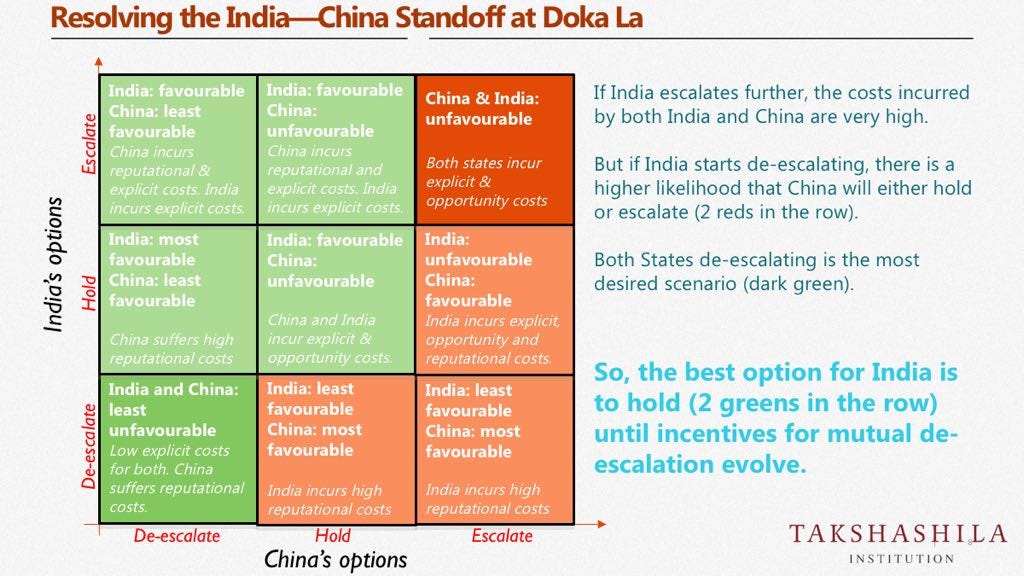
Instead, what might have been preferable would have been to define each countries strategies in terms of levels of aggressions, define their current levels of aggression, and evaluate the two countries’ strategies in terms of moving to each possible alternate level. Here is why.

The problem with using shifts (or “deltas” or “slopes” or whatever you call the movement between levels) is that they are not consistent. Putting it mathematically, the tangent doesn’t measure the rate of change in a curve when you go far away from the point where you’ve calibrated the tangent.

To illustrate, let’s use this diagram itself. The strategy is that India should “hold”. From the diagram, if India holds, China’s best option is to escalate. In the next iteration, India continues to hold, and China continues to escalate. After a few such steps, surely we will be far away enough from the current equilibrium that the payoff for changing stance is very different from what is represented by this diagram?

This graph is perhaps valid for the current situation where (say) India’s aggression level is at 2 on a 1–5 integer scale, while China is at 3. But will the payoffs of going up and down by a notch be the same if India is still at 2 and China has reached the maximum pre-war aggression of 5 (remember that both are nuclear powers)?

On the flip side, the good thing about using payoffs based on changes in level is that it keeps the payoff diagram small, and this is especially useful when the levels cannot be easily discretised or there are too many possible levels. Think of a 5×5 square graph, or even a 10×10, in place of the 3×3, for example?—?soon it can get rather unwieldy. That is possibly what led Nitin and Pranay to choose the delta graph.

Mirrored here.

When a two-by-two ruins a scatterplot

The BBC has some very good analysis of the Brexit vote (how long back was that?), using voting data at the local authority level, and correlating it with factors such as ethnicity and educational attainment.

In terms of educational attainment, there is a really nice chart, that shows the proportion of voters who voted to leave against the proportion of population in the ward with at least a bachelor’s degree. One look at the graph tells you that the correlation is rather strong:

‘Source: http://www.bbc.com/news/uk-politics-38762034And then there is the two-by-two that is superimposed on this – with regions being marked off in pink and grey. The idea of the two-by-two must have been to illustrate the correlation – to show that education is negatively correlated with the “leave” vote.

But what do we see here? A majority of the points lie in the bottom left pink region, suggesting that wards with lower proportion of graduates were less likely to leave. And this is entirely the wrong message for the graph to send.

The two-by-two would have been useful had the points in the graph been neatly divided into clusters that could be arranged in a grid. Here, though, what the scatter plot shows is a nice negatively correlated linear relationship. And by putting those pink and grey boxes, the illustration is taking attention away from that relationship.

Instead, I’d simply put the scatter plot as it is, and maybe add the line of best fit, to emphasise the negative correlation. If I want to be extra geeky, I might also write down the R^2 next to the line, to show the extent of correlation!


The Art of Drawing Spectacular Graphs

Bloomberg Business has a feature on the decline of the Euro after the Greek “No” vote last night. As you might expect, the feature is accompanied by a graphic which shows a “precipitous fall” in the European currency.

I’m in two minds of whether to screenshot the graphic (so that any further changes are not reflected), or to not plagiarise by simply putting a link (but exposing this post to the risk of becoming moot, if Bloomberg changes its graphs later on. It seems like the graphic on the site is a PNG, so let me go ahead and link to it:

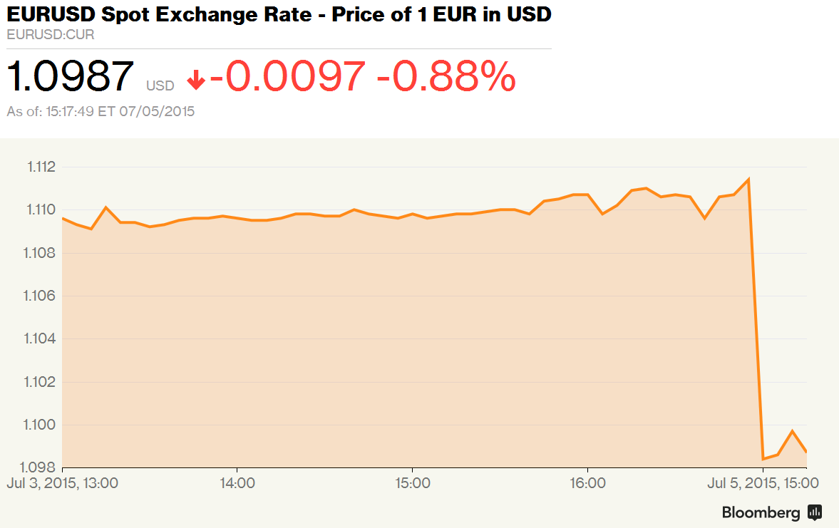
You notice the spectacular drop right? Cliff-like. You think the Euro is doomed now that the Greeks have voted “no”? Do not despair, for all you need to do is to look at the axis, and the axis labels.

The “precipitous drop” that is indicated by the above graph indicates a movement of the EUR/USD from about 1.11 to about 1.10. Or a fall of 0.88%, as the text accompanying the graph says! And given how volatile the EUR/USD has been over the last couple of months (look at graph below), this is not that significant!

eurusd


I won’t accuse Bloomberg of dishonesty since they’ve clearly mentioned “0.88%”, but they sure know how to use graphics to propagate their message!

Slider design

Not often that I comment on User Interface, but this has a quantitative aspect to it, so I thought I’ll write about it. Basically it’s with the use of sliders on websites that you move around to determine an amount or a limit.

More specifically, I’m in the process of planning an extended weekend in Bali next month (the wife is going to be based in Jakarta for two months starting this weekend), and checking out sites such as TripAdvisor and AirBnB for accommodation. This necessarily means using a slider to determine my maximum willingness to pay for a room.

The problem with such sliders is that they’re linear. So for example, on the Travelmob page where I’m looking for villas, the price per night varies from Rs. 650 to Rs. 65000, or a factor of 100. And the slider uses a linear scale. So considering that I consider about Rs. 3500 per night as my budget, in order to set that budget I have to move the right slider (my maximum willingness to pay) way over to the left, till it almost coincides with the left slider (which determines the minimum price). And considering the small distance between the two sliders, it is easy go wrong and not be precise on your limits. A rather frustrating experience!

Instead, if the slider were to use a logarithmic scale, then 6500 would be the midpoint (geometric average of minimum and maximum), and that would allow me to pull the slider to 3500 without much hassle, improving my experience!

But then I suspect the current poor design is by design – by making it hard for you to move sliders down to low prices, maybe they are nudging customers to go for higher priced rooms?

On a different note, while on the topic of sliders, there are “fin-tech” startups that determine whether you are good credit depending upon things like the amount of time you spend moving around a slider to determine how much money you want to borrow. Quoting from Sangeet’s blog:

As an example, most peer lending platforms have a slider allowing the borrower to decide what loan they would like to take. In an excellent whitepaper by Foundation Capital on the state of peer lending, Charles Moldow shares that  the longer a borrower spends moving the slider up and down (and hence, potentially, debating her ability to return the loan), the more likely is she to return the loan. Such correlations help platforms improve their ability to curate participants over time.

This slider also looks linear, rather than logarithmic! And so it goes.

Update

AirBnB actually uses a logarithmic slider! Whatay!

Datapukes and Dashboards

Avinash Kaushik has put out an excellent, if long, blog post on building dashboards. A key point he makes is about the difference between dashboards and what he calls “datapukes” (while the name is quite self-explanatory and graphic, it basically refers to a report with a lot of data and little insight). He goes on in the blog post to explain how dashboards need to be tailored for recipients at different levels in the organisation, and the common mistakes people make about building a one-size fits all dashboard (most likely to be a dashboard).

Kaushik explains that the higher up you go in an organisation’s hierarchy, the lesser access to data the managers have and they also have lesser time to look into and digest data before they come to a decision – they want the first level of interpretation to have been done for them so that they can proceed to the action. In this context, Kaushik explains that dashboards for top management should be “action-oriented” in that they clearly show the way forward. Such dashboards need to be annotated, he says, with reasoning provided as to why the numbers are in a certain way, and what the company needs to do to take care of it.

Going by Kaushik’s blog post, a dashboard is something that definitely requires human input – it requires an intelligent human to look at and analyse the data, analyse the reasons behind why the data looks a particular way, and then intelligently try and figure out how the top management is likely to use this data, and thus prepare a dashboard.

Now, notice how this requirement of an intelligent human in preparing each dashboard conflicts with the dashboard solutions that a lot of so-called analytics or BI (for Business Intelligence) companies offer – which are basically automated reports with multiple tabs which the manager has to navigate in order to find useful information – in other words, they are datapukes!

Let us take a small digression – when you are at a business lunch, what kind of lunch do you prefer? Given three choices – a la carte, buffet and set menu, which one would you prefer? Assuming the kind of food across the three is broadly the same, there is reason to prefer a set menu over the other two options – at a business lunch you want to maximise the time you spend talking and doing business. Given that the lunch is incidental, it is best if you don’t waste any time or energy getting it (or ordering it)!

It is a similar case with dashboards for top management. While a datapuke might give a much broader insight, and give the manager opportunity to drill down, such luxuries are usually not necessary for a time-starved CXO – all he wants are the distilled insights with a view towards what needs to be done. It is very unlikely that such a person will have the time or inclination to drill down -which can anyway be made possible via an attached data puke.

It will be interesting what will happen to the BI and dashboarding industry once more companies figure out that what they want are insightful dashboards and not mere data pukes. With the requirement of an intelligent human to make these “real” dashboards (he is essentially a business analyst), will these BI companies respond by putting dedicated analysts for each of their clients? Or will we see a new layer of service providers (who might call themselves “management consultants”) who take in the datapukes and use their human intelligence to provide proper dashboards? Or will we find artificial intelligence building the dashboards?

It will be very interesting to watch this space!


The Problem With Pie Charts

People don’t seem to get that pie charts are awful. The basic point is that the human eye cannot measure areas as well as it can measure lengths. In order to show this I’ve done some exercises in my workshops – I drew a pie chart and a bar chart and asked the class to estimate the number associated with a particular sector of the pie / particular bar of the bar  graph, and (luckily I must point out, since the class was small) the error in measurement from the class for the pie was more than that of the bar, so I could convince them.

At yet another class I was teaching last weekend, I got another idea to show why pie charts aren’t particularly useful and I thought I’ll share that here.

Check out this pie chart. Let’s say this represents the quantities of various fruits I’ve consumed in the last one year (numbers pulled out of thin air, using the rand() function in Excel). Look at this chart and tell me which fruit I’ve consumed the most and which the least.

You might say that adding data labels might help solve this problem, but my question is if you must add data labels, why have a visualization at all in the first place? Also note the other problem with the pie chart – you need to keep referring to the legend (at least in the default version that Excel offers. I haven’t been able to figure out how to put the category labels next to the pies itself).

How would you better represent this data? Consider this bar chart, in that case, again made using Excel (with a few tweaks to reduce the “ink”). Here, you can clearly see the relative sizes of the quantities of consumption of various fruits, and easily figure out for yourself that my favourite fruit is Orange and least favourite is Grape.

barsample

The basic idea I’m trying to explain is this – there is little that a pie chart can show (apart from proportions, maybe) that a bar chart cannot. And even if you want to show proportions, you can do one additional step of calculating proportions and plotting that in a bar, instead of putting it in a pie.


vso_diwali

Charting in Excel

Pavan Srinath, my colleague at the Takshashila Institution, referred to me this excellent tutorial on charting in Excel. It’s been a while since I made too many charts in Excel, since I find the defaults rather irritating and manipulation rather difficult. I make most of my charts using R. I like the command line interface. I like the fact that I have full control over my charts and that I can customize it the way I want (and with a dozen characters of code make it look like a chart from The Economist or The Wall Street Journal).

However, I realize R is a specialized tool and not everyone will want to use it. Hence, at least for the purpose of teaching visualization, I need to learn to chart on Excel. The link above is excellent, and has some good tips on visualization also (for example – on not using 3D charts and not using multiple Y axes). I’m not including any excerpt here since I think anything less than the full post will not do justice to it.