Premier League Sub-Tables

Ahead of the Chelsea-Liverpool game on Sunday, the pre-match show showed a “sub-table” of the premier league of how the top 8 teams had fared against each other. While by definition, the Premier League is played among 20 teams, and your result against Chelsea is as important as that against Crystal Palace, looking at sub-leagues like this one can help us gauge what the overall points table is trying to hide.

In this post I’ll just show the sub-league of the top of the league (top 3 to top 7) and bottom of the league (bottom 3 to bottom 7). Offered without further comment.

topbottom7

Premier League – Home and Away

So we are halfway through what is easily the most competitive English Premier League in recent times. To illustrate, Liverpool were on top of the table at Christmas, and after two successive defeats, lie fifth at the New Year. Anything can happen this season and the top seven or eight teams are all still in contention.

One interesting factor this season, however, has been the fixture list. For example, only Manchester United among the top eight has played at Anfield (Liverpool’s home ground) this season. Liverpool has played every other top eight team away so far – which means they will face them all at home in the second half of the season.

On the other hand, Manchester City has hosted all top eight teams bar Chelsea so far! Which means they will be playing all these teams away this season! Sunderland is currently bottom. However, they have hosted mostly top-half teams (which are significantly superior to them) and played away to other bottom half teams which are of comparable strength.

The following table illustrates who has hosted whom. The table is to be read row-wise. “H” and a red cell means that the team in the corresponding row has hosted the team in the corresponding column. A while cell and “A” implies otherwise.Notice that this is the only point of time in the season when we can do this analysis for now everyone has played everyone else exactly once. Teams in this table are ordered in descending order of points.

plhomeaway


Can we have a metric of who has had the best set of home fixtures this season so far? For this, let us define a “home index”. For each team, this is calculated as the difference between the average points of the teams played at home and the average points of the teams played away.

Let me illustrate. Arsenal, for example have so far hosted Chelsea, Everton, Liverpool, Spurs, Southampton, Hull, Stoke, Villa and Norwich. These teams have an average of 28.6 points as of now. Arsenal has so far visited the rest of the clubs, viz. Manchester City, Manchester United, Newcastle, Swansea, Cardiff, West Brom, Crystal Palace, Fulham, West Ham and Sunderland. These teams average 22.6 points as of now. So Arsenal’s home index is 28.6 – 22.6 = 6.0

A positive home index implies a team has played more strong teams at home and weak teams away. It is not easy to say, however, whether this implies an easier second half of the season. Arsenal, for example, would be happy to host the weaker teams they have traveled to, but the fixture list means they will be traveling to more strong teams, which means the potential for dropping points is higher.

Among the relegation-threatened teams, Sunderland has the highest “home index”, and for them the season is likely to become better – in the second half, they will get to host the weaker teams whom they can reasonably expect to beat while traveling to stronger teams (who they’ve lost to anyway) won’t change much. Thus, a high home index is a positive for lower-ranked clubs.

The following graph shows the home-away index for all clubs:

haindexNotice that both Arsenal and Manchester City have had an easier run so far – hosting the better teams. it will be interesting to see how they perform in the second half of the season when they travel to the better clubs. Especially given that Liverpool and Chelsea have had a bad run of fixtures in the first half and are likely to improve in the second half.

Finally, the first part of the post assumes that teams are better off playing at home rather than away. Is this really true? To check this, let us look at the average points scored by teams in home and away games. This number should be taken with a pinch of salt, though – teams with a high home index are less likely to perform significantly better at home compared to away.

Based on the performance so far, the average points in home games is 0.28 more than the average points in an away game. However, we also need to take into account the home index. When we regress the difference between home and away points against the home index, we find that for every one point higher in home index, the difference between home and away performance comes down by 0.04 (the R-square, for those that are interested in such things, is 15%).

The following table shows the difference in home and away performances of different teams:

homeaway2Most teams, you can see from this table, have done better home than away. The significant exceptions are Aston Villa, Manchester United and Spurs. Villa and Manchester United have a high Home Index which possibly explains this. There is no explanation of spurs’ home form, though.


Spending on Indian Players in IPL Auctions

In the first IPL Auction in 2008, teams spent an average (median) of 47% of their overall spend on Indian players, the rest going to foreign players. By the time of the auction in 2011, however, they had wisened up to the fact that only four foreigners can play in the eleven, and the average (median) spend on Indian players went up to 65%.

How did different teams fare on this count? The following graph describes this (I’m generally not a big fan of “dodged” bar graphs but couldn’t think of a better way of representing this data. If you have any ideas, do let me know).

foreignspend


As you can see in this graph, most teams significantly increased their spending on Indian players. The only teams that failed to do so were Deccan Chargers (who performed really badly and then dropped out of the IPL), Kings XI Punjab (performed badly all three seasons) and Rajasthan Royals (who built their team around “uncapped” Indian players who were not part of the auction).

It will be interesting to see what this ratio is like in the following auction.


Analyzing the IPL Auction Rules – 1

So finally after a really long delay the rules for the IPL Auction 2014 are out. Each franchise has the option of retaining up to five players, with additional “trump cards” that allow them to match the price of a winning bid in the auction for players that were part of their teams in the earlier IPLs.

At the outset, the rules of the auction look loaded towards teams that already have strong squads and want to retain as many players as they can – for example, given the rules of the auction, a team can retain up to 6 players from their existing squads, and this significantly biases the auction in favour of teams that want to retain players.

Looking a bit deeper, though, it is clear that this luxury of retention comes at a price. For example, irrespective of what the team negotiates with its number one player, Rs. 12.5 Crore (125 million), or a little more than 20% of the cumulative salary cap will be debited from the team’s account. For the next player, Rs. 9.5 Crore (95 million) will be debited. There is a sliding scale and the fifth player a team retains will cost them Rs. 4 Crore in terms of their budget.

The question is if this pricing is appropriate – is charging 20% of the team budget for the number one player enough compensation for the benefit the team gets by way of retention? Is charging two thirds of the total salary cap (Rs. 39 Crore) enough for retention of five players?

At first look, this pricing looks appropriate – after all, why would someone want to forego two thirds of their auction kitty for keeping just five players, when the total squad size is 16 to 27? However, looking at the previous auctions tells a different story.

The two graphs here shows the proportion of total auction money spent by each team on each player in the last two auctions. The graph might appear complicated so let me explain. For each team, I ordered players bought in the auction in the descending order of price. Then I looked at how much the top player cost as a proportion of the total money spent at the auction. Then, how much the top two players cost and so on.

ipl08


ipl11


(click on images for full size. For the 2008 auction, marquee players have been included in the analysis)

In the 2008 auction, teams spent between 60 and 85% of their budgets in order to select their five most expensive players, with a median of 72%. In the 2011 auction, teams spent between 65 and 90% of their budgets for their top five players (takes into account retained players), and the median spend was 71%. 

Given that the “top 5” players for each team cost them upwards of 70% of their total budgets in the last two auctions, charging teams only Rs. 39 Crore (65%) for retaining five players is blatantly unfair, and biased towards the teams that want to retain. Also, considering that retained players are “known devils”, there is more value for money for teams from retained players. So in the ideal case, the fee for retaining 5 players should have been definitely upwards of 75% of the total budget (Rs. 45 Crore).

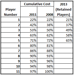
The following table helps to show the undervaluation of each retained player:

costmatrix


The second and third columns in the above table shows the median percentage of total budget teams spent in order to buy their top N players. The last column shows what percentage of their budget they would have to spend if they are to retain players in the auction.

The message for teams is clear: retain as much as you can. It is cheaper to retain your top players rather than building a new team from the available pool. The challenge, however, is to negotiate a good price with these players.

PS: I have a solution that can help teams plan their auction strategy. If you are an IPL team and you are interested in this, contact me through the contact form.


Identifying Groups of Death

The Guardian has an interesting set of graphics trying to identify the “Group of Death” at the forthcoming (2014) football World Cup. They have basically ordered groups and teams on three counts – something called as “strength of schedule” (how it is calculated is not explained), average strength of each group (mean rating points) and the strength of each match (sum total of rating points of the teams playing). They don’t actually go on to identify which the groups of death are. 

Another piece in the same paper gives a history of the concept of the Group of Death, and tries to explain why some groups can be classified so while others cannot. So in this post we will focus on precisely that – once a draw has been made, how do we identify groups of death? Without loss of generality, let us restrict our analysis to groups of four teams from which two qualify for the next round following a round robin (the format the World Cup uses). We will also restrict ourselves to analyzing the group stage and ignore chances of “death” in the knockout stages.

A “group of death” traditionally refers to a group where at least one “favourite”  team gets knocked out. Assuming that a team with higher odds of winning the tournament is likely to beat one with lower odds, a group of death is necessarily one that contains at least three teams that are “favourites” to win the tournament.

From this, one way to measure groups of death is to order teams in decreasing order of odds of winning based on a reputed bookie’s odds, and then see how closely the top three teams of a group are clustered. The closer three teams are to each other, the closer the group is. We can use a distance metric to measure this.

Another simpler method is to see the odds of the third team in a group winning the world cup. The groups where the third best odds of winning are the groups of death! Again this is a relative metric since if each group has two “strong teams” and two “weak teams” there is effectively no group of death (hence the earlier metric trumps this one).

Another way to identify how deadly the groups are is to use bilateral odds for each match, and to identify the odds that the two “seeded teams” in a group both don’t qualify. For example, Group B has Spain, Netherlands, Australia and Chile, with the first two being the “seeded teams” (given their ranking). Now, we can calculate the probability that at least one of Spain and Netherlands doesn’t qualify. That gives the “death rating” for this group. The group for which this “death rating” is highest is the group of death.

As you can see, there are several ways for identifying the group of death. Unfortunately, none of the analysis that the Guardian has put out contributes to this. Let us now look at a couple of methods for ourselves. For the purpose of analysis I’m using the easiest available odds, which are from the Bleacher Report. Ideally, for this analysis we should be using odds before the draw was made – since the draw itself would have ended up adjusting odds. Nevertheless, since this is for illustrative (rather than predictive) purposes only, we’ll stick to the current odds.

Let us start with the easiest method, which is the odds of victory of the third best team in the group. Based on the Bleacher odds, the third best teams in each group are likely to be :

A Mexico 150/1
B Chile 33/1
C Japan 150/1
D England 28/1
E Ecuador 150/1
F Nigeria 250/1
G United States 150/1
H South Korea 150/1

Two teams stand out – Chile at 33/1 and England at 28/1. Based on this metric, the group of death is Group D (Italy, England, Uruguay, Costa Rica). The Guardian might say that Australia, Ghana or the United States might have the toughest draw, but the odds of each of them winning is so low that it doesn’t matter that they have tough draws!

Let us now use another metric – the difference between the odds of the second and third placed teams in each group. One metric of the group of death might be where this difference is the minimum (this metric has the problem of classifying groups with one clear winner as groups of death, while they technically are not).

And this metric identifies Group F (Bosnia, Nigeria)  and Group A (Croatia, Mexico) as groups of death. You might notice that these are Argentina and Brazil’s groups respectively and those two teams are expected to sail through, so this is not a good metric.

Next, let us involve the top three teams of each group (to prevent the above anomaly) and look at the sum of the absolute difference in odds. For example, if the odds of the top three teams in a group are o1, o2, o3, we will measure each group by (|o1-o2| + |o2-o3| + |o3-o1|). The smaller this sum is, the more likely a group is a “group of death”.

The results from this metric are below:

A 42% Brazil, Croatia, Mexico
B 16% Spain, Netherlands, Chile
C 7% Colombia, Japan, Greece
D 0.7% Uruguay, Italy, England
E 7% Switzerland, France, Ecuador
F 27% Argentina, Bosnia, Nigeria
G 23% Germany, Portugal, United States
H 10% Belgium, Russia, South Korea.

From this metric, it is absolutely clear which the most competitive group is – it is group D, with Uruguay, Italy and England. Based on this metric, it is unambiguous that Group D is the group of death. Groups C and E come next according to this measure, followed by Group H.

Goodhart’s Law and getting beaten on the near post

I would have loved to do this post with data but I’m not aware of any source from where I could get data for this over a long period of time. Recent data might be available with vendors such as Opta, but to really test my hypothesis we will need data from much farther back – from the times when few football games were telecast, let alone “tagged” by a system like Opta. Hence, in this post I’ll simply stick to building my hypothesis and leave the testing for an enterprising reader who might be able to access the data.

In association football, it is more likely for an attacker to have a goalscoring opportunity from one side rather than from straight ahead. Standing between the attacker and the net is the opposing goalkeeper, and without loss of generality, the attacker can try to score on either side of the goalkeeper. Now, because of the asymmetry in the attacker’s position, these two sides of the goalkeeper can be described as “near side” and “far side”. The near side is the gap between the goalkeeper and the goalpost closest to the attacker. The far side is the gap between the goalkeeper and the goalpost on the farther side.

Red dot is goalkeeper, blue dot is striker.


However, my hypothesis is that this has not been the case recently. For a while now (my football history is poor, so I’m not sure since when) it has been considered shameful for a goalkeeper to be “beaten at the near post”. The argument has been that given the short distance between himself and the near post, the goalie has no business in letting in the ball through that gap. Commentators and team selectors have been more forgiving of the far post, though. The gap there is large enough, they say, that the chances of scoring are high anyway, so it is okay if a goalie lets in a goal on that side.

Introductory microeconomics tells us that people respond to incentives. Goodhart’s Law states that

When a measure becomes a target, it ceases to be a good measure.

So with it becoming part of the general discourse that it is shameful for a goalkeeper to be beaten on the near side, and that selectors and commentators are more forgiving to goals scored on the far side, goalkeepers have responded to the changed incentives. My perception and hypothesis is that with time goalkeepers are positioning themselves closer to their near post, and thus leaving a bigger gap towards the far post. And thus, they are not any more optimizing to minimize the total chance of scoring a goal.

But isn’t it the same thing? Isn’t it possible that the optimal position of the goalkeeper for stopping a shot be the same as that of stopping a shot on the near side? The answer is an emphatic no.

Let us refer to the above figure once again. Let us assume that the chance of scoring when the angle is theta be f(theta). Now, we can argue that this is a super-linear function. That is, if theta increases by 10%, the chances of scoring increase by more than 10%. Again we could use data to prove this but I think it is mathematically intuitive. Given that f(theta) is super-linear, what this means is that 1. The function is strictly increasing, and 2. The derivative f'(theta) is also strictly increasing.

So, going by the above figure, the goalkeeper needs to minimize f(theta_1) + f(theta_2). If the total angle available is theta (= theta_1 + theta_2), then the goalkeeper needs to minimize f(theta_1) + f(theta - theta_1). Taking first derivative and equating it to zero we get,

f'(theta_1) = f'(theta - theta_1)

Because f is a super-linear function, we had argued earlier that its derivative is strictly increasing. Thus, the above equality implies that theta_1 = theta - theta_1 or theta_1 = theta_2 or f(theta_1) = f(theta_2).

Essentially, if the goalkeeper positions himself right, there should be an equal chance of getting beaten on the near and far posts. However, given the stigma attached to being beaten on the near post, he is likely to position himself such that theta_1 < theta_2, and thus increases the overall chance of getting beaten.

It would be interesting to look at data (I’m sure Opta will have this) of different goalkeepers and the number of times they get beaten on the near and far posts. If a goalie is intelligent, these two numbers should be equal. How good the goalkeeper is, however, determined by the total odds of scoring a goal past him.

Sehwag versus Tendulkar

Though he hasn’t formally retired yet, given that he is hopelessly out of form, one can probably conclude that Virender Sehwag is unlikely to play for India again, and hence it is time to pay tribute.

I have developed a little visualization where I plot the trajectories of a batsman’s innings based on his past records. There are basically two plots – in the first, I track the expected number of runs he would have scored as a function of the number of balls he has faced. In the second, I plot the probability of the batsman still batting as a function of the number of balls faced.

I’ve created an interactive visualization using the Shiny Server plugin for R, on a little Digital Ocean server that I’ve leased. In this application, you can compare the innings trajectories of different players in different formats. I have taken my raw ball by ball data for this application from cricsheet and have analyzed and visualized the data using R.

Having built this “app”, I was playing around with random combinations of players and formats, and soon started comparing Sachin Tendulkar with Virender Sehwag. Medium-timers like me might remember that back when Sehwag started out in the early 2000s, he was called “the clone” for his batting style was extremely similar to that of Sachin Tendulkar. That they are both short and chubby also helped fuel this comparison. One thing that sets Sehwag apart, though, is his sheer pace of scoring, especially in Test matches.

So while playing around with the “app”, when I loaded Sehwag and Tendulkar together, I noticed one interesting thing – Sehwag in Test matches plays exactly like how Tendulkar plays in ODIs, and Sehwag in ODIs plays like Tendulkar does in T20s (data includes IPL  games). Check out the graphs for yourselves!

srtvssehwag1

srtvssehwag2


I’m not sure how much load my small server can take so I’m not putting the link to the app here. However, if you think you’ll find this interesting and will want to play with it, write to me and I’ll send you the link.

Analyzing Premier League Performance so far

After yet another round of matches this weekend, Liverpool were unable to beat a 10-man Newcastle, and have slipped to third spot, with Chelsea going ahead of them on goal difference. Arsenal thumped Norwich to go clear at the top of the table. Manchester United continued to flounder, drawing at home to Southampton, who are the most improved team this season, compared to the last.

Now, the problem is that each team has a different fixture list. Some teams (such as Manchester United) have had an insanely tough set of fixtures so far this season. Others such as Arsenal have had it quite easy (the eight games Arsenal have played this season have all been fixtures that they won last year!). How do we account for this relative ease in fixtures to see how well teams have been performing?

In chess, one of the popular tie breaker methods used for “Swiss League” tournaments is called the “Solkoff method”. According to this method, the tie breaker score for each player is the sum of points scored by all his opponents. In a swiss league, each player plays against a different set of players, so a higher Solkoff score means a player has played his games against tougher opponents, and has hence done better than someone else with the same points tally but who has played weaker opponents. The question is if we can use these principles to evaluate football teams at this point in the season.

I propose what I call the “Modified Solkoff” score. Here, we not only take into account the total points of each opponent of a team, but also the result of the game against the particular opponent. This is then normalized by the total points scored by all your opponents. Take Arsenal for example. Their opponents so far this season have a total of 69 points as of today. Of the eight games they’ve played, Arsenal have lost to Aston Villa and drawn at West Brom. So the numerator of Arsenal’s Modified Solkoff score becomes 0 * Aston Villa’s points (10) + 1 * West Brom’s points (10) + 3 * total points of all their other opponents, which  amounts to 157. This is then normalized by the total  points tally of their opponents so far (69) and we get Arsenal’s normalized Modified Solkoff score of 2.28. You can see that the maximum possible Solkoff score is 3 (if a team has won all its games) and the minimum is 0 (losing all games). The higher the Solkoff score the better (better performance against better opponents).

This is what the Modified Solkoff table looks like as of today (21st October 2013). Arsenal may not have played the toughest opponents but the fact that they have won so many of their games means that they are on top. They are interestingly followed by Manchester City and then Southampton. Manchester United is buried somewhere in the bottom half of the table:


It is also interesting to note that Sunderland is ahead of Crystal Palace at the bottom of their table. This is due to the fact that Palace’s only points so far have come against Sunderland, while Sunderland earned their point from a draw with high-flying Southampton.

This also shows that Liverpool’s early season highs have come on the back of wins against relatively weaker teams (it doesn’t help their cause that Manchester United is classified as a “weak team” thanks to their performance so far), and thus their early season table topping is unlikely to sustain.

Let me know in the comments what you think of this method of computing a normalized score based on a team’s opponents so far.

PS: This table will be regularly updated (after each “matchday”), so if you are reading this after October, some of the notes may not match what is there in the table.

Has Manchester United Really Been a Disaster This Season?

The talk of this English Premier League season so far has been the poor performance of defending champions Manchester United. After six rounds of matches, the Red Devils lie twelfth, with only seven points from six games. While we are barely one sixth our way into the season (where each team plays 38 games), people are talking about the loss of the United “magic” following the departure of its long-standing coach Sir Alex Ferguson last season break. Other analysts, however, are quick to point out that United started off with a rather tough fixture list this year, having visited Liverpool and Manchester City and hosted Chelsea already.

A snapshot of the Premier League Table, thus, does not paint a particularly accurate picture. It is possible that at a particular interval in the season you can go through a series of tough games, or easy games. The fixture schedule each year is different and thus early league positions can be deceptive.

On this page, we will try to adjust for that. This post is going to be updated every week, and what we will do is to compare this season to the earlier one and see how teams are performing relative to the same set of fixtures last year. Thus far this season, Manchester United have played Chelsea, West Bromwich and Crystal Palace, all at home and have traveled to Swansea, Liverpool and Manchester City. What we do is to compare the performance of Manchester United in these six games to the corresponding six fixtures last season.

To adjust for relegation and promotion, the teams that placed 18th to 20th last season are respectively replaced by the three qualifiers (in order) from the Championship. Thus, we will assume that Cardiff City will replicate Wigan’s performance, Hull City Reading’s and Crystal Palace has taken QPR’s place.

Thus, we get table 1 – the “points change graph”, which shows how many additional points each team has got so far relative to the corresponding fixtures last year.

pointschange

This table confirms that irrespective of the fixture list, Manchester United’s performance so far this season is significantly inferior to that of last year. At the other end, Southampton and Tottenham Hotspur have vastly improved from last season.

Next, we will assume that the rest of the season would go as it did last season, and see how the table has changed taking into account this season’s performance.

pointstable

Again, it is early in the season yet, but if the rest of this season were to go as it did last year, Manchester United is likely to still win the title, but only just. Interestingly, Tottenham will be second if the rest of the season goes as per last season’s performances.