Liverpool FC: Mid Season Review

After 20 games played, Liverpool are sitting pretty on top of the Premier League with 58 points (out of a possible 60). The only jitter in the campaign so far came in a draw away at Manchester United.

I made what I think is a cool graph to put this performance in perspective. I looked at Liverpool’s points tally at the end of the first 19 match days through the length of the Premier League, and looked at “progress” (the data for last night’s win against Sheffield isn’t yet up on my dataset, which also doesn’t include data for the 1992-93 season, so those are left out).

Given the strength of this season’s performance, I don’t think there’s that much information in the graph, but here it goes in any case:

I’ve coloured all the seasons where Liverpool were the title contenders. A few things stand out:

  1. This season, while great, isn’t that much better than the last one. Last season, Liverpool had three draws in the first half of the league (Man City at home, Chelsea away and Arsenal away). It was the first month of the second half where the campaign faltered (starting with the loss to Man City).
  2. This possibly went under the radar, but Liverpool had a fantastic start to the 2016-17 season as well, with 43 points at the halfway stage. To put that in perspective, this was one more than the points total at that stage in the title-chasing 2008-9 season.
  3. Liverpool went close in 2013-14, but in terms of points, the halfway performance wasn’t anything to write home about. That was also back in the time when teams didn’t dominate like nowadays, and eighty odd points was enough to win the league.

This is what Liverpool’s full season looked like (note that I’ve used a different kind of graph here. Not sure which one is better).


Finally, what’s the relationship between points at the end of the first half of the season (19 games) and the full season? Let’s run a regression across all teams, across all 38 game EPL seasons.

The regression doesn’t turn out to be THAT significant, with an R Squared of 41%. In other words, a team’s points tally at the halfway point in the season explains less than 50% of the variation in the points tally that the team will get in the second half of the season.

Coefficients:
            Estimate Std. Error t value Pr(>|t|)    
(Intercept)  9.42967    0.97671   9.655   <2e-16 ***
Midway       0.64126    0.03549  18.070   <2e-16 ***
---
Signif. codes:  0 ‘***’ 0.001 ‘**’ 0.01 ‘*’ 0.05 ‘.’ 0.1 ‘ ’ 1

Residual standard error: 6.992 on 478 degrees of freedom
  (20 observations deleted due to missingness)
Multiple R-squared:  0.4059,    Adjusted R-squared:  0.4046 
F-statistic: 326.5 on 1 and 478 DF,  p-value: < 2.2e-16

The interesting thing is that the coefficient of the midway score is less than 1, which implies that teams’ performances at the end of the season (literally) regress to the mean.

55 points at the end of the first 19 games is projected to translate to 100 at the end of the season. In fact, based on this regression model run on the first 19 games of the season, Liverpool should win the title by a canter.

PS: Look at the bottom of this projections table. It seems like for the first time in a very long time, the “magical” 40 points might be necessary to stave off relegation. Then again, it’s regression (pun intended).

Spurs right to sack Pochettino?

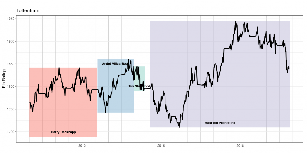
A few months back, I built my “football club elo by manager” visualisation. Essentially, we take the week-by-week Premier League Elo ratings from ClubElo and overlay it with managerial tenures.

A clear pattern emerges – a lot of Premier League sackings have been consistent with clubs going down significantly in terms of Elo Ratings. For example, we have seen that Liverpool sacked Rafa Benitez, Kenny Dalglish (in 2012) and Brendan Rodgers all at the right time, and that similarly Manchester United sacked Jose Mourinho when he brought them back to below where he started.

And now the news comes in that Spurs have joined the party, sacking long-time coach Mauricio Pochettino. What I find interesting is the timing of the sacking – while international breaks are usually a popular time to change managers (the two week gap in fixtures gives a club some time to adjust), most sackings happen in the first week of the international break.

The Pochettino sacking is surprising in that it has come towards the end of the international break, giving the club four days before their next fixture (a derby at the struggling West Ham). However, the Guardian reports that Spurs are close to hiring Jose Mourinho, and that might explain the timing of the sacking.

So were Spurs right in sacking Pochettino, barely six months after he took them to a Champions League final? Let’s look at the Spurs story under Pochettino using Elo ratings. 


Pochettino took over in 2014 after an underwhelming 2013-14 when the club struggled under Andre Villas Boas and then Tim Sherwood. Initially, results weren’t too promising, as he took them from a 1800 rating down to 1700.

However, chairman Daniel Levy’s patience paid off, and the club mounted a serious challenge to Leicester in the 2015-16 season before falling away towards the end of the season, finishing third behind Arsenal. As the Elo shows, the improvement continued, as the club remained in Champions League places through the course of Pochettino’s reign.

Personally, the “highlight” of Pochettino’s reign was Spurs’ 4-1 demolition of Liverpool at Wembley in October 2017, a game I happened to watch at the stadium. And as per the Elo ratings the club plateaued shortly after that.

If that plateau had continued,  I suppose Pochettino would have remained in his job, giving the team regular Champions League football. This season, however, has been a disaster.

Spurs are 13 points below what they had scored in comparable fixtures last season, and unlikely to finish in the top six even. Their Elo has also dropped below 1850 for the first time since 2016-17. While that is still higher than where Pochettino started off at, the precipitous drop in recent times has meant that the club has possibly taken the right call in sacking Pochettino.

If Mourinho does replace him (it looks likely, as per the Guardian), it will present a personal problem for me – for over a decade now, Tottenham have been my “second team” in the top half of the Premier League, behind Liverpool. That cannot continue if Mourinho takes over. I’m wondering who to shift my allegiance to – it will have to be either Leicester or (horror of horrors) Chelsea!

EPL: Mid-Season Review

Going into the November international break, Liverpool are eight points ahead at the top of the Premier League. Defending champions Manchester City have slipped to fourth place following their loss to Liverpool. The question most commentators are asking is if Liverpool can hold on to this lead.

We are two-thirds of the way through the first round robin of the premier league. The thing with evaluating league standings midway through the round robin is that it doesn’t account for the fixture list. For example, Liverpool have finished playing the rest of the “big six” (or seven, if you include Leicester), but Manchester City have many games to go among the top teams.

So my practice over the years has been to compare team performance to corresponding fixtures in the previous season, and to look at the points difference. Then, assuming the rest of the season goes just like last year, we can project who is likely to end up where.

Now, relegation and promotion introduces a source of complication, but we can “solve” that by replacing last season’s relegated teams with this season’s promoted teams (18th by Championship winners, 19th by Championship runners-up, and 20th by Championship playoff winners).

It’s not the first time I’m doing this analysis. I’d done it once in 2013-14, and once in 2014-15. You will notice that the graphs look similar as well – that’s how lazy I am.

Anyways, this is the points differential thus far compared to corresponding fixtures of last season. 


Leicester are the most improved team from last season, having scored 8 points more than in corresponding fixtures from last season. Sheffield United, albeit starting from a low base, have done extremely well as well. And last season’s runners-up Liverpool are on a plus 6.

The team that has done worst relative to last season is Tottenham Hotspur, at minus 13. Key players entering the final years of their contract and not signing extensions, and scanty recruitment over the last 2-3 years, haven’t helped. And then there is Manchester City at minus 9!

So assuming the rest of the season’s fixtures go according to last season’s corresponding fixtures, what will the final table look  like at the end of the season?
We see that if Liverpool replicate their results from last season for the rest of the fixtures, they should win the league comfortably.

What is more interesting is the gaps between 1-2, 2-3 and 3-4. Each of the top three positions is likely to be decided “comfortably”, with a fairly congested mid-table.

As mentioned earlier, this kind of analysis is unfair to the promoted teams. It is highly unlikely that Sheffield will get relegated based on the start they’ve had.

We’ll repeat this analysis after a couple of months to see where the league stands!

Chasing Dhoni

Former India captain Mahendra Singh Dhoni has a mixed record when it comes to chasing in limited overs games (ODIs and T20s). He initially built up his reputation as an expert chaser, who knew exactly how to pace an innings and accelerate at the right moment to deliver victory.

Of late, though, his chasing has been going wrong, the latest example being Chennai Super Kings’ loss at Kings XI Punjab over the weekend. Dhoni no doubt played excellently – 79 off 44 is a brilliant innings in most contexts. Where he possibly fell short was in the way he paced the innings.

And the algorithm I’ve built to represent (and potentially evaluate) a cricket match seems to have done a remarkable job in identifying this problem in the KXIP-CSK game. Now, apart from displaying how the game “flowed” from start to finish, the algorithm is also designed to pick out key moments or periods in the game.

One kind of “key period” that the algorithm tries to pick is a batsman’s innings – periods of play where a batsman made a significant contribution (either positive or negative) to his team’s chances of winning. And notice how nicely it has identified two distinct periods in Dhoni’s batting:

The first period is one where Dhoni settled down, and batted rather slowly – he hit only 21 runs in 22 balls in that period, which is incredibly slow for a 10 runs per over game. Notice how this period of Dhoni’s batting coincides with a period when the game decisively swung KXIP’s way.

And then Dhoni went for it, hitting 36 runs in 11 balls (which is great going even for a 10-runs-per-over game), including 19 off the penultimate over bowled by Andrew Tye. While this brought CSK back into the game (to right where the game stood prior to Dhoni’s slow period of batting), it was a little too late as KXIP managed to hold on.

Now I understand I’m making an argument using one data point here, but this problem with Dhoni, where he first slows down and then goes for it with only a few overs to go, has been discussed widely. What’s interesting is how neatly my algorithm has picked out these periods!

A banker’s apology

Whenever there is a massive stock market crash, like the one in 1987, or the crisis in 2008, it is common for investment banking quants to talk about how it was a “1 in zillion years” event. This is on account of their models that typically assume that stock prices are lognormal, and that stock price movement is Markovian (today’s movement is uncorrelated with tomorrow’s).

In fact, a cursory look at recent data shows that what models show to be a one in zillion years event actually happens every few years, or decades. In other words, while quant models do pretty well in the average case, they have thin “tails” – they underestimate the likelihood of extreme events, leading to building up risk in the situation.

When I decided to end my (brief) career as an investment banking quant in 2011, I wanted to take the methods that I’d learnt into other industries. While “data science” might have become a thing in the intervening years, there is still a lot for conventional industry to learn from banking in terms of using maths for management decision-making. And this makes me believe I’m still in business.

And like my former colleagues in investment banking quant, I’m not immune to the fat tail problem as well – replicating solutions from one domain into another can replicate the problems as well.

For a while now I’ve been building what I think is a fairly innovative way to represent a cricket match. Basically you look at how the balance of play shifts as the game goes along. So the representation is a line graph that shows where the balance of play was at different points of time in the game.

This way, you have a visualisation that at one shot tells you how the game “flowed”. Consider, for example, last night’s game between Mumbai Indians and Chennai Super Kings. This is what the game looks like in my representation.

What this shows is that Mumbai Indians got a small advantage midway through the innings (after a short blast by Ishan Kishan), which they held through their innings. The game was steady for about 5 overs of the CSK chase, when some tight overs created pressure that resulted in Suresh Raina getting out.

Soon, Ambati Rayudu and MS Dhoni followed him to the pavilion, and MI were in control, with CSK losing 6 wickets in the course of 10 overs. When they lost Mark Wood in the 17th Over, Mumbai Indians were almost surely winners – my system reckoning that 48 to win in 21 balls was near-impossible.

And then Bravo got into the act, putting on 39 in 10 balls with Imran Tahir watching at the other end (including taking 20 off a Mitchell McClenaghan over, and 20 again off a Jasprit Bumrah over at the end of which Bravo got out). And then a one-legged Jadhav came, hobbled for 3 balls and then finished off the game.

Now, while the shape of the curve in the above curve is representative of what happened in the game, I think it went too close to the axes. 48 off 21 with 2 wickets in hand is not easy, but it’s not a 1% probability event (as my graph depicts).

And looking into my model, I realise I’ve made the familiar banker’s mistake – of assuming independence and Markovian property. I calculate the probability of a team winning using a method called “backward induction” (that I’d learnt during my time as an investment banking quant). It’s the same system that the WASP system to evaluate odds (invented by a few Kiwi scientists) uses, and as I’d pointed out in the past, WASP has the thin tails problem as well.

As Seamus Hogan, one of the inventors of WASP, had pointed out in a comment on that post, one way of solving this thin tails issue is to control for the pitch or  regime, and I’ve incorporated that as well (using a Bayesian system to “learn” the nature of the pitch as the game goes on). Yet, I see I struggle with fat tails.

I seriously need to find a way to take into account serial correlation into my models!

That said, I must say I’m fairly kicked about the system I’ve built. Do let me know what you think of this!

English Premier League: Goal Difference to points correlation

So I was just looking down the English Premier League Table for the season, and I found that as I went down the list, the goal difference went lower. There’s nothing counterintuitive in this, but the degree of correlation seemed eerie.

So I downloaded the data and plotted a scatter-plot. And what do you have? A near-perfect regression. I even ran the regression and found a 96% R Square.

In other words, this EPL season has simply been all about scoring lots of goals and not letting in too many goals. It’s almost like the distribution of the goals itself doesn’t matter – apart from the relegation battle, that is!

PS: Look at the extent of Manchester City’s lead at the top. And what a scrap the relegation is!

Mike Hesson and cricket statistics

While a lot is made of the use of statistics in cricket, my broad view based on presentation of statistics in the media and the odd player/coach interview is that cricket hasn’t really learnt how to use statistics as it should. A lot of so-called insights are based on small samples, and coaches such as Peter Moores have been pilloried for their excess focus on data.

In this context, I found this interview with New Zealand coach Mike Hesson in ESPNCricinfo rather interesting. From my reading of the interview, he seems to “get” data and how to use it, and helps explain the general over-performance to expectations of the New Zealand cricket team in the last few years.

Some snippets:

You’re trying to look at trends rather than chuck a whole heap of numbers at players.

For example, if you look at someone like Shikhar Dhawan, against offspin, he’s struggled. But you’ve only really got a nine or ten-ball sample – so you’ve got to make a decision on whether it’s too small to be a pattern

Also, players take a little while to develop. You’re trying to select the player for what they are now, rather than what their stats suggest over a two or three-year period.

And there are times when you have to revise your score downwards. In our first World T20 match, in Nagpur, we knew it would slow up,


Go ahead and read the whole thing.

What did Brendan in? Priors? The schedule? Or the cups?

So Brendan Rodgers has been sacked as Liverpool manager, after what seems like an indifferent start to the season. The club is in tenth position with 12 points after 8 games, with commentators noting that “at the same stage last season” the club had 13 points from 8 games.

Yet, the notion of “same stage last season” is wrong, as I’d explained in this post I’d written two years back (during Liverpool’s last title chase), since the fixture list changes year on year. As I’ve explained in that post, a better way to compare a club’s performance is to compare its performance this season to corresponding fixtures from last season.

Looking at this season from such a lens (and ignoring games against promoted teams Bournemouth and Norwich), this is what Liverpool’s season so far looks like:

Fixture This season Last season Difference
Stoke away Win Loss +3
Arsenal away Draw Loss +1
West Ham home Loss Win -3
Manchester United Away Loss Loss 0
Aston Villa home Win Loss +3
Everton away Draw Draw 0

In other words, compared to similar fixtures last season, Liverpool is on a +4 (winning two games and drawing one among last season’s losses, and losing one of last season’s wins). In fact, if we look at the fixture schedule, apart from the games against promoted sides (which Liverpool didn’t do wonderfully in, scraping through with an offside goal against Bournemouth and drawing with Norwich), Liverpool have had a pretty tough start to the season in terms of fixtures.

So the question is what led to Brendan Rodgers’ dismissal last night? Surely it can’t be the draw at Everton, for that has become a “standard result” of late? Maybe the fact that Liverpool didn’t win allowed the management to make the announcement last evening, but surely the decision had been made earlier?

The first possibility is that the priors had been stacked against Rodgers. Considering the indifferent performance last season in both the league (except for one brilliant spell) and the cups, and the sacking of Rodgers’ assistants, it’s likely that the benefit of the doubt before the season began was against Rodgers, and only a spectacular performance could have turned it around.

The other possibility is indifferent performances in the cups, with 1-1 home draws against FC Sion and Carlisle United being the absolute low points, in fixtures that one would have expected Liverpool to win easily (albeit with weakened sides). While Liverpool is yet to exit any cup, indifferent performances so far meant that there hasn’t been much improvement in the squad since last season.

Leaving aside a “bad prior” at the beginning of the season and cup performances (no pun intended), there’s no other reason to sack Rodgers. As my analysis above shows, his performance in the league hasn’t been particularly bad in terms of results, with only the defeat to West Ham and possibly the draw to Norwich being bad. If Fenway Sports Group (the owners of Liverpool FC) have indeed sacked Rodgers on his league performance, it simply means that they don’t fully get the “Moneyball” philosophy that they supposedly follow, and could do with some quant consulting.

And if they’re reading this, they should know who to approach for such consulting services!

Valuing loan deals for football players

Initial reports yesterday regarding Radamel Falcao’s move to Manchester United mentioned a valuation of GBP 6 million for the one year loan, i.e. Manchester United had paid Falcao’s parent club AS Monaco GBP 6 million so that they could borrow Falcao for a year. This evidently didn’t make sense since earlier reports suggested that Falcao had been priced at GBP 55 million for an outright transfer, and has four years remaining on his Monaco contract.

In this morning’s reports, however, the value of the loan deal has been corrected to GBP 16 million, which makes more sense in light of his remaining period of contract, age and outright valuation.

So how do you value a loan deal for a player? To answer that, first of all, how do you value a player? The “value” of a player is essentially the amount of money that the player’s parent club is willing to accept in exchange for foregoing his use for the rest of his contract. Hence, for example, in Falcao’s case, GBP 55M  is the amount that Monaco was willing to accept for foregoing the remaining four years they have him on contract.

Based on this, you might guess that transfer fees are (among other things) a function of the number of years that a player has remaining on his contract with the club – ceteris paribus, the longer the period of contract, the greater is the transfer fee demanded (this is intuitive. You want more compensation for foregoing something for a longer time period than for a shorter time period).

From this point of view, let us now evaluate what it might take to take Falcao on loan for one year. Conceptually it is straightforward. Let us assume that the value Monaco expects to get from having Falcao on their books for a further four years is a small amount less than their asking price of GBP 55M – given they were willing to forego their full rights for that amount, their valuation can be any number below that; we’ll assume it was just below that. Now, all we need to do is to determine how much of this GBP 55M in value will be generated in the first year, how much in the second year and so on. Whatever is the value for the first year is the amount that Monaco will demand for a loan.

Now, loans can be of different kinds. Clubs sometimes lend out their young and promising players so that they can get first team football in a different club – something the parent club would not be able to provide. In such loans, clubs expect the players to come back as better players (Daniel Sturridge’s loan from Chelsea to Bolton is one such example) and thus with a higher valuation. Given this expectations, loan fees are usually zero (or even negative – where the parent club continues to bear part of the loanee’s wages).

Another kind of loan is for a player who is on the books but not particularly wanted for the season. It could happen that player’s wages are more than what the club hopes to get in terms of his contribution on the field (implying a negative valuation for the player). In such cases, it is possible for clubs to loan out the player while still covering part of the player’s salary. In that sense, the loan fee paid by the target club is actually negative (since they are in a sense being paid by the parent club to loan the player out). An example of this kind was Andy Carroll’s loan from Liverpool to West Ham United in the 2012-13 season.

Falcao is currently in the prime of his career (aged 29) and heavily injury prone. Given his age and injury record, he is likely to be a fast depreciating asset. By the time he runs out his contract at Monaco (when he will be 33), he is likely to be not worth anything at all. This means that a lion’s share of the value Monaco can derive out of him would be what they would derive in the next one year. This is the primary reason that Monaco have demanded 30% of the four year fee for one year of loan.

Loaning a player also involves some option valuation – based on his performance on loan his valuation at the end of the loan period can either increase or decrease. At the time of loaning out this is a random variable and we can only work on expectations. The thing with Falcao is that given the stage of his career the probability of him being much improved after a year is small. On the other hand, his brittleness means the probability of him being a lesser player is much larger. This ends up depressing the expected valuation at the end of the loan period and thus pushes up the loan fee. Thinking about it, this should have pushed up Falcao’s loan fee above GBP 16M but another factor – that he has just returned from injury and may not be at peak impact for a couple of months has depressed his wages.

Speaking of option valuation, it is possibly the primary reason why young loan signings to lesser clubs come cheap – the possibility of regular first team football increases significantly the expected valuation of the player at the end of the loan period, and this coupled with the fact that the player is not yet proven (which implies a low “base sale price”) drives the loan valuation close to zero.

Loaning is thus a fairly complex process, but players’ valuations can be done in rather economic terms – based on expected contribution in that time period and option valuation. Loaning can also get bizarre at times – Fernando Torres’s move to Milan, for example, has been classified by Chelsea as a “two year loan”, which is funny given that he has two years remaining on his Chelsea contract. It is likely that the deal has been classified as a loan for accounting purposes so that Chelsea do not write off the GBP 50M they paid for Torres’s rights in 2010 too soon.

Why Brazil is undervalued by punters

When India exited the 2007 Cricket World Cup, broadcasters, advertisers and sponsors faced huge losses. They had made the calculations for the tournament based on the assumption that India would qualify for the second group stage, at least, and when India failed to do so, it possibly led to massive losses for these parties.

Back then I had written this blog post where I had explained that one way they could have hedged their exposure to the World Cup would have been by betting against India’s performance. Placing a bet that India would not get out of their World Cup group would have, I had argued, helped mitigate the potential losses coming out of India’s early exist. It is not known if any of them actually hedged their World Cup bets in the betting market.

Looking at the odds in the ongoing Football World Cup, though, it seems like bets are being hedged. The equivalent in the World Cup is Brazil, the home team. While the world football market is reasonably diversified with a large number of teams having a reasonable fan following, the overall financial success of the World Cup depends on Brazil’s performance. An early exit by Brazil (as almost happened on Saturday) can lead to significant financial losses for investors in the tournament, and thus they would like to hedge these bets.

The World Cup simulator is a very interesting website which simulates the remaining games of the World Cup based on a chosen set of parameters (you can choose a linear combination of Elo rating, FIFA ranking, ESPN Soccer Power Index, Home advantage, Players’ Age, Transfer values, etc.). This is achieved by means of a Monte Carlo simulation.

I was looking at this system’s predictions for the Brazil-Colombia quarter final, and comparing that with odds on Betfair (perhaps the most liquid betting site). Based purely on Elo rating, Brazil has a 77% chance of progress. Adding home advantage increases the probability to 80%. The ESPN SPI is not so charitable to Brazil, though – it gives Brazil a 65% chance of progress, which increases to 71% when home advantage is factored in.

Assuming that home advantage is something that cannot be ignored (though the extent of it is questionable for games played at non-traditional venues such as Fortaleza or Manaus), we will take the with home advantage numbers – that gives a 70-80% chance of Brazil getting past Colombia.

So what does Betfair say? As things stand now, a Brazil win is trading at 1.85, which translates to a 54% chance of a Brazil victory.  A draw is trading at 3.8, which translates to a 26% chance. Assuming that teams are equally matched in case of a penalty shootout, this gives Brazil a 67% chance of qualification – which is below the range that is expected based on the SPI and Elo ratings. This discount, I hypothesize, is due to the commercial interest in Brazil’s World Cup performance.

Given that a large number of entities stand to gain from Brazil’s continued progress in the World Cup, they would want to protect their interest by hedging their bets – or by betting against Brazil. While there might be some commercial interest in betting against Colombia (by the Colombian World Cup broadcaster, perhaps?) this interest would be lower than that of the Brazil interest. As a result, the volume of “hedges” by entities with an exposure to Brazil is likely to pull down the “price” of a Brazil win – in other words, it will lead to undervaluation (in the betting market) of the probability that Brazil will win.

So how can you bet on it? There is no easy answer – since the force is acting only one way, there is no real arbitrage opportunity (all betting exchanges are likely to have same prices). The only “trade” here is to go long Brazil – since the “real probability” or progress is probably higher than what is implied by the betting markets. But then you need to know that this is a directional bet contingent upon Brazil’s victory, and need to be careful!