Levels and shifts in analysing games

So Nitin Pai and Pranay Kotasthane have a great graphic on how India should react to China’s aggressions on Doka La. While the analysis is excellent, my discomfort is with the choice of “deltas” as the axes of this payoff diagram, rather than levels.

Source: Nitin Pai and Pranay Kotasthane

Instead, what might have been preferable would have been to define each countries strategies in terms of levels of aggressions, define their current levels of aggression, and evaluate the two countries’ strategies in terms of moving to each possible alternate level. Here is why.

The problem with using shifts (or “deltas” or “slopes” or whatever you call the movement between levels) is that they are not consistent. Putting it mathematically, the tangent doesn’t measure the rate of change in a curve when you go far away from the point where you’ve calibrated the tangent.

To illustrate, let’s use this diagram itself. The strategy is that India should “hold”. From the diagram, if India holds, China’s best option is to escalate. In the next iteration, India continues to hold, and China continues to escalate. After a few such steps, surely we will be far away enough from the current equilibrium that the payoff for changing stance is very different from what is represented by this diagram?

This graph is perhaps valid for the current situation where (say) India’s aggression level is at 2 on a 1–5 integer scale, while China is at 3. But will the payoffs of going up and down by a notch be the same if India is still at 2 and China has reached the maximum pre-war aggression of 5 (remember that both are nuclear powers)?

On the flip side, the good thing about using payoffs based on changes in level is that it keeps the payoff diagram small, and this is especially useful when the levels cannot be easily discretised or there are too many possible levels. Think of a 5×5 square graph, or even a 10×10, in place of the 3×3, for example?—?soon it can get rather unwieldy. That is possibly what led Nitin and Pranay to choose the delta graph.

Mirrored here.

Newsletter!

So after much deliberation and procrastination, I’ve finally started a newsletter. I call it “the art of data science” and the title should be self-explanatory. It’s pure unbridled opinion (the kind of which usually goes on this blog), except that I only write about one topic there.

I intend to have three sections and then a “chart of the edition” (note how cleverly I’ve named this section to avoid giving much away on the frequency of the newsletter!). This edition, though, I ended up putting too much harikathe, so I restricted to two sections before the chart.

I intend to talk a bit each edition about some philosophical part of dealing with data (this section got a miss this time), a bit on data analysis methods (I went a bit meta on this this time) and a little bit on programming languages (which I used for bitching a bit).

And that I plan to put a “chart of the edition” means I need to read newspapers a lot more, since you are much more likely to find gems (in either direction) there than elsewhere. For the first edition, I picked off a good graph I’d seen on Twitter, and it’s about Hull City!

Anyway, enough of this meta-harikathe. You can read the first edition of the newsletter here. In case you want to get it in your inbox each week/fortnight/whenever I decide to write it, then subscribe here!

And put feedback (by email, not comments here) on what you think of the newsletter!

Using all available information

In “real-life” problems, it is not necessary to use all the given data. 

My mind goes back eleven years, to the first exam in the Quantitative Methods course at IIMB. The exam contained a monster probability problem. It was so monstrous that only some two or three out of my batch of 180 could solve it. And it was monstrous because it required you to use every given piece of information (most people missed out the “X and Y are independent” statement, since this bit of information was in words, while everything else was in numbers).

In school, you get used to solving problems where you are required to use all the given information and only the given information to solve the given problem. Taken out of the school setting, however, this is not true any more. Sometimes in “real life”, you have problems where next to no data is available, for which you need to make assumptions (hopefully intelligent) and solve the problem.

And there are times  in “real life” when you are flooded with so much data that a large part of the problem solving process is in the identification of what data is actually relevant and what you can ignore. And it can often happen that different pieces of given information contradict each other and deciding upon what to use and what to ignore is critical to efficient solution, and the decision is an art form.

Yet, in the past I’ve observed that people are not happy when you don’t use all the information at your disposal. The general feeling is that ignoring information leads to a suboptimal model – one which could be bettered by including the additional information. There are several reasons, though, that one might choose to leave out information while solving a real-life problem:

  • Some pieces of available information are mutually contradictory, so taking them both into account will lead to no solution.
  • A piece of data may not add any value after taking into account the other data at hand
  • The incremental impact of a particular piece of information is so marginal that you don’t lose much by ignoring it
  • Making use of all available information can lead to increased complexity in the model, and the incremental impact of the information may not warrant this complexity
  • It might be possible to use established models if you were to use part of the information. So we lose precision for a known model. Not always recommended but done.

The important takeaway, though, is that knowing what information to use is an art, and this forms a massive difference between textbook problems and real-life problems.

Means, medians and power laws

Following the disbursement of Rs. 10 lakh by the Andhra Pradesh government for the family of each victim killed in the stampede on the Godavari last week, we did a small exercise to put a value on the life of an average Indian.

The exercise itself is rather simple – you divide India’s GDP by its population to get the average productivity (this comes out to Rs. 1 lakh). The average Indian is now 29 and expected to live to 66 (another 37 years). Assume a nominal GDP growth rate of 12%, annual population increase of 2%  and a cost of capital of 8% (long term bond yield) and you value the average Indian life at 52 lakhs.

People thought that the amount the AP government disbursed itself was on the higher side, yet we have come up with a higher number. The question is if our calculation is accurate.

We came up with the Rs. 1 lakh per head figure by taking the arithmetic mean of the productivity of all Indians. The question is if that is the right estimate.

Now, it is a well established fact that income and wealth follow a power law distribution. In fact, Vilfredo Pareto came up with his “Pareto distribution” (the “80-20 rule” as some people term it) precisely to describe the distribution of wealth. In other words, some people earn (let’s stick to income here) amounts that are several orders of magnitude higher than what the average earns.

A couple of years someone did an analysis (I don’t know where they got the data) and concluded that a household earning Rs. 12 lakh a year is in the “top 1%” of the Indian population by income. Yet, if you talk to a family earning Rs. 12 lakh per year, they will most definitely describe themselves as “middle class”.

The reason for this description is that though these people earn a fair amount, among people who earn more than them there are people who earn a lot more.

Coming back, if income follows a power law distribution, are we still correct in using the mean income to calculate the value of a life? It depends on how we frame the question. If we ask “what is the average value of an Indian life” we need to use mean. If we ask “what is the value of an average Indian life” we use median.

And for the purpose of awarding compensation after a tragedy, the compensation amount should be based on the value of the average Indian life. Since incomes follow a Power Law distribution, so does the value of lives, and it is not hard to see that average of a power law can be skewed by numbers in one extreme.

For that reason, a more “true” average is one that is more representative of the population, and there is no better metric for this than the median (other alternatives are “mean after knocking off top X%” types, and they are arbitrary). In other words, compensation needs to be paid based on the “value of the average life”.

The problem with median income is that it is tricky to calculate, unlike the mean which is straightforward. No good estimates of the median exist, for we need to rely on surveys for this. Yet, if we look around with a cursory google search, the numbers that are thrown up are in the Rs. 30000 to Rs. 50000 range (and these are numbers from different time periods in the past). Bringing forward older numbers, we can assume that the median per capita income is about Rs. 50000, or half the mean per capita income.

Considering that the average Indian earns Rs. 50000 per year, how do we value his life? There are various ways to do this. The first is to do a discounted cash flow of all future earnings. Assuming nominal GDP growth of about 12% per year, population growth 2% per year and long-term bond yield of 8%, and that the average Indian has another 37 years to live (66 – 29), we value the life at Rs. 26 lakh.

The other way to value the life is based on “comparables”. The Nifty (India’s premier stock index) has a Price to Earnings ratio of about 24. We could apply that on the Indian life, and that values the average life at Rs. 12 lakh.

Then, there are insurance guidelines. It is normally assumed that one should insure oneself up to about 7 times one’s annual income. And that means we should insure the average Indian at Rs. 3.5 lakh (the Pradhan Mantri Suraksha Bima Yojana provides insurance of Rs. 2 lakhs).

When I did a course on valuations a decade ago, the first thing the professor taught us was that “valuation is always wrong”. Based on the numbers above, you can decide for yourself if the Rs. 10 lakh amount offered by the AP government is appropriate.


The Art of Drawing Spectacular Graphs

Bloomberg Business has a feature on the decline of the Euro after the Greek “No” vote last night. As you might expect, the feature is accompanied by a graphic which shows a “precipitous fall” in the European currency.

I’m in two minds of whether to screenshot the graphic (so that any further changes are not reflected), or to not plagiarise by simply putting a link (but exposing this post to the risk of becoming moot, if Bloomberg changes its graphs later on. It seems like the graphic on the site is a PNG, so let me go ahead and link to it:

You notice the spectacular drop right? Cliff-like. You think the Euro is doomed now that the Greeks have voted “no”? Do not despair, for all you need to do is to look at the axis, and the axis labels.

The “precipitous drop” that is indicated by the above graph indicates a movement of the EUR/USD from about 1.11 to about 1.10. Or a fall of 0.88%, as the text accompanying the graph says! And given how volatile the EUR/USD has been over the last couple of months (look at graph below), this is not that significant!

eurusd


I won’t accuse Bloomberg of dishonesty since they’ve clearly mentioned “0.88%”, but they sure know how to use graphics to propagate their message!

Airline delays in India

So DNA put out a news report proclaiming “Air India, IndiGo flyers worst hit by flight delays in January: DGCA“. The way the headline has been written, it appears as if Air India and Indigo are equally bad in terms of delayed flights. And an innumerate reader or journalist would actually believe that number, since the article states that 96,000 people were inconvenienced by Air India’s delays, and 75,000 odd by Indigo’s delays – both are of the same order of magnitude.

However, by comparing raw numbers thus, an important point that this news report misses out is that Indigo flies twice as many passengers as Air India. For the same period as the above data (January 2015), DGCA data (it’s all in this one big clunky PDF) shows that while about 11.65 lakh passengers flew Air India, about 22.76 lakh passengers flew Indigo – almost twice the number. So on a percentage basis, Indigo is only half as bad as Air India.

airlinedelays

The graph above shows the number of passengers delayed as a proportion of the number of passengers flown, and this indicates that Indigo is in clear second place as an offender (joined by tiny AirAsia). Yet, to bracket it with Air India (by not taking proportions) indicates sheer innumeracy on the part of the journalist (unnamed in the article)!

I’m not surprised by the numbers, though. The thing with Indigo (and AirAsia) is that the business model depends upon quick turnaround of planes, and thus there is little slack between flights. In winters, morning flights (especially from North India) get delayed because of fog and the lack of slack means the delays cascade leading to massive delays. Hence there is good reason to not fly Indigo in winter (and for Indigo to build slack into its winter schedules). Interestingly, the passenger load factor (number of passengers carried as a function of capacity) for Indigo is 85%, which is interestingly lower than Jet Airways (a so-called “full service carrier”)’ s 87%. And newly launched full service Vistara operated at only 45% in January!

We are in for interesting times in the Indian aviation industry.

Categorisation and tagging

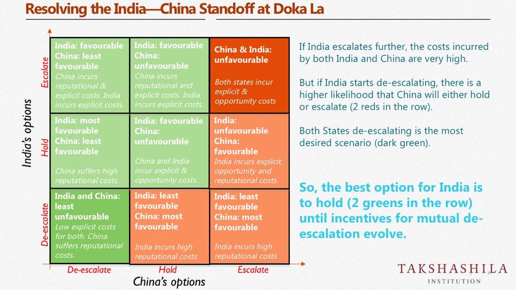
Tagging offers an efficient method to both searching and for identifying customer preferences on the axis most appropriate for the customer

The traditional way to organise a retail catalogue is by means of hierarchical categorisation. If you’re selling clothes, for example, you first divide it into men’s and women’s, then into formal and casual, and then into different items of clothing and so on. With a good categorisation, each SKU will have a unique “path” down the category tree. For traditional management purposes, this kind of categorisation might be useful, but it doesn’t lend itself well to both searching and pattern recognition.

To take a personal example (note that I’m going into anecdata territory here), I’m in the market for a hooded sweatshirt, and it has been extremely hard to find. Having given up on a number of “traditional retail” stores in the “High Street” (11th Main Road, 4th Block, Jayanagar, Bangalore) close to where I stay, I decided to check online sources and they’ve left me disappointed, too.

To be more precise, I’m looking for a grey sweatshirt made with a mix of cotton and wool (“traditional sweatshirt material”) with a zipper down the front, pockets large enough to keep my hands and a hood. Of size 42. This description is as specific as it gets and I don’t imagine any brand having more than a small number of SKUs that fit this specification.

In case I were shopping offline in a well-stocked store (perhaps a “well stocked offline store” is entering mythical territory nowadays), I would  repeat the above paragraph to a store attendant (good store attendants are also very hard to find nowadays) and he/she would pick out the sweatshirts that would conform to these specifications and I would buy one of them. The question is how one can replicate this experience in online shopping.

In other words, how can we set up our online customer catalog such that it becomes easy for shoppers to search specifically for what they’re looking for. Currently, most online stores follow a “categorisation” format, where you step into two or three levels of categorisation, where you’re shown a large assortment. This, however, doesn’t allow for efficient search. Let me illustrate by my own experience this morning.

1. Amazon.in : I hit “hoodies” in the search bar, and got shown a large assortment of hoodies. I can drill deeper in terms of sleeve length, material, colour and brand. My choice of material (which I’m particular about) is not there in the given list. There are too many colour choices and I can’t simply say “grey” and be shown all greys. There is no option to say i want a zip-open front, or a cotton-wool mix. My search ends there.

2. Jabong (rumoured to be bought by Amazon shortly): I hover over “Men’s”, click on “winter wear” and then on “hoodies”. There is a large assortment of both material (cotton-wool mix not here) and brand. There are several colours available, but no way for me to tell the system I’m looking for a zip-down hoodie. I can set my price-range and size, though. Search ends at a point when there’s too much choice.

3. Flipkart: Hover over “men’s”, click “winter wear” and then sweatshirt. Price, size and brand are the only axes on which I can drill down further. The least impressive of all the sites I’ve seen. Too much choice again at a point when I end search.

4. Myntra (recently bought by Flipkart, but not yet merged): The most impressive of all sites. I hover over “Men’s” and click on sweaters and sweatshirts (one less click than Jabong or Flipkart). After I click on “sweatshirts” it gives me a “closure” option (this is the part that impresses me) where I can say I want a zippered front. No option to indicate hood or material, though.

In each of the above, it seems like the catalog has been thought up in a hierarchical format, with little attention paid to tagging. There might be some tags attached such as “brand” but these are tags that are available to every item. The key to tagging is that not all tags need to be applicable for all items. For example, “closure” (zippered or buttoned or open) is applicable only to sweatshirts. Sleeve length is applicable only to tops.

In addition to search (as illustrated above), the purpose of tagging is to identify patterns in purchases and know more about customers. The basic idea is that people’s preferences could be along several axes, and at the time of segmentation and bucketing you are not sure which axis describes the person’s preferences best. So by having a large number of tags that you assign to each SKU (this sadly is a highly manual process), you give yourself a much superior chance of getting to know the customer.

In terms of technological capability, things have advanced much in terms of getting to know the customer. For example, it is now really quick to do a Market Basket Analysis based on large numbers of bills, which helps you identify patterns in purchase. With the technology bit being easy, the key to learning more about your customers is the framework you employ to “encase” the technology. And without efficient tagging, you are giving yourself a lesser chance of categorising the customer on the right axis.

Of course for someone used to relational databases, tagging requires non-trivial methods of storage. Firstly the number of tags varies widely by item. Secondly, tags can themselves have a hierarchy, and items might not necessarily be associated with the lowest level of tag. Thirdly, tagging is useless without efficient searching, at various levels, and it is a non-trivial technological problem to solve. But while the problems are non-trivial, the solutions are well-known and advantages large enough that whether to use tags or not is a no-brainer for an organisation that wants to use data in its decision-making.
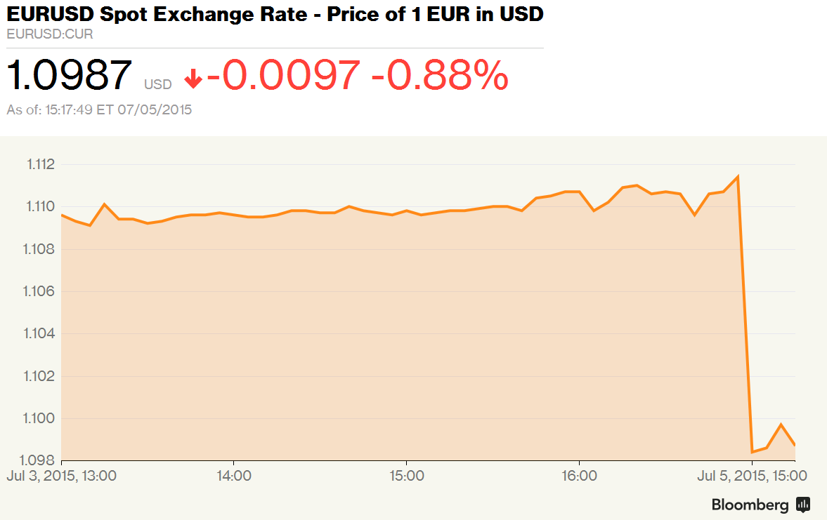
 

A/B testing with large samples

Out on Numbers Rule Your World, Kaiser Fung has a nice analysis on Andrew Gelman’s analysis of the Facebook controversy (where Facebook apparently “played with people’s emotions” by manipulating their news feeds. The money quote from Fung’s piece is here:

Sadly, this type of thing happens in A/B testing a lot. On a website, it seems as if there is an inexhaustible supply of experimental units. If the test has not “reached” significance, most analysts just keep it running. This is silly in many ways but the key issue is that if you need that many samples to reach significance, it is guaranteed that the measured effect size is tiny, which also means that the business impact is tiny.

This refers to a common fallacy that I’ve often referred to on this blog, and in my writing elsewhere. Essentially, when you have really large sample sizes, even small changes in measured values can be statistically significant. The fact that they are statistically significant, however, does not mean that they have a business impact – sometimes the effect is so small that the only significance it has is statistical!

So before you blindly make business decisions based on statistical significance, you need to take into account whether the measured difference is actually significant enough to have an impact on your business! It may not strictly be “noise” – for the statistical significance test has shown that it’s not “noise”, but it is essentially an effect that, for all business purposes, can be ignored.

PS: Fung and Gelman are among my two favourite bloggers when it comes to statistics and quant. A lot of what I’ve learnt on this subject is down to these two gentlemen. If you’re interested in statistics and quant and visualisation I recommend you to subscribe to both of Fung’s feeds and to Gelman’s feed.

Nate Silver Interview At HBR Blogs

HBR Blogs has interviewed Nate Silver on analytics, building a career in analytics and how organizations should manage analytics. I agree with his views on pretty much everything. Some money quotes:

HBR: Say an organization brings in a bunch of ‘stat heads’ to use your terminology. Do you silo them in their own department that serves the rest of the company? Or is it important to make sure that every team has someone who has the analytic toolkit to pair with expertise?

Silver: I think you want to integrate it as much as possible. That means that they’re going to have some business skills, too, right? And learn that presenting their work is important. But you need it to be integrated into the fabric of the organization.

And this:

Silver: If you can’t present your ideas to at least a modestly larger audience, then it’s not going to do you very much good. Einstein supposedly said that I don’t trust any physics theory that can’t be explained to a 10-year-old. A lot of times the intuitions behind things aren’t really all that complicated. In Moneyball that on-base percentage is better than batting average looks like ‘OK, well, the goal is to score runs. The first step in scoring runs is getting on base, so let’s have a statistic that measures getting on base instead of just one type of getting on base.’ Not that hard a battle to fight.

And this:

Silver: A lot of times when data isn’t very reliable, intuition isn’t very reliable either. The problem is people see it as an either/or, when it sometimes is both or neither, as well. The question should be how good is a model relative to our spitball, gut-feel approach.

Go on and read the whole interview.

Would you want a free membership card?

Last weekend I was at Cafe Coffee Day on MG Road, waiting to meet a prospective client, when one of the store staff walked up to me with a card. “This is a free loyalty card, Sir”, he said, going on to tell me that if I were to buy three coffees using the card I would stand to get a free additional coffee. Considering that Cafe Coffee Day is my favourite meeting room, I thought it might make sense to use the card.

You might have noticed this in supermarkets, too. Invariably you get asked if you want a free membership card. In case you tell them that you had taken a card but are not carrying it, they offer to find your card number for you based on your phone number. Given that it probably costs the store to issue these cards (cost of cards, maintenance, staff time, cost of rewards), there must be a good reason that they are so eager to give it to you for free.

What separates traditional retail from modern is that in the latter, there are way too many customers who visit a store, and way too many store staff who attend to them. Consequently, it is hard for store staff to know who is a regular, and what the regular customers want. You might go up to your regular “single store” bar, and the barman might start mixing your favourite drink as soon as he sees you pop in. In a chain such as Cafe Coffee Day, however, such information is not forthcoming.

What loyalty cards enable stores to do is to track repeat purchases. You might be buying a kilo of rice every week at the neighbourhood supermarket, but in most cases there is no way for the supermarket to know it is you who bought the rice each time. Once you have a card and your sales are logged to that each week, the store knows how often you visit and what kind of items you are likely to buy together. Loyalty cards allow the store to “profile” you and thus hope to serve you better. The cost of the card is small compared to the value of the information the store gets about you.

A new trend in loyalty cards is “third party cards” that work across stores. These cards are issued by independent third party vendors and multiple stores subscribe to them. The advantage with these cards is that the third party has information about the customer across retailers. So for example, it makes it possible for the vendor to know the brand of formal shirts that people who buy Levi’s Jeans buy.

While this is a dream from an analyst’s viewpoint, the uptake of such cards so far has been low. I know of at least one company in this area that folded up and another that is not doing too well. Hopefully this trend will reverse soon and we will find one player who manages to scale up and issue cards at lots of retailers.