Meaningful and meaningless variables (and correlations)

A number of data scientists I know like to go about their business in a domain-free manner. They make a conscious choice to not know anything about the domain in which they are solving the problem, and instead treat a dataset as just a set of anonymised data, and attack it with the usual methods.

I used to be like this as well a long time ago. I remember in my very first job I had pissed off some clients by claiming that “I don’t care if this is a nut or a screw. As far as I’m concerned this is just a part number”.

Over time, though, I’ve come to realise that even a little bit of domain knowledge or intuition can help build significantly superior models. To use a framework I had introduced a few months back, your domain knowledge can be used to restrict the degrees of freedom in your model, thus increasing how much the machine can learn with the available data.

Then again, some problems lend themselves better to domain-based intuition than others, and this has to do with the meaning of a data point.

Consider two fairly popular problem statements from data science – determining whether a borrower will pay back a loan, and determining whether there is a cat in a given picture. While at the surface level, both are binary decisions, to be made by looking at large dimensional data (the number of data points that can be used for credit scoring can be immense), there is an important distinction between the two problems.

In the cat picture case, a single data point is basically the colour of a single pixel in an image, and it doesn’t really mean anything. If we were to try and build a cat recognition algorithm based on a single pre-chosen pixel in an image, it is unlikely we can do better than noise. Instead, the information is encoded in groups of pixels near each other – a bunch of pixels that look like cat ears, for example. In this case, whether you are training to model to identify cats or cinnamon buns is immaterial, and the domain-free approach works well.

With the credit scoring problem, the amount of information in each explanatory variable is significant. Unless we are looking at some extremely esoteric or insignificant variables (trust me, these get used fairly often in credit scoring models), it is possible to build a decision model based on just one explanatory variable and still have significant predictive power. There is definitely information in correlation between explanatory variables, but that pales compared to the information in the variables themselves.

And the amount of information captured by each explanatory variable means that it makes sense in these cases to invest some human effort to understand the variables and the impact it is having. In some cases, you might decide to use a mathematical transformation of a variable (square or log or inverse) instead of the variable itself. In other cases, you might determine based on logic that some correlations are spurious and drop the variables altogether. You might see a few explanatory variables with largely similar information and decide to drop some of them or use dimension reduction algorithms. And you can do a much better job of this if you have some experience or intuition about the domain, and care to understand what each variable means. Because variables have meanings.

Unlike in the image recognition problem, where most of the intuition is in the correlation term, because of which the “variables” don’t have any meaning, where domain doesn’t matter that much (though it can – in that some kinds of algorithms are superior at some kinds of images. I don’t have much experience in this domain to comment 🙂 ).

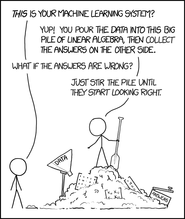
Again like in all the two-by-twos that I produce (and there are many, though this is arguably the most famous one), the problem is where you take people from one side and put them in a situation from the other side.

If you come from a background where you’ve mostly dealt with datasets where each individual variable is meaningless, but there is information in the collective, you are likely to “stir the pile” rather than using intuition to build better models.

If you are used to dealing with datasets with “meaning”, where variables hold the information, you might waste time doing your jiggery-pokery when you should be looking to apply models that get information in the collective.

The problem is this is a rather esoteric classification, so there is plenty of chance for people to be thrown into the wrong end.

Yet another way of classifying data scientists

There are many axes along which we can classify data scientists.

We can classify based on the primary specialty, in terms “analytics”, “business intelligence” and “machine learning”. We can classify based on domain, into “financial data scientists” and “retail data scientists” and “industrial data scientists”. We can classify by the choice of primary software tool, into “R data scientists” and “Python data scientists” and “SAS data scientists”. We can also classify by expertise, such as “deep learning” and “statistics” and “stochastic calculus”. The axes are endless.

Here is my not-so-humble attempt to contribute yet another such axis based on my observations in the industry – “technology facing” and “business facing” data scientists.

Technology facing data scientists put the software first. You’ll see them building pipelines, making sure their solutions can be easily integrated into the software stack, and worrying about how quickly their analysis can run. They will spend a lot of time on data engineering and infrastructure works, and their first concern when designing a solution is that it should be easy to implement. They are highly process oriented and not so fond of hacks.

Business facing data scientists, on the other hand, are primarily concerned with insights, and don’t care much about technological niceties. The technological feasibility and ease of implementation of a solution is an afterthought. Their data is messy, and the process is not easily repeatable (might even involve some manual processes). But they make sure that the insights they draw can be easily understood by a human, and invest time and effort in communication and visualisation. They might even build tools to help the business side of the organisation understand what is happening in the model.

This distinction is actually unsurprising if you look at who the primary clients of these respective types are. The business facing data scientists are more likely to be employed in generating insights, and building models to try and understand what is happening. The technology-facing data scientists will have spent most of their careers building production systems, and are thus very well acquainted with the software engineering process.

It is important, however, to recognise this distinction, and employ the data scientists as per their specialisation. A technology-facing data scientist in a business-facing role might be seen as spending way too much effort in getting the technology right, and doing her own thing while being unmindful of the business clients. A business-facing data scientist in a technology facing role will end up producing messy solutions that may be insightful, but will be a nightmare to implement.

This was first posted on LinkedIn

Stocks and flows

One common mistake even a lot of experienced analysts make is comparing stocks to flows. Recently, for example, Apple’s trillion dollar valuation was compared to countries’ GDP. A few years back, an article compared the quantum of bad loans in Indian banks to the country’s GDP. Following an IPL auction a few years back, a newspaper compared the salary of a player the market cap of some companies (paywalled).

The simplest way to reason why these comparisons don’t make sense is that they are comparing variables that have different dimensionality. Stock variables are usually measured in dollars (or pounds or euros or whatever), while flows are usually measured in terms of currency per unit time (dollars per year, for example).

So to take some simple examples, your salary might be $100,000 per year. The current value of your stock portfolio might be $10,246. India’s GDP is 2 trillion dollars per year.  Liverpool FC paid £67 million to buy out Alisson’s contract at AS Roma, and will pay him a salary of about £77,000 per week. Apple’s market capitalisation is 1.05 trillion dollars, and its sales as per the latest financials is 229 billion dollars per year.

Get the drift? The simplest way to avoid confusing stocks and flows is to be explicit about the dimensionality of the quantity being compared – flows have a “per unit time” suffixed to their dimensions.

Following the news of Apple’s market cap hitting a trillion dollars, I put out a tweet about the fallacy of comparing it to the GDP of the United States.

A lot of the questions that followed came from stock market analysts, who are used to looking at companies in terms of financial ratios, most of which involve both stocks and flows. They argued that because these ratios are well-established, it is legitimate to compare stocks to flows.

For example, we get the Price to Earnings ratio by dividing a company’s stock price (a stock) by the company’s annual earnings per share (a flow). The asset turnover ratio is derived by dividing the annual revenues (a flow) by the amount of assets (a stock). In fact, barring simple ratios such as gross margin, most ratios in financial analysis involve dividing a stock by a flow or the other way round.

To put it simply, financial ratios are not a case of comparing stocks to flows because ratios by themselves don’t mean a thing, and their meaning is derived from comparing them to similar ratios from other companies or geographies or other points in time.

A price to earnings ratio is simply the ratio of price per share to (annual) earnings per share, and has the dimension of “years”. When we compute the P/E ratio, we are not comparing price to earnings, since that would be nonsensical (they have different dimensions). We are dividing one by the other and comparing the ratio itself to historic or global benchmarks.

The reason a company with a P/E ratio of 25 (for example) is seen as being overvalued is because this value lies at the upper end of the distribution of historical P/E ratios. So we are comparing one ratio to the other (with both having the same dimension).

In conclusion, when you take the ratio of one quantity to another, you are just computing a new quantity – you are not comparing the numerator to the denominator. And when you compare quantities, always make sure that you are being dimensionally consistent.


Why AI will always be biased

Out on Marginal Revolution, Alex Tabarrok has an excellent post on why “sexism and racism will never diminish“, even when people on the whole become less sexist and racist. The basic idea is that there is always a frontier – even when we all become less sexist or racist, there will be people who will  be more sexist or racist than the others and they will get called out as extremists.

To quote a paper that Tabarrok has quoted (I would’ve used a double block-quote for this if WordPress allowed it):

…When blue dots became rare, purple dots began to look blue; when threatening faces became rare, neutral faces began to appear threatening; and when unethical research proposals became rare, ambiguous research proposals began to seem unethical. This happened even when the change in the prevalence of instances was abrupt, even when participants were explicitly told that the prevalence of instances would change, and even when participants were instructed and paid to ignore these changes.

Elsewhere, Kaiser Fung has a nice post on some of his learnings from a recent conference on Artificial Intelligence that he attended. The entire post is good, and I’ll probably comment on it in detail in my next newsletter, but there is one part that reminded me of Tabarrok’s post – on bias in AI.

Quoting Fung (no, this is not a two-level quote. it’s from his blog post):

Another moment of the day is when one speaker turned to the conference organizer and said “It’s become obvious that we need to have a bias seminar. Have a single day focused on talking about bias in AI.” That was his reaction to yet another question from the audience about “how to eliminate bias from AI”.

As a statistician, I was curious to hear of the earnest belief that bias can be eliminated from AI. Food for thought: let’s say an algorithm is found to use race as a predictor and therefore it is racially biased. On discovering this bias, you remove the race data from the equation. But if you look at the differential impact on racial groups, it will still exhibit bias. That’s because most useful variables – like income, education, occupation, religion, what you do, who you know – are correlated with race.

This is exactly like what Tabarrok mentioned about humans being extremist in whatever way. You take out the most obvious biases, and the next level of biases will stand out. And so on ad infinatum.

Beer and diapers: Netflix edition

When we started using Netflix last May, we created three personas for the three of us in the family – “Karthik”, “Priyanka” and “Berry”. At that time we didn’t realise that there was already a pre-created “kids” (subsequently renamed “children” – don’t know why that happened) persona there.

So while Priyanka and I mostly use our respective personas to consume Netflix (our interests in terms of video content hardly intersect), Berry uses both her profile and the kids profile for her stuff (of course, she’s too young to put it on herself. We do it for her). So over the year, the “Berry” profile has been mostly used to play Peppa Pig, and the occasional wildlife documentary.

Which is why we were shocked the other day to find that “Real life wife swap” had been recommended on her account. Yes, you read that right. We muttered a word of abuse about Netflix’s machine learning algorithms and since then have only used the “kids” profile to play Berry’s stuff.

Since then I’ve been wondering what made Netflix recommend “real life wife swap” to Berry. Surely, it would have been clear to Netflix that while it wasn’t officially classified as one, the Berry persona was a kid’s account? And even if it didn’t, didn’t the fact that the account was used for watching kids’ stuff lead the collaborative filtering algorithms at Netflix to recommend more kids’ stuff? I’ve come up with various hypotheses.

Since I’m not Netflix, and I don’t have their data, I can’t test it, but my favourite hypothesis so far involves what is possibly the most commonly cited example in retail analytics – “beer and diapers“. In this most-likely-apocryphal story, a supermarket chain discovered that beer and diapers were highly likely to appear together in shopping baskets. Correlation led to causation and a hypothesis was made that this was the result of tired fathers buying beer on their diaper shopping trips.

So the Netflix version of beer-and-diapers, which is my hypothesis, goes like this. Harrowed parents are pestered by their kids to play Peppa Pig and other kiddie stuff. The parents are so stressed that they don’t switch to the kid’s persona, and instead play Peppa Pig or whatever from their own accounts. The kid is happy and soon goes to bed. And then the parent decides to unwind by watching some raunchy stuff like “real life wife swap”.

Repeat this story in enough families, and you have a strong enough pattern that accounts not explicitly classified as “kids/children” have strong activity of both kiddie stuff and adult content. And when you use an account not explicitly mentioned as “kids” to watch kiddie stuff, it gets matched to these accounts that have created the pattern – Netflix effectively assumes that watching kid stuff on an adult account indicates that the same account is used to watch adult content as well. And so serves it to Berry!

Machine learning algorithms basically work on identifying patterns in data, and then fitting these patterns on hitherto unseen data. Sometimes the patterns make sense – like Google Photos identifying you even in your kiddie pics. Other times, the patterns are offensive – like the time Google Photos classified a black woman as a “gorilla“.

Thus what is necessary is some level of human oversight, to make sure that the patterns the machine has identified makes some sort of sense (machine learning purists say this is against the spirit of machine learning, since one of the purposes of machine learning is to discover patterns not perceptible to humans).

That kind of oversight at Netflix would have suggested that you can’t tag a profile to a “kiddie content AND adult content” category if the profile has been used to watch ONLY kiddie content (or ONLY adult content). And that kind of oversight would have also led Netflix to investigate issues of users using “general” account for their kids, and coming up with an algorithm to classify such accounts as kids’ accounts, and serve only kids’ content there.

It seems, though, that algorithms run supreme at Netflix, and so my baby daughter gets served “real life wife swap”. Again, this is all a hypothesis (real life wife swap being recommended is a fact, of course)!

Stirring the pile efficiently

Warning: This is a technical post, and involves some code, etc. 

As I’ve ranted a fair bit on this blog over the last year, a lot of “machine learning” in the industry can be described as “stirring the pile”. Regular readers of this blog will be familiar with this image from XKCD by now:

Source: https://xkcd.com/1838/

Basically people simply take datasets and apply all the machine learning techniques they have heard of (implementation is damn easy – scikit learn allows you to implement just about any model in three similar looking lines of code; See my code here to see how similar the implementation is).

So I thought I’ll help these pile-stirrers by giving some hints of what method to use for different kinds of data. I’ve over-simplified stuff, and so assume that:

  1. There are two predictor variables X and Y. The predicted variable “Z” is binary.
  2. X and Y are each drawn from a standard normal distribution.
  3. The predicted variable Z is “clean” – there is a region in the X-Y plane where Z is always “true” and another region where Z is always “false”
  4. So the idea is to see which machine learning techniques are good at identifying which kind of geometrical figures.
  5. Everything is done “in-sample”. Given the nature of the data, it doesn’t matter if we do it in-sample or out-of-sample.

For those that understand Python (and every pile-stirrer worth his salt is excellent at Python), I’ve put my code in a nice Jupyter Notebook, which can be found here.

So this is what the output looks like. The top row shows the “true values” of Z. Then we have a row for each of the techniques we’ve used, which shows how well these techniques can identify the pattern given in the top row (click on the image for full size).

As you can see, I’ve chosen some common geometrical shapes and seen which methods are good at identifying those. A few pertinent observations:

  1. Logistic regression and linear SVM are broadly similar, and both are shit for this kind of dataset. Being linear models, they fail to deal with non-linear patterns
  2. SVM with RBF kernel is better, but it fails when there are multiple “true regions” in the dataset. At least it’s good at figuring out some non-linear patterns. However, it can’t figure out the triangle or square – it draws curves around them, instead.
  3. Naive Bayesian (I’ve never understood this even though I’m pretty good at Bayesian statistics, but I understand this is a commonly used technique; and I’ve used default parameters so not sure how it is “Bayesian” even) can identify some stuff but does badly when there are disjoint regions where Z is true.
  4. Ensemble methods such as Random Forests and Gradient Boosting do rather well on all the given inputs. They do well for both polygons and curves. Elsewhere, Ada Boost mostly does well but trips up on the hyperbola.
  5. For some reason, Lasso fails to give an output (in the true spirit of pile-stirring, I didn’t explore why). Ridge is again a regression method and so does badly on this non-linear dataset
  6. Neural Networks (Multi Layer Perceptron to be precise) does reasonably well, but can’t figure out the sharp edges of the polygons.
  7. Decision trees again do rather well. I’m pleasantly surprised that they pick up and classify the disjoint sets (multi-circle and hyperbola) correctly. Maybe it’s the way scikit learn implements them?

Of course, the datasets that one comes across in real life are never such simple geometrical figures, but I hope that this set can give you some idea on what techniques to use where.

At least I hope that this makes you think about the suitability of different techniques for the data rather than simply applying all the techniques you know and then picking the one that performs best on your given training and test data.

That would count as nothing different from p-hacking, and there’s an XKCD for that as well!

Source: https://xkcd.com/882/

Astrology and Data Science

The discussion goes back some 6 years, when I’d first started setting up my data and management consultancy practice. Since I’d freshly quit my job to set up the said practice, I had plenty of time on my hands, and the wife suggested that I spend some of that time learning astrology.

Considering that I’ve never been remotely religious or superstitious, I found this suggestion preposterous (I had a funny upbringing in the matter of religion – my mother was insanely religious (including following a certain Baba), and my father was insanely rationalist, and I kept getting pulled in both directions).

Now, the wife has some (indirect) background in astrology. One of her aunts is an astrologer, and specialises in something called “prashNa shaastra“, where the prediction is made based on the time at which the client asks the astrologer a question. My wife believes this has resulted in largely correct predictions (though I suspect a strong dose of confirmation bias there), and (very strangely to me) seems to believe in the stuff.

“What’s the use of studying astrology if I don’t believe in it one bit”, I asked. “Astrology is very mathematical, and you are very good at mathematics. So you’ll enjoy it a lot”, she countered, sidestepping the question.

We went off into a long discussion on the origins of astrology, and how it resulted in early developments in astronomy (necessary in order to precisely determine the position of planets), and so on. The discussion got involved, and involved many digressions, as discussions of this sort might entail. And as you might expect with such discussions, my wife threw a curveball, “You know, you say you’re building a business based on data analysis. Isn’t data analysis just like astrology?”

I was stumped (ok I know I’m mixing metaphors here), and that had ended the discussion then.

Until I decided to bring it up recently. As it turns out, once again (after a brief hiatus when I decided I’ll do a job) I’m in process of setting up a data and management consulting business. The difference is this time I’m in London, and that “data science” is a thing (it wasn’t in 2011). And over the last year or so I’ve been kinda disappointed to see what goes on in the name of “data science” around me.

This XKCD cartoon (which I’ve shared here several times) encapsulates it very well. People literally “pour data into a machine learning system” and then “stir the pile” hoping for the results.

Source: https://xkcd.com/1838/

In the process of applying fairly complex “machine learning” algorithms, I’ve seen people not really bother about whether the analysis makes intuitive sense, or if there is “physical meaning” in what the analysis says, or if the correlations actually determine causation. It’s blind application of “run the data through a bunch of scikit learn models and accept the output”.

And this is exactly how astrology works. There are a bunch of predictor variables (position of different “planets” in various parts of the “sky”). There is the observed variable (whether some disaster happened or not, basically), which is nicely in binary format. And then some of our ancients did some data analysis on this, trying to identify combinations of predictors that predicted the output (unfortunately they didn’t have the power of statistics or computers, so in that sense the models were limited). And then they simply accepted the outputs, without challenging why it makes sense that the position of Jupiter at the time of wedding affects how your marriage will go.

So I brought up the topic of astrology and data science again recently, saying “OK after careful analysis I admit that astrology is the oldest form of data science”. “That’s not what I said”, the wife countered. “I said that data science is new age astrology, and not the other way round”.

It’s hard to argue with that!

Ratings revisited

Sometimes I get a bit narcissistic, and check how my book is doing. I log on to the seller portal to see how many copies have been sold. I go to the Amazon page and see what are the other books that people who have bought my book are buying (on the US store it’s Ray Dalio’s Principles, as of now. On the UK and India stores, Sidin’s Bombay Fever is the beer to my book’s diapers).

And then I check if there are new reviews of my book. When friends write them, they notify me, so it’s easy to track. What I discover when I visit my Amazon page are the reviews written by people I don’t know. And so far, most of them have been good.

So today was one of those narcissistic days, and I was initially a bit disappointed to see a new four-star review. I started wondering what this person found wrong with my book. And then I read through the review and found it to be wholly positive.

A quick conversation with the wife followed, and she pointed out that this reviewer perhaps reserves five stars for the exceptional. And then my mind went back to this topic that I’d blogged about way back in 2015 – about rating systems.

The “4.8” score that Amazon gives as an average of all the ratings on my book so far is a rather crude measure – since one reviewer’s 4* rating might differ significantly from another reviewer’s.

For example, my “default rating” for a book might be 5/5, with 4/5 reserved for books I don’t like and 3/5 for atrocious books. On the other hand, you might use the “full scale” and use 3/5 as your average rating, giving 4 for books you really like and very rarely giving a 5.

By simply taking an arithmetic average of ratings, it is possible to overstate the quality of a product that has for whatever reason been rated mostly by people with high default ratings (such a correlation is plausible). Similarly a low average rating for a product might mask the fact that it was rated by people who inherently give low ratings.

As I argue in the penultimate chapter of my book (or maybe the chapter before that – it’s been a while since I finished it), one way that platforms foster transactions is by increasing information flow between the buyer and the seller (this is one thing I’ve gotten good at – plugging my book’s name in random sentences), and one way to do this is by sharing reviews and ratings.

From this perspective, for a platform’s judgment on a product or seller (usually it’s the seller, but for products such as AirBnb, information about buyers also matters) to be credible, it is important that they be aggregated in the right manner.

One way to do this is to use some kind of a Z-score (relative to other ratings that the rater has given) and then come up with a normalised rating. But then this needs to be readjusted for the quality of the other items that this rater has rated. So you can think of some kind of a Singular Value Decomposition you can perform on ratings to find out the “true value” of a product (ok this is an achievement – using a linear algebra reference given how badly I suck in the topic).

I mean – it need not be THAT complicated, but the basic point is that it is important that platforms aggregate ratings in the right manner in order to convey accurate information about counterparties.

The (missing) Desk Quants of Main Street

A long time ago, I’d written about my experience as a Quant at an investment bank, and about how banks like mine were sitting on a pile of risk that could blow up any time soon.

There were two problems as I had documented then. Firstly, most quants I interacted with seemed to be solving maths problems rather than finance problems, not bothering if their models would stand the test of markets. Secondly, there was an element of groupthink, as quant teams were largely homogeneous and it was hard to progress while holding contrarian views.

Six years on, there has been no blowup, and in some sense banks are actually doing well (I mean, they’ve declined compared to the time just before the 2008 financial crisis but haven’t done that badly). There have been no real quant disasters (yes I know the Gaussian Copula gained infamy during the 2008 crisis, but I’m talking about a period after that crisis).

There can be many explanations regarding how banks have not had any quant blow-ups despite quants solving for math problems and all thinking alike, but the one I’m partial to is the presence of a “middle layer”.

Most of the quants I interacted with were “core” in the sense that they were not attached to any sales or trading desks. Banks also typically had a large cadre of “desk quants” who are directly associated with trading teams, and who build models and help with day-to-day risk management, pricing, etc.

Since these desk quants work closely with the business, they turn out to be much more pragmatic than the core quants – they have a good understanding of the market and use the models more as guiding principles than as rules. On the other hand, they bring the benefits of quantitative models (and work of the core quants) into day-to-day business.

Back during the financial crisis, I’d jokingly predicted that other industries should hire quants who were now surplus to Wall Street. Around the same time, DJ Patil et al came up with the concept of the “data scientist” and called it the “sexiest job of the 21st century”.

And so other industries started getting their own share of quants, or “data scientists” as they were now called. Nowadays its fashionable even for small companies for whom data is not critical for business to have a data science team. Being in this profession now (I loathe calling myself a “data scientist” – prefer to say “quant” or “analytics”), I’ve come across quite a few of those.

The problem I see with “data science” on “Main Street” (this phrase gained currency during the financial crisis as the opposite of Wall Street, in that it referred to “normal” businesses) is that it lacks the cadre of desk quants. Most data scientists are highly technical people who don’t necessarily have an understanding of the business they operate in.

Thanks to that, what I’ve noticed is that in most cases there is a chasm between the data scientists and the business, since they are unable to talk in a common language. As I’m prone to saying, this can go two ways – the business guys can either assume that the data science guys are geniuses and take their word for the gospel, or the business guys can totally disregard the data scientists as people who do some esoteric math and don’t really understand the world. In either case, value added is suboptimal.

It is not hard to understand why “Main Street” doesn’t have a cadre of desk quants – it’s because of the way the data science industry has evolved. Quant at investment banks has evolved over a long period of time – the Black-Scholes equation was proposed in the early 1970s. So the quants were first recruited to directly work with the traders, and core quants (at the banks that have them) were a later addition when banks realised that some quant functions could be centralised.

On the other hand, the whole “data science” growth has been rather sudden. The volume of data, cheap incrementally available cloud storage, easy processing and the popularity of the phrase “data science” have all increased well-at-a-faster rate in the last decade or so, and so companies have scrambled to set up data teams. There has simply been no time to train people who get both the business and data – and the data scientists exist like addendums that are either worshipped or ignored.