Smashing the Law of Conservation of H

A decade and half ago, Ravikiran Rao came up with what he called the “law of conservation of H“. The concept has to do with the South Indian practice of adding a “H” to denote a soft consonant, a practice not shared by North Indians (Karthik instead of Kartik for example). This practice, Ravikiran claims, is balanced by the “South Indian” practice of using “S” instead of “Sh”, because of which the number of Hs in a name is conserved.

Ravikiran writes:

The Law of conservation of H states that the total number of H’s in the universe will be conserved. So the extra H’s that are added when Southies have to write names like Sunitha and Savitha are taken from the words Sasi and Sri Sri Ravisankar, thus maintaining a balance in the language.

Using data from the Bangalore first names data set (warning: very large file), it is clear that this theory doesn’t hold water, in Bangalore at least. For what the data shows is that not only do Bangaloreans love the “th” and “dh” for the soft T and D, they also use “sh” to mean “sh” rather than use “s” instead.

The most commonly cited examples of LoCoH are Swetha/Shweta and Sruthi/Shruti. In both cases, the former is the supposed “South Indian” spelling (with th for the soft T, and S instead of sh), while the latter is the “North Indian” spelling. As it turns out, in Bangalore, both these combinations are rather unpopular. Instead, it seems like if Bangaloreans can add a H to their name, they do. This table shows the number of people in Bangalore with different spellings for Shwetha and Shruthi (now I’m using the dominant Bangalorean spellings).

As you can see, Shwetha and Shruthi are miles ahead of any of the alternate ways in which the names can be spelt. And this heavy usage of H can be attributed to the way Kannada incorporates both Sanskrit and Dravidian history.

Kannada has a pretty large vocabulary of consonants. Every consonant has both the aspirated and unaspirated version, and voiced and unvoiced. There are three different S sounds (compared to Tamil which has none) and two Ls. And we need a way to transliterate each of them when writing in English. And while capitalising letters in the middle of a word (as per Harvard Kyoto convention) is not common practice, standard transliteration tries to differentiate as much as possible.

And so, since aspirated Tha and Dha aren’t that common in Kannada (except in the “Tha-Tha” symbols used by non-Kannadigas to show raised eyes), th and dh are used for the dental letters. And since Sh exists (and in two forms), there is no reason to substitute it with S (unlike Tamil). And so we have H everywhere.

Now, lest you were to think that I’m using just two names (Shwetha and Shruthi) to make my point, I dug through the names dataset to see how often names with interchangeable T and Th, and names with interchangeable S and Sh, appear in the Bangalore dataset. Here is a sample of both:

There are 13002 Karthiks registered to vote in Bangalore, but only 213 Kartiks. There are a hundred times as many Lathas as Latas. Shobha is far more common than Sobha, and Chandrashekhar much more common than Chandrasekhar.


So while other South Indians might conserve H, by not using them with S to compensate for using it with T and D, it doesn’t apply to Bangalore. Thinking about it, I wonder how a Kannadiga (Ravikiran) came up with this theory. Perhaps the fact that he has never lived in Karnataka explains it.

The Comeback of Lakshmi

A few months back I stumbled upon this dataset of all voters registered in Bangalore. A quick scraping script followed by a run later, I had the names and addresses and voter IDs of all voters registered to vote in Bangalore in the state assembly elections held this way.

As you can imagine, this is a fantastic dataset on which we can do the proverbial “gymnastics”. To start with, I’m using it to analyse names in the city, something like what Hariba did with Delhi names. I’ll start by looking at the most common names, and by age.

Now, extracting first names from a dataset of mostly south indian names, since South Indians are quite likely to use initials, and place them before their given names (for example, when in India, I most commonly write my name as “S Karthik”). I decided to treat all words of length 1 or 2 as initials (thus missing out on the “Om”s), and assume that the first word in the name of length 3 or greater is the given name (again ignoring those who put their family names first, or those that have expanded initials in the voter set).

The most common male first name in Bangalore, not surprisingly, is Mohammed, borne by 1.5% of all male registered voters in the city. This is followed by Syed, Venkatesh, Ramesh and Suresh. You might be surprised that Manjunath doesn’t make the list. This is a quirk of the way I’ve analysed the data – I’ve taken spellings as given and not tried to group names by alternate spellings.

And as it happens, Manjunatha is in sixth place, while Manjunath is in 8th, and if we were to consider the two as the same name, they would comfortably outnumber the Mohammeds! So the “Uber driver Manjunath(a)” stereotype is fairly well-founded.

Coming to the women, the most common name is Lakshmi, with about 1.55% of all women registered to vote having that name. Lakshmi is closely followed by Manjula (1.5%), with Geetha, Lakshmamma and Jayamma coming some way behind (all less than 1%) but taking the next three spots.

Where it gets interesting is if we were to look at the most common first name by age – see these tables.


Among men, it’s interesting to note that among the younger age group (18-39, with exception of 35) and older age group (57+), Muslim names are the most common, while the intermediate range of 40-56 seeing Hindu names such as Venkatesh and Ramesh dominating (if we assume Manjunath and Manjunatha are the same, the combined name comes top in the entire 26-42 age group).

I find the pattern of most common women’s names more interesting. It is interesting to note that the -amma suffix seems to have been done away with over the years (suffixes will be analysed in a separate post), with Lakshmamma turning into Lakshmi, for example.

It is also interesting to note that for a long period of time (women currently aged 30-43), Lakshmi went out of fashion, with Manjula taking over as the most common name! And then the trend reversed, as we see that the most common name among 24-29 year old women in Lakshmi again! And that seems to have gone out of fashion once again, with “modern names” such as Divya, Kavya and Pooja taking over! Check out these graphs to see the trends.

(I’ve assumed Manjunath and Manjunatha are the same for this graph)

So what explains Manjunath and Manjula being so incredibly popular in a certain age range, but quickly falling away on both sides? Maybe there was a lot of fog (manju) over Bangalore for a few years? 😛

Human, Animal and Machine Intelligence

Earlier this week I started watching this series on Netflix called “Terrorism Close Calls“. Each episode is about an instance of attempted terrorism that has been foiled in the last 2 decades. For example, there is one example of the plot to bomb a set of transatlantic flights from London to North America in 2006 (a consequence of which is that liquids still aren’t allowed on board flights).

So the first episode of the series involves this Afghani guy who drives all the way from Colorado to New York to place a series of bombs in the latter’s subways (metro train system). He is under surveillance through the length of his journey, and just as he is about to enter New York, he is stopped for what seems like a “routine drugs test”.

As the episode explains, “a set of dogs went around his car sniffing”, but “rather than being trained to sniff drugs” (as is routine in such a stop), “these dogs had been trained to sniff explosives”.

This little snippet got me thinking about how machines are “trained” to “learn”. At the most basic level, machine learning involves showing a large number of “positive cases” and “negative cases” based on which the program “learns” the differences between the positive and negative cases, and thus to identify the positive cases.

So if you want to built a system to identify cats in an image, you feed the machine a large number of images with cats in them, and a large(r) number of images without cats in them, each appropriately “labelled” (“cat” or “no cat”) and based on the differences, the system learns to identify cats.

Similarly, if you want to teach a system to detect cancers based on MRIs, you show it a set of MRIs that show malignant tumours, and another set of MRIs without malignant tumours, and sure enough the machine learns to distinguish between the two sets (you might have come across claims of “AI can cure cancer”. This is how it does it).

However, AI can sometimes go wrong by learning the wrong things. For example, an algorithm trained to recognise sheep started classifying grass as “sheep” (since most of the positive training samples had sheep in meadows). Another system went crazy in its labelling when an unexpected object (an elephant in a drawing room) was present in the picture.

While machines learn through lots of positive and negative examples, that is not how humans learn, as I’ve been observing as my daughter grows up. When she was very little, we got her a book with one photo each of 100 different animals. And we would sit with her every day pointing at each picture and telling her what each was.

Soon enough, she could recognise cats and dogs and elephants and tigers. All by means of being “trained on” one image of each such animal. Soon enough, she could recognise hitherto unseen pictures of cats and dogs (and elephants and tigers). And then recognise dogs (as dogs) as they passed her on the street. What absolutely astounded me was that she managed to correctly recognise a cartoon cat, when all she had seen thus far were “real cats”.

So where do animals stand, in this spectrum of human to machine learning? Do they recognise from positive examples only (like humans do)? Or do they learn from a combination of positive and negative examples (like machines)? One thing that limits the positive-only learning for animals is the limited range of their communication.

What drives my curiosity is that they get trained for specific things – that you have dogs to identify drugs and dogs to identify explosives. You don’t usually have dogs that can recognise both (specialisation is for insects, as they say – or maybe it’s for all non-human animals).

My suspicion (having never had a pet) is that the way animals learn is closer to how humans learn – based on a large number of positive examples, rather than as the difference between positive and negative examples. Just that the limit of the animal’s communication being limited means that it is hard to train them for more than one thing (or maybe there’s something to do with their mental bandwidth as well. I don’t know).

What do you think? Interestingly enough, there is a recent paper that talks about how many machine learning systems have “animal-like abilities” rather than coming close to human intelligence.

For millions of years, mankind lived, just like the animals.
And then something happened that unleashed the power of our imagination. We learned to talk
– Stephen Hawking, in the opening of a Roger Waters-less Pink Floyd’s Keep Talking

Single Malt Recommendation App

Life is too short to drink whisky you don’t like.

How often have you found yourself in a duty free shop in an airport, wondering which whisky to take back home? Unless you are a pro at this already, you might want something you haven’t tried before, but don’t want to end up buying something you may not like. The names are all grand, as Scottish names usually are. The region might offer some clue, but not so much.

So I started on this work a few years back, when I first discovered this whisky database. I had come up with a set of tables to recommend what whisky is similar to what, and which single malts are the “most unique”. Based on this, I discovered that I might like Ardbeg. And I ended up absolutely loving it.

And ever since, I’ve carried a couple of tables in my Evernote to make sure I have some recommendations handy when I’m at a whisky shop and need to make a decision. But then the tables are not user friendly, and don’t typically tell you what you should buy, and what your next choice should be and so on .

To make things more user-friendly, I have built this app where all you need to enter is your favourite set of single malts, and it gives you a list of other single malts that you might like.

The data set is the same. I once again use cosine similarity to find the similarity of different whiskies. Except that this time I take the average of your favourite whiskies, and then look for the whiskies that are closest to that.

In terms of technologies, I’ve used this R package called Shiny to build the app. It took not more than half an hour of programming effort to build, and most of that was in actually building the logic, not the UI stuff.

So take it for a spin, and let me know what you think.


I’m not a data scientist

After a little over four years of trying to ride a buzzword wave, I hereby formally cease to call myself a data scientist. There are some ongoing assignments where that term is used to refer to me, and that usage will continue, but going forward I’m not marketing myself as a “data scientist”, and will not use the phrase “data science” to describe my work.

The basic problem is that over time the term has come to mean something rather specific, and that doesn’t represent me and what I do at all. So why did I go through this long journey of calling myself a “data scientist”, trying to fit in in the “data science community” and now exiting?

It all started with a need to easily describe what I do.

To recall, my last proper full-time job was as a Quant at a leading investment bank, when I got this idea that rather than building obscure models for trading obscure corner cases, I might as well use use my model-building skills to solve “real problems” in other industries which were back then not as well served by quants.

So I started calling myself a “Quant consultant”, except that nobody really knew what “quant” meant. I got variously described as a “technologist” and a “statistician” and “data monkey” and what not, none of which really captured what I was actually doing – using data and building models to help companies improve their businesses.

And then “data science” happened. I forget where I first came across this term, but I had been primed for it by reading Hal Varian saying that the “sexiest job in the next ten years will be statisticians”. I must mention that I had never come across the original post by DJ Patil and Thomas Davenport (that introduces the term) until I looked for it for my newsletter last year.

All I saw was “data” and “science”. I used data in my work, and I tried to bring science into the way my clients thought. And by 2014, Data Science had started becoming a thing. And I decided to ride the wave.

Now, data science has always been what artificial intelligence pioneer Marvin Minsky called a “suitcase term” – words or phrases that mean different things to different people (I heard about the concept first from this brilliant article on the “seven deadly sins of AI predictions“).

For some people, as long as some data is involved, and you do something remotely scientific it is data science. For others, it is about the use of sophisticated methods on data in order to extract insights. Some others conflate data science with statistics. For some others, only “machine learning” (another suitcase term!) is data science. And in the job market, “data scientist” can sometimes be interpreted as “glorified Python programmer”.

And right from inception, there were the data science jokes, like this one:

It is pertinent to put a whole list of it here.

‘Data Scientist’ is a Data Analyst who lives in California”
“A data scientist is someone who is better at statistics than any software engineer and better at software engineering than any statistician.”
“A data scientist is a business analyst who lives in New York.”
“A data scientist is a statistician who lives in San Francisco.”
“Data Science is statistics on a Mac.”

I loved these jokes, and thought I had found this term that had rather accurately described me. Except that it didn’t.

The thing with suitcase terms is that they evolve over time, as they start getting used differentially in different contexts. And so it was with data science. Over time, it has been used in a dominant fashion by people who mean it in the “machine learning” sense of the term. In fact, in most circles, the defining features of data scientists is the ability to write code in python, and to use the scikit learn package – neither of which is my distinguishing feature.

While this dissociation with the phrase “data science” has been coming for a long time (especially after my disastrous experience in the London job market in 2017), the final triggers I guess were a series of posts I wrote on LinkedIn in August/September this year.

The good thing about writing is that it helps you clarify your mind, and as I ranted about what I think data science should be, I realised over time that what I have in mind as “data science” is very different from what the broad market has in mind as “data science”. As per the market definition, just doing science with data isn’t data science any more – instead it is defined rather narrowly as a part of the software engineering stack where problems are solved based on building machine learning models that take data as input.

So it is prudent that I stop using the phrase “data science” and “data scientist” to describe myself and the work that I do.

PS: My newsletter will continue to be called “the art of data science”. The name gets “grandfathered” along with other ongoing assignments where I use the term “data science”.

Attractive graphics without chart junk

A picture is worth a thousand words, but ten pictures are worth much less than ten thousand words

One of the most common problems with visualisation, especially in the media, is that of “chart junk”. Graphics designers working for newspapers and television channels like to decorate their graphs, to make it more visually appealing. And in most cases, this results in the information in the graphs getting obfuscated and harder to read.

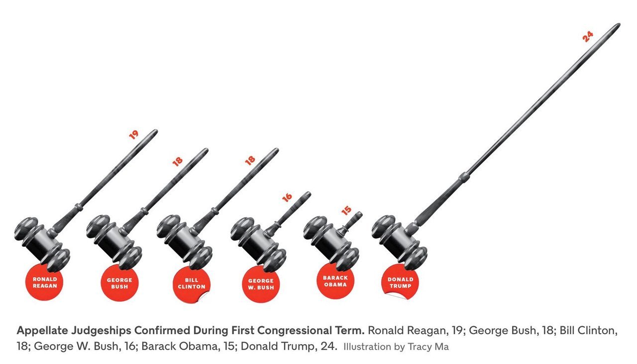
The commonest form this takes is in the replacement of bars in a simple bar graph with weird objects. When you want to show number of people in something, you show little people, sometimes half shaded out. Sometimes instead of having multiple people, the information is conveyed in the size of the people, or objects  (like below). 

Then, instead of using simple bar graphs, designers use more complicated structures such as 3-dimensional bar graphs, or cone graphs or doughnut charts (I’m sure I’ve abused some of them on my tumblr). All of them are visually appealing and can draw attention of readers or viewers. Most of them come at the cost of not really conveying the information!

I’ve spoken to a few professional graphic designers and asked them why they make poor visualisation choices even when the amount of information the graphics convey goes down. The most common answer is novelty – “a page full of bars can be boring for the reader”. So they try to spice it up by replacing bars with other items that “look different”.

Putting it another way, the challenge is two-fold – first you need to get your readers to look at your graph (here is where novelty helps). And once you’ve got them to look at it, you need to convey information to them. And the two objectives can sometimes collide, with the best looking graphs not being the ones that convey the best information. And this combination of looking good and being effective is possibly what turns visualisation into an art.

My way of dealing with this has been to play around with the non-essential bits of the visualisation. Using colours judiciously, for example. Using catchy headlines. Adding decorations outside of the graphs.

Another lesson I’ve learnt over time is to not have too many graphics in the same piece. Some of this has come due to pushback from my editors at Mint, who have frequently asked me to cut the number of graphs for space reasons. And some of this is something I’ve learnt as a reader.

The problem with visualisations is that while they can communicate a lot of information, they can break the flow in reading. So having too many visualisations in the piece means that you break the reader’s flow too many times, and maybe even risk your article looking academic. Cutting visualisations forces you to be concise in your use of pictures, and you leave in only the ones that are most important to your story.

There is one other upshot out of cutting the number of visualisations – when you have one bar graph and one line graph, you can leave them as they are and not morph or “decorate” them just for the heck of it!

PS: Even experienced visualisers are not immune to not having their graphics mangled by editors. Check out this tweet storm by Edward Tufte, the guru of visualisation.

The missing middle in data science

Over a year back, when I had just moved to London and was job-hunting, I was getting frustrated by the fact that potential employers didn’t recognise my combination of skills of wrangling data and analysing businesses. A few saw me purely as a business guy, and most saw me purely as a data guy, trying to slot me into machine learning roles I was thoroughly unsuited for.

Around this time, I happened to mention to my wife about this lack of fit, and she had then remarked that the reason companies either want pure business people or pure data people is that you can’t scale a business with people with a unique combination of skills. “There are possibly very few people with your combination of skills”, she had said, and hence companies had gotten around the problem by getting some very good business people and some very good data people, and hope that they can add value together.

More recently, I was talking to her about some of the problems that she was dealing with at work, and recognised one of them as being similar to what I had solved for a client a few years ago. I quickly took her through the fundamentals of K-means clustering, and showed her how to implement it in R (and in the process, taught her the basics of R). As it had with my client many years ago, clustering did its magic, and the results were literally there to see, the business problem solved. My wife, however, was unimpressed. “This requires too much analytical work on my part”, she said, adding that “If I have to do with this level of analytical work, I won’t have enough time to execute my managerial duties”.

This made me think about the (yet unanswered) question of who should be solving this kind of a problem – to take a business problem, recognise it can be solved using data, figuring out the right technique to apply to it, and then communicating the results in a way that the business can easily understand. And this was a one-time problem, not something you would need to solve repeatedly, and so without the requirement to set up a pipeline and data engineering and IT infrastructure around it.

I admit this is just one data point (my wife), but based on observations from elsewhere, managers are usually loathe to get their hands dirty with data, beyond perhaps doing some basic MS Excel work. Data science specialists, on the other hand, will find it hard to quickly get intuition for a one-time problem, get data in a “dirty” manner, and then apply the right technique to solving it, and communicate the results in a business-friendly manner. Moreover, data scientists are highly likely to be involved in regular repeatable activities, making it an organisational nightmare to “lease” them for such one-time efforts.

This is what I call as the “missing middle problem” in data science. Problems whose solutions will without doubt add value to the business, but which most businesses are unable to address because of a lack of adequate skillset in solving the issue; and whose one-time nature makes it difficult for businesses to dedicate permanent resources to solve.

I guess so far this post has all the makings of a sales pitch, so let me turn it into one – this is precisely the kind of problem that my company Bespoke Data Insights is geared to solving. We specialise in solving problems that lie at the cusp of business and data. We provide end-to-end quantitative solutions for typically one-time business problems.

We come in, understand your business needs, and use a hypothesis-driven approach to model the problem in data terms. We select methods that in our opinion are best suited for the precise problem, not hesitating to build our own models if necessary (hence the Bespoke in the name). And finally, we synthesise the analysis in the form of recommendations that any business person can easily digest and action on.

So – if you’re facing a business problem where you think data might help, but don’t know how to proceed; or if you are curious about all this talk about AI and ML and data science and all that, and want to include it in your business; or you want your business managers to figure out how to use the data  teams better, hire us.

Statistics and machine learning approaches

A couple of years back, I was part of a team that delivered a workshop in machine learning. Given my background, I had been asked to do a half-day session on Regression, and was told that the standard software package being used was the scikit-learn package in python.

Both the programming language and the package were new to me, so I dug around a few days before the workshop, trying to figure out regression. Despite my best efforts, I couldn’t locate how to find out the R^2. What some googling told me was surprising:

There exists no R type regression summary report in sklearn. The main reason is that sklearn is used for predictive modelling / machine learning and the evaluation criteria are based on performance on previously unseen data

As it happened, I requested the students at the workshop to install a package called statsmodels, which provides standard regression outputs. And then I proceeded to lecture to them on regression as I know it, including significance scores, p values, t statistics, multicollinearity and the likes. It was only much later was I to figure out that that is now how regression (and logistic regression) is done in the machine learning world.

In a statistical framework, the data sets in regression are typically “long” – you have a large number of data points, and a small number of variables. Putting it differently, we start off with a model with few degrees of freedom, and then “constrain” the variables with a large enough number of data points, so that if a signal exists, and it is in the right format (linear relationship and all that), we can pin it down effectively.

In a machine learning framework, it is common to run a regression where the number of data points is of the same order of magnitude as, or even smaller than the number of variables. Strictly speaking, such a problem is unbounded (there are too many degrees of freedom), and so regression is not well-defined. Instead, we rely upon “regularisation methods” to “tie down” the variables and (hopefully) produce a consistent solution.

Moreover, machine learning approaches are common to problems where individual predictor variables don’t have meaning. In this scenario, knowing whether a particular variable is significant or not is of no utility. Then, the signal in machine learning lies in the combination of variables, which means that multicollinearity (correlation between predictor variables) is not really a bad thing as it is in statistics. Variables not having meanings means that there are no correlations per se to be defined, and so machine learning models are harder to interpret, and are more likely to have hidden spurious correlations.

Also, when you have a small number of variables and a large number of data points, it is easy to get an “exact solution” for regression, which is what statistical methods use. In a machine learning framework with “wide” data, though, exact solutions are computationally infeasible, and so you need to use approximate algorithms such as gradient descent – which are common across ML techniques.

All in all, while statistics and machine learning might use techniques with the same name (“regression”, for example), they are both in theory and practice, very different ways to solve the problem. The important thing is to figure out the approach most suited for a particular problem, and use it accordingly.

Dam capacity

In Mint, Narayan Ramachandran has a nice op-ed on the issue of dam capacity and damn management in the wake of the floods in Kerala last year. In that, he writes:

For dams to do their jobs in extreme situations, they should have large unfilled capacity in their reservoirs when extreme events occur

Reading this piece reminded me of Benoit Mandelbrot’s The (Mis)Behaviour of Markets, and his description of the efforts of the colonial British government in Egypt in deciding the height of the Aswan dam. The problem with the Nile was “long range dependence” – the flow in the river in a year was positively correlated with the flow in the previous few years. This meant that there would be years of high flow followed by years of low flow.

The problem was solved by a British hydrologist Harold Edwin Hurst by looking at thousands of years of data of the flooding of the Nile (yes, this data was available), and there is a nice description of it in Mandelbrot’s book.

I had taken a few insights from this chapter for my own piece on long-range dependence in stock markets that I had written for Mint a few years back.

Coming back to Narayan’s piece, one problem is that in India we have an obsession with keeping dams filled up. In Karnataka, for example, every year during the monsoons, newspapers keep track of the level of water in the major reservoirs, expressing worry in case they’re not full enough. In that sense, I guess our dams haven’t been planned for long-range water sharing, and that has contributed to problems such as sudden water release.
Also not helping matters I guess is the fact that a lot of rivers flow across states, and the level of dams is a source of negotiation between states, and this leads to further keeping them small and ill-geared to long term water management.

Why data scientists should be comfortable with MS Excel

Most people who call themselves “data scientists” aren’t usually fond of MS Excel. It is slow and clunky, can only handle a million rows of data (and nearly crash your computer if you go anywhere close to that), and despite the best efforts of Visual Basic, is not very easy to program for doing repeatable tasks.

In fact, some data scientists may consider Excel to be “too downmarket” for them to use. At one firm I worked for, I had heard a rumour that using Excel for modelling was a fire-able offence, though I’m glad to report that I flouted this rule without much adverse effect. Yet, in my years as a “data science” and analytics consultant, and having done several modelling jobs before, I think Excel is an extremely necessary tool in a data scientist’s arsenal. There are several reasons for this.

The main one is communication. “Business types” love Excel – they use it for pretty much every official activity (I know of people who write documents in Excel). If you ask for a set of numbers, you are most likely to find it in an Excel sheet. I know of fairly large organisations which use Excel to store and transmit data (admittedly poor usage). And even non-quantitaive business types understand some of the basic quantitative functions thanks to Excel, such as joining (VLookup), pivoting, basic data cleaning (TRIM, VALUE, etc.), averaging, visualisation and sometimes even basic statistics such as correlation and regression.

One of the main problems that organisations face is lack of communication between data scientists and the business side (I mentioned this in a talk I gave last month: video here and slides here). Excel is an excellent middle ground, since it is reasonably quantitative and business people know how to use it.

In fact, in my consulting experience I’ve found that when working with clients, using Excel can make your client (usually a business person) feel more comfortable and involved in the analysis, speeding up the process and significantly improving collaboration. They’ll feel more empowered to intervene, which means they can add value, and they can feel especially happy if you occasionally let them enter some simple quantitative formulae.

The next advantage of Excel is that it puts the numbers out there. A long time back, when I was still doing full time jobs, I was asked to build a forecasting model (using a programming language) and couldn’t get it right for several months. And then on a whim I decided to use Excel, and when I saw the data in front of me, it was clear why the forecasts were so useless – because the data was so random.

Excel also allows you to quickly try things and iterate, again by putting the data and the analysis in front of you. Admittedly, the toolkit available is limited compared to what programming languages or statistical softwares can offer, but through clever usage (especially with Visual Basic), there is a lot you can achieve.

Then, Excel sometimes nudges you towards finding simple solutions. It is possible when you’re using a programming language to veer towards overly complicated solutions, and possibly use the proverbial nuclear weapon against the sparrow.

When I was working on the forecasting work a decade ago, I found that the forecasts would feed into a fairly complicated-looking model that had been developed over several years by several developers. On a whim, I decided to “do more” in Excel and managed to replicate the entire model in Excel (using VB and Solver). The people leading the product weren’t particularly happy, but using Excel was critical in ultimately moving to a simpler solution.

A similar thing occurred recently as well. I had been building a fairly complex optimisation model, which I tried replicating in Excel for communication purposes (so I could work on it together with the client). And it turned out there was a far simpler solution that I had missed all this time, and the simpler solution became apparent only because I used Excel.

I’m sure this is not an exhaustive list. So, if you’re a data scientist, you will do well to be at least conversant with Excel. I know it may only serve limited needs in terms of analysis, but the effort in learning  will get more than compensated for in the communication and collaboration and simplicity.

Tailpiece:
A long time ago, a co-worker passed by my desk and saw me work on Excel. He saw my spreadsheet and remarked, “oh, so many numbers! it must be very complicated” and went on his way. I don’t know if he is a data scientist now.