Covid-19 recoveries in Bangalore

Something seems off in terms of the Covid-19 statistics for Bangalore. The number of “active cases” just don’t seem to be going down in line with the drop in the number of new cases. It seems like we’re not counting “recoveries” like we used to.

Active covid-19 cases in Bangalore in the second wave

In terms of active cases, covid-19 cases in Bangalore peaked in the middle of May. And then active cases started dropping rapidly. It seemed (when I ran this analysis towards the end of June) that active cases would drop well below 50,000 in the middle of June. However, as the graph shows, that hasn’t happened. The reduction in active cases has come down to a trickle.

Now it might well be that the way down is more gradual than the way up, but the thing is that the drop in active cases doesn’t square at all with the number of daily cases.

One metric we can look at is – how many days back do we have to go (in terms of newly infected cases) to get the current number of active cases? This is not correct – it assumes that infection is “first in first out” – but a good enough assumption for our analysis.

I’m writing this on 20th of June. As of today, there are 71000 odd active cases in Bangalore. And we have to go back 26 days to total up 71000 NEW INFECTIONS (assuming none of these people have died). This means that the average recovery period is far more than 26 days.

It wasn’t like this. I graphed this (I’m apologising for using a weird metric here. I thought of dividing active cases by new cases but thought that’s less accurate than this).

At the beginning of June, the number of active cases was equal to the number of new cases in the preceding 18 days. And notice that through June that number has gone up steadily. For whatever reason, the number of days after which a patient is considered “recovered” has been going up. It seems like we’re not counting the recoveries like we used to earlier.

I don’t know why we are doing this.

For the record, if the number of active cases has continued to be in the range of the number of new cases in the preceding 18 days, then we would have about 35,000 active cases in Bangalore right now. That is half the official number of active cases right now.

Again – I’m indulging in curve-fitting of some kind. Just that the data doesn’t tally.

PS: All data in this post from the brilliant covid19india.org .

Launching: Data Chatter

A few weeks back I had mentioned here that I’m starting a podcast. And it is now ready for release. Listen to the trailer here:

It is a series of conversations about all things data. First episode will be out on Tuesday, and then weekly after that. I’ve already built up an inventory of seven episodes. So far I’ve recorded episodes about big data, business intelligence, visualisations, a lot of “domain-specific” analytics, and the history of analytics in India. And many more are to come.

Subscribe to the podcast to be able to listen to it whenever it comes out. It is available on all podcasting platforms. For some reason, Apple is not listed on the anchor site, but if you search for “Data Chatter” on Apple Podcasts, you should find it (I did).

And of course, feedback is welcome (you can just comment on this post). And please share this podcast with whoever else you think might like it.

Should this have been my SOP?

I was chatting with a friend yesterday about analytics and “data science” and machine learning and data engineering and all that, and he commented that in his opinion a lot of the work mostly involves gathering and cleaning the data, and that any “analytics” is mostly around averaging and the sort.

This reminded me of an old newsletter I’d written way back in January 2018, soon after I’d read Raphael Honigstein‘s Das Reboot. A short discussion ensued. I sent him the link to that newsletter. And having read the bit about Das Reboot (I was talking about how SAP had helped the German national team win the 2014 FIFA World Cup) and the subsequent section of the newsletter, my friend remarked that I could have used that newsletter edition as a “statement of purpose for my job hunt”.

Now that my job hunt is done, and I’m no more in the job market, I don’t need an SOP. However, for the purpose that I don’t forget this, and keep in mind the next time I’m applying for a job, I’m reproducing a part of that newsletter here. Even if you subscribed to that newsletter, I recommend that you read it again. It’s been a long time, and this is still relevant.

Das Reboot

This is not normally the kind of book you’d see being recommended in a Data Science newsletter, but I found enough in Raphael Honigstein’s book on the German football renaissance in the last 10 years for it to merit a mention here.

So the story goes that prior to the 2014 edition of the Indian Premier League (cricket), Kolkata Knight Riders had announced a partnership with tech giant SAP, and claimed that they would use “big data insights” from SAP’s HANA system to power their analytics. Back then, I’d scoffed, since I wasn’t sure if the amount of data that’s generated in all cricket matches till then wasn’t big enough to merit “big data analytics”.

As it happens, the Knight Riders duly won that edition of the IPL. Perhaps coincidentally, SAP entered into a partnership with another champion team that year – the German national men’s football team, and Honigstein dedicates a chapter of his book to this, and other, partnerships, and the role of analytics in helping the team’s victory in that year’s World Cup.

If you look past all the marketing spiel (“HANA”, “big data”, etc.) what SAP did was to group data, generate insights and present it to the players in an easily consumable format. So in the football case, they developed an app for players where they could see videos of specific opponents doing things. It made it easy for players to review certain kinds of their own mistakes. And so on. Nothing particularly fancy; simply simple data put together in a nice easy-to-consume format.

A couple of money quotes from the book. One on what makes for good analytics systems:

‘It’s not particularly clever,’ says McCormick, ‘but its ease of use made it an effective tool. We didn’t want to bombard coaches or players with numbers. We wanted them to be able to see, literally, whether the data supported their gut feelings and intuition. It was designed to add value for a coach or athlete who isn’t that interested in analytics otherwise. Big data needed to be turned into KPIs that made sense to non-analysts.’

And this one on how good analytics can sometimes invert hierarchies, and empower the people on the front to make their own good decisions rather than always depend on direction from the top:

In its user-friendliness, the technology reversed the traditional top-down flow of tactical information in a football team. Players would pass on their findings to Flick and Löw. Lahm and Mertesacker were also allowed to have some input into Siegenthaler’s and Clemens’ official pre-match briefing, bringing the players’ perspective – and a sense of what was truly relevant on the pitch – to the table.

A lot of business analytics is just about this – presenting the existing data in an easily consumable format. There might be some statistics or machine learning involved somewhere, but ultimately it’s about empowering the analysts and managers with the right kind of data and tools. And what SAP’s experience tells us is that it may not be that bad a thing to tack on some nice marketing on top!

Hiring data scientists

I normally don’t click through on articles in my LinkedIn feed, but this article about the churn in senior data scientists caught my eye enough for me to click through and read the whole thing. I must admit to some degree of confirmation bias – the article reflected my thoughts a fair bit.

Given this confirmation bias, I’ll spare you my commentary and simply put in a few quotes:

Many large companies have fallen into the trap that you need a PhD to do data science, you don’t.

Not to mention, I have yet to see a data science program I would personally endorse. It’s run by people who have never done the job of data science outside of a lab. That’s not what you want for your company.

Doing data science and managing data science are not the same. Just like being an engineer and a product manager are not the same. There is a lot of overlap but overlap does not equal sameness.

Most data scientists are just not ready to lead the teams. This is why the failure rate of data science teams is over 90% right now. Often companies put a strong technical person in charge when they really need a strong business person in charge. I call it a data strategist.

I have worked with companies that demand agile and scrum for data science and then see half their team walk in less than a year. You can’t tell a team they will solve a problem in two sprints. If they don’t’ have the data or tools it won’t happen.

I’ll end this blog post with what my friend had to say (yesterday) about what I’d written about how SAP helped the German National team. “This is what everyone needs to do first. (All that digital transformation everyone is working on should be this kind of work)”.

I agree with him on this.

How Python swallowed R

A week ago, I put a post on LinkedIn saying if someone else working in analytics / data science primarily uses R for their work, I would like to chat.

I got two responses, one of which was from a guy who strictly isn’t in analytics / data science, but needs to analyse large amounts of data for his work. I had a long chat with the other guy today.

Yesterday I put the same post on Twitter, and have got a few more responses from there. However, it is staggering. An overwhelming majority of data people who I know work in Python. One of the reasons I put these posts was to assure myself that I’m not alone in using R, though the response so far hasn’t given me too much of an assurance.

So why do most companies end up using Python for analytics, even when R is clearly better for things like data wrangling, reporting, visualisation, dashboarding, etc.? I have a few theories on this, and I think all of them come together to result in python having its “overwhelming marketshare” (at least among people I know).

Tech people clearly prefer python since it’s easier to integrate. So the tech leaders request the data science leaders to use Python, since it is much easier for the tech people. In a lot of organisations, data science reports into tech, so this request is honoured.

Even if it isn’t, if you recall, “data scientists” are generally tech facing rather than business facing. This means that the models they build need to be codified, and added to the company’s code base. This means necessarily working together with tech, and this means using a programming language that tech is comfortable with.

Then, this spills over. Usually, someone has the bright idea that the firm shouldn’t use two languages for what is essentially the same thing. And so the analytics people are also forced to use python for their analytics, even if it isn’t built for the purpose. And then it spreads.

Next is the “cool factor”. There is this impression that the more technical a solution is, the more superior it is, even if it has no direct business impact (an employer had once  told me, “I have raised money saying we are using machine learning. If our investors see the algorithms you’re proposing, they’ll want their money back”).

So a youngster getting into data wants to do “all the latest stuff”. This means machine learning. Deep learning. Reinforcement learning. And all that. There is an impression that this kind of work is “better work” compared to let’s say generating business insights using data. And in general, the packages for machine learning have traditionally been easier in Python than they are in R (though R is fast catching up, and in general python is far behind R when it comes to user friendliness).

Then, the growth in data and jobs associated with it such as machine learning or data engineering have meant that a lot of formerly tech people have got into data work. Python is fundamentally a programming language, with a package (pandas) added on to do data work. Techies find it far more intuitive than R, which is fundamentally a statistical software. On the other hand, people who are coming from a business / Excel background find it far more comfortable to use R. Python can be intimidating (I fall in this bucket).

So yeah – the tech integration, the number of tech people who are coming into data and the “cool factor” associated with the more techie stuff means that Python is gaining, at R’s expense (in my circle at least).

In any case I’m going to continue to use R. I’m at least 10X faster in R than I am in Python, and having used R for 12 years now, I’m too used to that way of working to change things up.

Start the schools already

Irrespective of when you open the schools, there will be a second wave at that point in time. So we might as well reopen sooner rather than later and put children (and parents of young children) out of their misery.

OK, I admit I have a personal interest in this one. Being a double income, single kid, no nanny, nuclear family, we have been incredibly badly hit by the school shutdown for the last nine months. The wife and I have been effectively working at 50% capacity since March, been incredibly stressed out, and have no time for anything.

And now that I’ve begun a “proper job”, her utilisation has dropped well below 50%. This can’t last for long.

Then again, this post is not being driven solely by personal agendas or interests. The more perceptive of you might know that on my twitter account, I publish a bunch of graphs every morning, based on the statistics put out by covid19india.org . And every day, even when I don’t log into twitter, I go and take a look at the graphs to see what’s happening in the country.

And the message is clear – the pandemic is dying down in India. It is a pretty consistent trend. The Levitt Model might not really be true (my old friend’s comment that it is “random curve fitting” when I first came across it holds true, I would think), but it gives a great picture of how the pandemic has been performing in India. This is the graph I put out today.

In most states in India, the Levitt measure is incredibly close to 1, indicating that the pandmic is all but over. However, you might notice that the decline in this metric is not monotoniuc.

However, if you look at the Delhi numbers on the top right, notice how nicely the Levitt metric shows the three “waves” of the disease in the city. And you can see here that the third wave in Delhi is all but over. And while you see the clear effect of Delhi’s third wave in the Levitt metric, you can also see that it coincided with a second wave in Haryana, and a (barely noticeable) second wave in Uttar Pradesh and Rajasthan.

This wave was due to increased pollution, primarily on the account of crop burning in Punjab and Haryana in October-November. The reason the second waves in Uttar Pradesh and Rajasthan (as seen in terms of the Levitt measures) were small is that they are rather large states, and the areas affected by the bad pollution was fairly small.

And along with this, consider the serosurveys in Karnataka (both the government one and the IDFC-sponsored one), which estimated that the number of actual infections in the state are higher than the official counts of infections by a factor of 40 to 100 (we had initially assumed 10-20 for this factor). In other words, an overwhelmingly large number of cases in India are “asymptomatic” (which is to say that the people are, for all practical purposes, “unaffected”).

In other words, we know cases only when someone is affected badly enough to get themselves tested, or has a family member affected badly enough to get themselves tested. And what happened in Delhi and surrounding states in October-November was that with higher pollution, everyone who got affected got affected more severely than they would have otherwise.

Some people who might have otherwise been unaffected showed symptoms and got themselves tested. Some people who might have not been affected seriously enough ended up in hospital. Pollution meant that some people who might have recovered in hospital ended up dying. And as the crops finished burning and pollution levels dropped, you can see the Levitt metric dropping as well.

And lest you argue that I’m making an argument based on a mostly discredited metric, here is the actual number of known cases in the most affected states in the country. The graph is a Loess smoothing, and the points can be seen here.

See the precipitous decline in Delhi (green line) and Karnataka (orange) and Andhra Pradesh (pink) in the last couple of months. The pandemic has pretty much burnt through in most states. We can start relaxing, and opening schools.

You might be tempted to ask, “but won’t there be a second wave when schools reopen?”. That is a very fair concern, since people who have so far been extremely conservative might relatively relax when the schools open. The counterpoint to that is, “irrespective of when you open the schools, there will be a second wave at that point in time“.

It doesn’t matter if we reopen the schools now, or in April, or in August, or in next December. There will always be a few vestigial (possibly unaffected) cases going around, and there will be a spike in known cases at that point. And by quickly dialling up and down, we can control that.

So I hereby strongly urge the state governments (especially looking at you, Government of Karnataka) to permit schools to reopen. A few vocal and overly conservative parents should not be able to hold the rest of the country (or state) to ransom.

69 is the answer

The IDFC-Duke-Chicago survey that concluded that 50% of Bangalore had covid-19 in late June only surveyed 69 people in the city. 

When it comes to most things in life, the answer is 42. However, if you are trying to rationalise the IDFC-Duke-Chicago survey that found that over 50% of people in Bangalore had had covid-19 by end-June, then the answer is not 42. It is 69.

For that is the sample size that the survey used in Bangalore.

Initially I had missed this as well. However, this evening I attended half of a webinar where some of the authors of the survey spoke about the survey and the paper, and there they let the penny drop. And then I found – it’s in one small table in the paper.

The IDFC-Duke-Chicago survey only surveyed 69 people in Bangalore

The above is the table in its glorious full size. It takes effort to read the numbers. Look at the second last line. In Bangalore Urban, the ELISA results (for antibodies) were available for only 69 people.

And if you look at the appendix, you find that 52.5% of respondents in Bangalore had antibodies to covid-19 (that is 36 people). So in late June, they surveyed 69 people and found that 36 had antibodies for covid-19. That’s it.

To their credit, they didn’t highlight this result (I sort of dug through their paper to find these numbers and call the survey into question). And they mentioned in tonight’s webinar as well that their objective was to get an idea of the prevalence in the state, and not just in one particular region (even if it be as important as Bangalore).

That said, two things that they said during the webinar in defence of the paper that I thought I should point out here.

First, Anu Acharya of MapMyGenome (also a co-author of the survey) said “people have said that a lot of people we approached refused consent to be surveyed. That’s a standard of all surveying”. That’s absolutely correct. In any random survey, you will always have an implicit bias because the sort of people who will refuse to get surveyed will show a pattern.

However, in this particular case, the point to note is the extremely high number of people who refused to be surveyed – over half the households in the panel refused to be surveyed, and in a further quarter of the panel households, the identified person refused to be surveyed (despite the family giving clearance).

One of the things with covid-19 in India is that in the early days of the pandemic, anyone found having the disease would be force-hospitalised. I had said back then (not sure where) that hospitalising asymptomatic people was similar to the “precogs” in Minority Report – you confine the people because they MIGHT INFECT OTHERS.

For this reason, people didn’t want to get tested for covid-19. If you accidentally tested positive, you would be institutionalised for a week or two (and be made to pay for it, if you demanded a private hospital). Rather, unless you had clear symptoms or were ill, you were afraid of being tested for covid-19 (whether RT-PCR or antibodies, a “representative sample” won’t understand).

However, if you had already got covid-19 and “served your sentence”, you would be far less likely to be “afraid of being tested”. This, in conjunction with the rather high proportion of the panel that refused to get tested, suggests that there was a clear bias in the sample. And since the numbers for Bangalore clearly don’t make sense, it lends credence to the sampling bias.

And sample size apart, there is nothing Bangalore-specific about this bias (apart from that in some parts of the state, the survey happened after people had sort of lost their fear of testing). This further suggests that overall state numbers are also an overestimate (which fits in with my conclusion in the previous blogpost).

The other thing that was mentioned in the webinar that sort of cracked me up was the reason why the sample size was so low in Bangalore – a lockdown got announced while the survey was on, and the sampling team fled. In today’s webinar, the paper authors went off on a rant about how surveying should be classified as an “essential activity”.

In any case, none of this matters. All that matters is that 69 is the answer.


More on Covid-19 prevalence in Karnataka

As the old song went, “when the giver gives, he tears the roof and gives”.

Last week the Government of Karnataka released its report on the covid-19 serosurvey done in the state. You might recall that it had concluded that the number of cases had been undercounted by a factor of 40, but then some things were suspect in terms of the sampling and the weighting.

This week comes another sero-survey, this time a preprint of a paper that has been submitted to a peer reviewed journal. This survey was conducted by the IDFC Institute, a think tank, and involves academics from the University of Chicago and Duke University, and relies on the extensive sampling network of CMIE.

At the broad level, this survey confirms the results of the other survey – it concludes that “Overall seroprevalence in the state implies that by August at least 31.5 million residents had been infected by August”. This is much higher than the overall conclusions of the state-sponsored survey, which had concluded that “about 19 million residents had been infected by mid-September”.

I like seeing two independent assessments of the same quantity. While each may have its own sources of error, and may not independently offer much information, comparing them can offer some really valuable insights. So what do we have here?

The IDFC-Duke-Chicago survey took place between June and August, and concluded that 31.5 million residents of Karnataka (out of a total population of about 70 million) have been infected by covid-19. The state survey in September had suggested 19 million residents had been infected by September.

Clearly, since these surveys measure the number of people “who have ever been affected”, both of them cannot be correct. If 31 million people had been affected by end August, clearly many more than 19 million should have been infected by mid-September. And vice versa. So, as Ravi Shastri would put it, “something’s got to give”. What gives?

Remember that I had thought the state survey numbers might have been an overestimate thanks to inappropriate sampling (“low risk” not being low risk enough, and not weighting samples)? If 20 million by mid-September was an overestimate, what do you say about 31 million by end August? Surely an overestimate? And that is not all.

If you go through the IDFC-Duke-Chicago paper, there are a few figures and tables that don’t make sense at all. For starters, check out this graph, that for different regions in the state, shows the “median date of sampling” and the estimates on the proportion of the population that had antibodies for covid-19.

Check out the red line on the right. The sampling for the urban areas for the Bangalore region was completed by 24th June. And the survey found that more than 50% of respondents in this region had covid-19 antibodies. On 24th June.

Let’s put that in context. As of 24th June, Bangalore Urban had 1700 confirmed cases. The city’s population is north of 10 million. I understand that 24th June was the “median date” of the survey in Bangalore city. Even if the survey took two weeks after that, as of 8th of July, Bangalore Urban had 12500 confirmed cases.

The state survey had estimated that known cases were 1 in 40. 12500 confirmed cases suggests about 500,000 actual cases. That’s 5% of Bangalore’s population, not 50% as the survey claimed. Something is really really off. Even if we use the IDFC-Duke-Chicago paper’s estimates that only 1 in 100 cases were reported / known, then 12500 known cases by 8th July translates to 1.25 million actual cases, or 12.5% of the city’s population (well below 50% ).

My biggest discomfort with the IDFC-Duke-Chicago effort is that it attempts to sample a rather rapidly changing variable over a long period of time. The survey went on from June 15th to August 29th. By June 15th, Karnataka had 7200 known cases (and 87 deaths). By August 29th the state had 327,000 known cases and 5500 deaths. I really don’t understand how the academics who ran the study could reconcile their data from the third week of June to the data from the third week of August, when the nature of the pandemic in the state was very very different.

And now, having looked at this paper, I’m more confident of the state survey’s estimations. Yes, it might have sampling issues, but compared to the IDFC-Duke-Chicago paper, the numbers make so much more sense. So yeah, maybe the factor of underestimation of Covid-19 cases in Karnataka is 40.

Putting all this together, I don’t understand one thing. What these surveys have shown is that

  1. More than half of Bangalore has already been infected by covid-19
  2. The true infection fatality rate is somewhere around 0.05% (or lower).

So why do we still have a (partial) lockdown?

PS: The other day on WhatsApp I saw this video of an extremely congested Chickpet area on the last weekend before Diwali. My initial reaction was “these people have lost their minds. Why are they all in such a crowded place?”. Now, after thinking about the surveys, my reaction is “most of these people have most definitely already got covid and recovered. So it’s not THAT crazy”.

Communicating binary forecasts

One silver lining in the madness of the US Presidential election counting is that there are some interesting analyses floating around regarding polling and surveying and probabilities and visualisation. Take this post from Andrew Gelman’s blog, for example:

Suppose our forecast in a certain state is that candidate X will win 0.52 of the two-party vote, with a forecast standard deviation of 0.02. Suppose also that the forecast has a normal distribution.[…]

Then your 68% predictive interval for the candidate’s vote share is [0.50, 0.54], and your 95% interval is [0.48, 0.56].

Now suppose the candidate gets exactly half of the vote. Or you could say 0.499, the point being that he lost the election in that state.

This outcome falls on the boundary of the 68% interval, it’s one standard deviation away from the forecast. In no sense would this be called a prediction error or a forecast failure.

But now let’s say it another way. The forecast gave the candidate an 84% chance of winning! And then he lost. That’s pretty damn humiliating. The forecast failed.

It took me a while to appreciate this. In a binary outcome, if your model says predicts 52%, with a standard deviation of 2%, you are in effect predicting a “win” (50% or higher) with a probability of 84%! Somehow I had never thought about it that way.

In any case, this tells you how tricky forecasting a binary outcome is. You might think (based on your sample size) that a 2% standard deviation is reasonable. Except that when the mean of your forecast is close to the barrier (50% in this case), the “reasonable standard deviation” lends a much stronger meaning to your forecast.

Gelman goes on:

That’s right. A forecast of 0.52 +/- 0.02 gives you an 84% chance of winning.

We want to increase the sd in the above expression so as to send the win probability down to 60%. How much do we need to increase it? Maybe send it from 0.02 to 0.03?

> pnorm(0.52, 0.50, 0.03)
[1] 0.75

Uh, no, that wasn’t enough! 0.04?

> pnorm(0.52, 0.50, 0.04)
[1] 0.69

0.05 won’t do it either. We actually have to go all the way up to . . . 0.08:

> pnorm(0.52, 0.50, 0.08)
[1] 0.60

That’s right. If your best guess is that candidate X will receive 0.52 of the vote, and you want your forecast to give him a 60% chance of winning the election, you’ll have to ramp up the sd to 0.08, so that your 95% forecast interval is a ridiculously wide 0.52 +/- 2*0.08, or [0.36, 0.68].

Who said forecasting an election is easy?


How do bored investors invest?

Earlier this year, the inimitable Matt Levine (currently on paternity leave) came up with the “boredom markets hypothesis” ($, Bloomberg).

If you like eating at restaurants or bowling or going to movies or going out dancing, now you can’t. If you like watching sports, there are no sports. If you like casinos, they are closed. You’re pretty much stuck inside with your phone. You can trade stocks for free on your phone. That might be fun? It isn’t that fun, compared to either (1) what you’d normally do for fun or (2) trading stocks not in the middle of a recessionary crisis, but those are not the available competition. The available competition is “Animal Crossing” and “Tiger King.” Is trading stocks on your phone more fun than playing “Animal Crossing” or watching “Tiger King”?

The idea was that with the coming of the pandemic, there was a stock market crash and that “normal forms of entertainment” were shut, so people took to trading stocks for fun. Discount brokers such as Robinhood or Zerodha allowed investors to trade in a cheap and easy way.

In any case, until August, a website called RobinTrack used to track the number of account holders on Robinhood who were invested in each stock (or ETF or Index). The service was shut down in August after Robinhood shut down access to the data that Robintrack was accessing.

In any case, the Robintrack archives exist, and just for fun, I decided to download all the data the other day and “do some data mining”. More specifically I thought I should explore the “boredom market hypothesis” using Robintrack data, and see what stocks investors were investing in, and how its price moved before and after they bought it.

Now, I’m pretty certain that someone else has done this exact analysis. In fact, in the brief period when I did consider doing a PhD (2002-4), the one part I didn’t like at all was “literature survey”. And since this blog post is not an academic exercise, I’m not going to attempt doing a literature survey here. Anyways.

First up, I thought I will look at what the “most popular stocks” are. By most popular, I mean the stocks held by most investors on Robinhood. I naively thought it might be something like Amazon or Facebook or Tesla. I even considered SPY (the S&P 500 ETF) or QQQ (the Nasdaq ETF). It was none of those.

The most popular stock on Robinhood turned out to be “ACB” (Aurora Cannabis). It was followed b y Ford and GE. Apple came in fourth place, followed by American Airlines (!!) and Microsoft. Again, note that we only have data on the number of Robinhood accounts owning each stock, and don’t know how many stocks they really owned.

In any case, I thought I should also look at how this number changed over time for the top 20 such stocks, and also look at how the stocks did at the same time. This graph is the result. Both the red and blue lines are scaled. Red lines show how many investors held the stock. Blue line shows the closing stock price on each day. 

The patterns are rather interesting. For stocks like Tesla, for example, yoou find a very strong correlation between the stock price and number of investors on Robinhood holding it. In other words, the hypothesis that the run up in the Tesla stock price this year was a “retail rally” makes sense. We can possibly say the same thing about some of the other tech stocks such as Apple, Microsoft or even Amazon.

Not all stocks show this behaviour, though. Aurora Cannabis, for example, we find that the lower the stock price went, the more the investors who invested. And then the company announced quarterly results in May, and the stock rallied. And the Robinhood investors seem to have cashed out en masse! It seems bizarre. I’m sure if you look carefully at each graph in the above set of graphs, you can tell a nice interesting story.

Not satisfied with looking at which stocks most investors were invested in this year, I wanted to look at which the “true boredom” stocks are. For this purpose, I looked at the average number of people who held the stock in January and February, and the maximum number of of people who held the stock March onwards. The ratio of the latter to the former told me “by how many times the interest in a stock rose”. To avoid obscure names, I only considered stocks held by at least 1000 people (on average) in Jan-Feb.

Unsurprisingly, Hertz, which declared bankruptcy in the course of the pandemic, topped here. The number of people holding the stock increased by a factor of 150 during the lockdown.

And if you  go through the list you will see companies that have been significantly adversely affected by the pandemic – cruise companies (Royal Caribbean and Carnival), airlines (United, American, Delta), resorts and entertainment (MGM Resorts, Dave & Buster’s). And then in July, you see a sudden jump in interest in AstraZeneca after the company announced successful (initial rounds of) trials of its Covid vaccine being developed with Oxford University.

And apart from a few companies where retail interest has largely coincided with increasing share price, we see that retail investors are sort of contrarians – picking up bets in companies with falling stock prices. There is a pretty consistent pattern there.

Maybe “boredom investing” is all about optionality? When you are buying a stock at a very low price, you are essentially buying a “real option” (recall that fundamentally, equity is a call option on the assets of a company, with the strike price at the amount of debt the company has).

So when the stock price goes really low, retail investors think that there isn’t much to lose (after all a stock price is floored at zero), and that there is money to be made in case the company rallies. It’s as if they are discounting the money they are actually putting in, and any returns they get out of this is a bonus.

I think that is a fair way to think about investing when you are using it as a cure for boredom. Do you?

Covid-19 Prevalence in Karnataka

Finally, many months after other Indian states had conducted a similar exercise, Karnataka released the results of its first “covid-19 sero survey” earlier this week. The headline number being put out is that about 27% of the state has already suffered from the infection, and has antibodies to show for it. From the press release:

Out of 7.07 crore estimated populationin Karnataka, the study estimates that 1.93 crore (27.3%) of the people are either currently infected or already had the infection in the past, as of 16 September 2020.

To put that number in context, as of 16th September, there were a total of 485,000 confirmed cases in Karnataka (official statistics via covid19india.org), and 7536 people had died of the disease in the state.

It had long been estimated that official numbers of covid-19 cases are off by a factor of 10 or 20 – that the actual number of people who have got the disease is actually 10 to 20 times the official number. The serosurvey, assuming it has been done properly, suggests that the factor (as of September) is 40!

If the ratio has continued to hold (and the survey accurate), nearly one in two people in Karnataka have already got the disease! (as of today, there are 839,000 known cases in Karnataka)

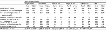
Of course, there are regional variations, though I should mention that the smaller the region you take, the less accurate the survey will be (smaller sample size and all that). In Bangalore Urban, for example, the survey estimates that 30% of the population had been infected by mid-September. If the ratio holds, we see that nearly 60% of the population in the city has already got the disease.

The official statistics (separate from the survey) also suggest that the disease has peaked in Karnataka. In fact, it seems to have peaked right around the time the survey was being conducted, in September. In September, it was common to see 7000-1000 new cases confirmed in Karnataka each day. That number has come down to about 3000 per day now.

Now, there are a few questions we need to answer. Firstly – is this factor of 40 (actual cases to known cases) feasible? Based on this data point, it makes sense:

In May, when Karnataka had a very small number of “native cases” and was aggressively testing everyone who had returned to the state from elsewhere, a staggering 93% of currently active cases were asymptomatic. In other words, only 1 in 14 people who was affected was showing any sign of symptoms.

Then, as I might have remarked on Twitter a few times, compulsory quarantining or hospitalisation (which was in force until July IIRC) has been a strong disincentive to people from seeking medical help or getting tested. This has meant that people get themselves tested only when the symptoms are really clear, or when they need attention. The downside of this, of course, has been that many people have got themselves tested too late for help. One statistic I remember is that about 33% of people who died of covid-19 in hospitals died within 24 hours of hospitalisation.

So if only one in 14 show any symptoms, and only those with relatively serious symptoms (or with close relatives who have serious symptoms) get themselves tested, this undercount by a factor of 40 can make sense.

Then – does the survey makes sense? Is 15000 samples big enough for a state of 70 million? For starters, the population of the state doesn’t matter. Rudimentary statistics (I always go to this presentation by Rajeeva Karandikar of CMI)  tells us that the size of the population doesn’t matter. As long as the sample has been chosen randomly, all that matters for the accuracy of the survey is the size of the sample. And for a binary decision (infected / not), 15000 is good enough as long as the sample has been random.

And that is where the survey raises questions – the survey has used an equal number of low risk, high risk and medium risk samples. “High risk” have been defined as people with comorbidities. Moderate risk are people who interact a lot with a lot of people (shopkeepers, healthcare workers, etc.). Both seem fine. It’s the “low risk” that seems suspect, where they have included pregnant women and attendants of outpatient patients in hospitals.

I have a few concerns – are the “low risk” low risk enough? Doesn’t the fact that you have accompanied someone to hospital, or  gone to hospital yourself (because you are pregnant), make you higher than average risk? And then – there are an equal number of low risk, medium risk and high risk people in the sample and there doesn’t seem to be any re-weighting. This suggests to me that the medium and high risk people have been overrepresented in the sample.

Finally, the press release says:

We excluded those already diagnosed with SARS-CoV2 infection, unwilling to provide a sample for the test, or did not agree to provide informed consent

I wonder if this sort of exclusion doesn’t result in a bias in itself.

Putting all this together – that there are qual samples of low, medium and high risk, that the “low risk” sample itself contains people of higher than normal risk, and that people who have refused to participate in the survey have been excluded – I sense that the total prevalence of covid-19 in Karnataka is likely to be overstated. By what factor, it is impossible to say. Maybe our original guess that the incidence of the disease is about 20 times the number of known cases is still valid? We will never know.

Nevertheless, we can be confident that a large section of the state (may not be 50%, but maybe 40%?) has already been infected with covid-19 and unless the ongoing festive season plays havoc, the number of cases is likely to continue dipping.

However, this is no reason to be complacent. I think Nitin Pai is  bang on here.

And I know a lot of people who have been aggressively social distancing (not even meeting people who have domestic help coming home, etc.). It is important that when they do relax, they do so in a graded manner.

Wear masks. Avoid crowded closed places. If you are going to get covid-19 anyway (and many of us have already got it, whether we know it or not), it is significantly better for you that you get a small viral load of it.